
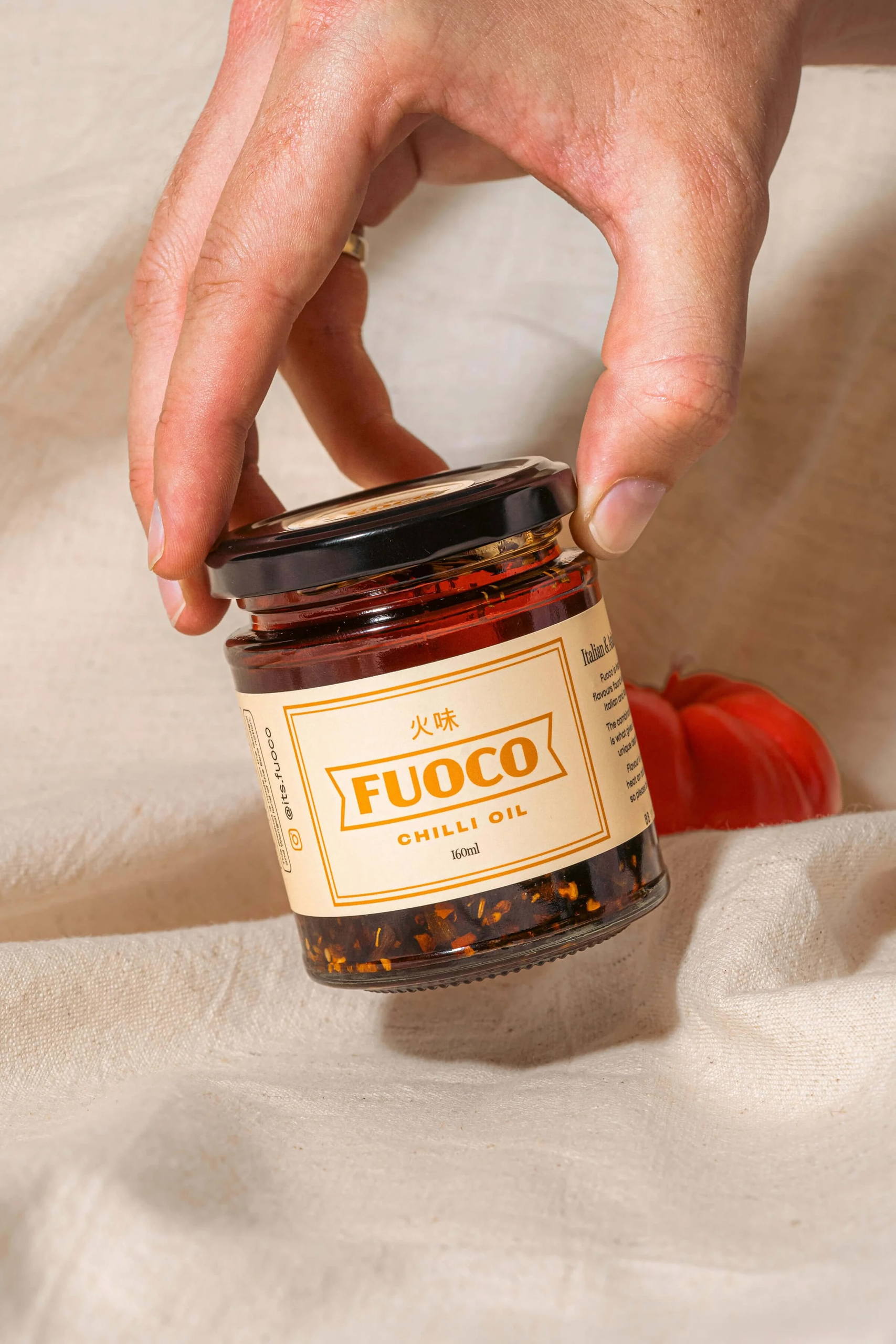
Fuoco Chilli Oil’s packaging design is a fusion of vintage Italian charm and a modern, slick aesthetic, capturing the essence of a timeless and contemporary product. Originating as a graphic design portfolio project, the brand evolved from a mere concept into a reality after extensive recipe research and testing. The unique blend of Italian and Asian recipes sets Fuoco apart in the market, aiming to find the perfect middle ground that appeals to diverse culinary preferences. The name “Fuoco,” derived from the Italian word for “Fire,” not only reflects the heat within the jar but also aligns with the modern everyday meaning of something exceptional. Ultimately, Fuoco aspires to be the go-to chili oil for home cooks and food enthusiasts looking to elevate the flavors of every dish.
Fuoco Chilli Oil started out as a simple branding project for my graphic design portfolio. Inspired by the endless amazing branding projects I had come across and been saving as random inspiration.


