Design Bridge has knocked this design out of the park for Fortnum & Mason’s Classic County Biscuits. We love the striking blue illustrations against the white background along with the traditional typography.
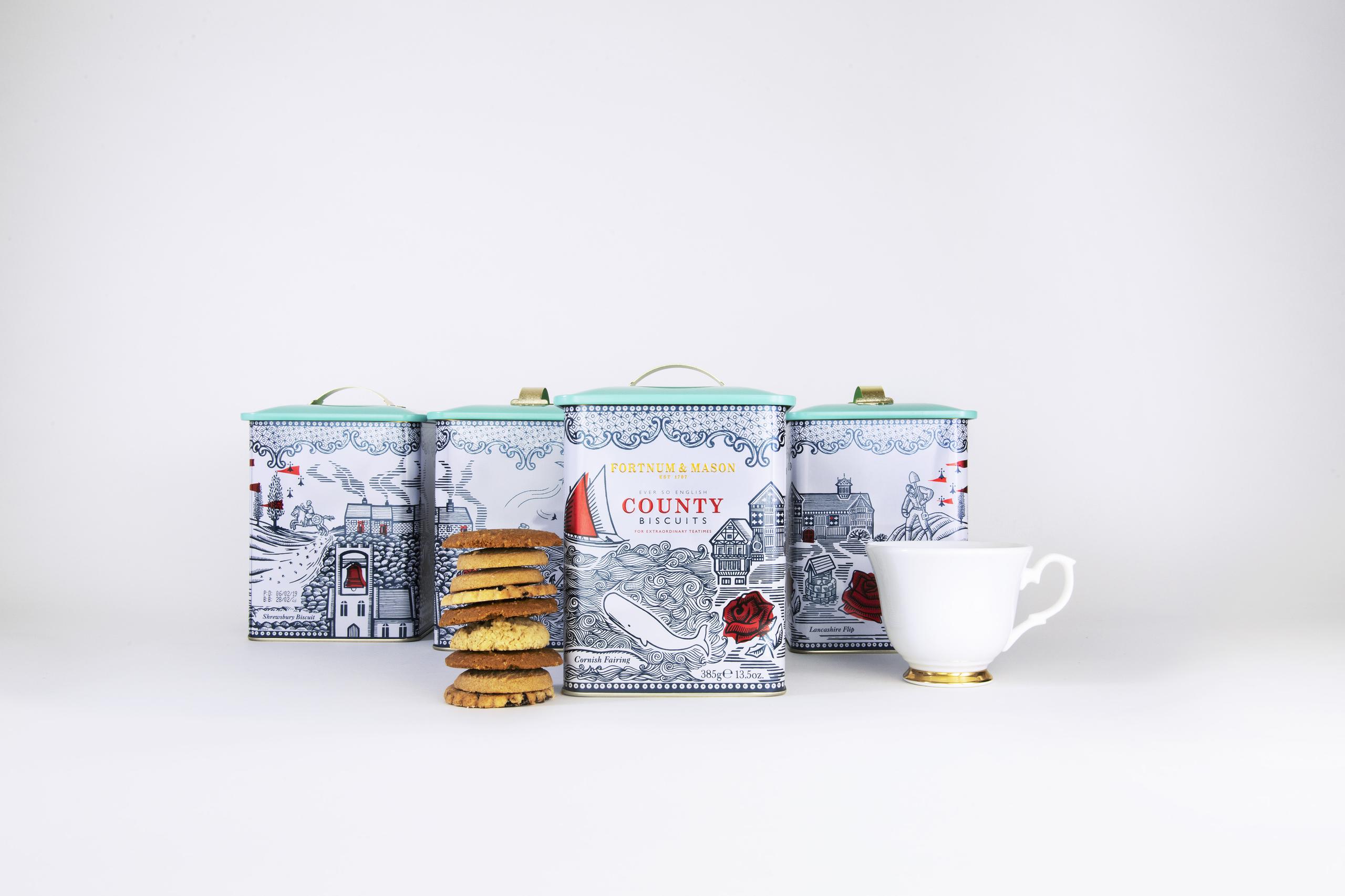
“Design Bridge is pleased to announce details of their latest work for Fortnum & Mason: reinvigorating the iconic British retailer’s classic County Biscuits. Design Bridge has injected new appeal into the product with packaging design that depicts quirky English folklore from the counties each biscuit originates from – Cornwall, Lancashire, Yorkshire and Shropshire. It’s the latest installment of Design Bridge’s on-going work with Fortnum & Mason, which so far has included designs for confectionery, biscuits, honey, and the Christmas range.Chloé Templeman, Creative Director from Design Bridge, commented: ‘Our approach was to attract a new wave of customers by capturing their imagination through telling the unique stories and traditions associated with the biscuits – Cornish Fairing, Yorkshire Parkin, Lancashire Flip, Shrewsbury Biscuit – using vivid illustrations of ancient folklore and traditions associated with each of the four English counties they come from.’”