Fantom Flower Will Slither Its Way Into Your Cold, Black Heart (But in a Good Way!)
By
Published
Filed under
By
Published
Filed under
Overall, the state of cannabis packaging is no great shakes.
There are plenty of reasons for this when you account for varying state regulations and childproof packaging, all unavoidable and quasi-necessary evils. It also tends to mean a lot of plastic and Mylar pouches, too. It’s bad enough when you see an overpriced and overhyped snack brand use a cheap pouch, but it’s even more wince-worthy when you see them deployed at your local dispensary.

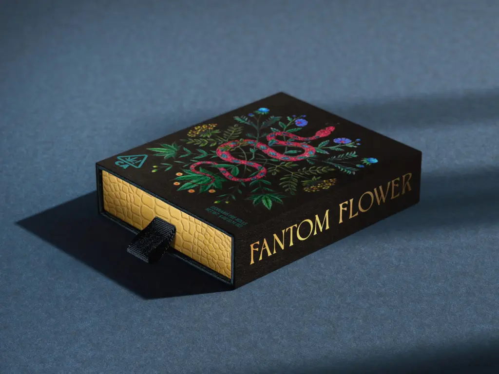
Which is precisely why I’ve come to sing the praises of Fantom Flower, one of our 2025 DIELINE Award-winning cannabis entries. Designed by Pavement, every ounce of the brand’s packaging is thoroughly considered. Designed as the house brand for a WeHo cannabis lounge, with illustrations from Kathleen Lolley, Pavement reaches into its trusty toolbox for an array of luxuriously subtle elements; think snakeskin textures and gorgeous embossing. Altogether, it’s the kind of brand I wish I could find in my own state.
We spoke with Pavement’s Michael Hester about how they dreamed up the visual identity and why worry-warting over packaging costs isn’t worth the stress.

Walk me through the design brief?
Located in the heart of West Hollywood at the former home of the historic Larrabee Sound Studios, Fantom Flower was a premier cannabis lounge offering enthusiasts and the curious a full range of curated cannabis products, fine dining, and live entertainment in a luxury setting. Founded by a team led by actress Patricia Arquette, they had a vision to create an ultra-chic space that celebrated the healing nature of the cannabis plant. As part of this, they wanted to create a line of house products that embodied the brand’s overall ethos.
They came with a very specific vision for the aesthetic, grounded deeply in creating a mysterious atmosphere of artistry and spectacle. Ancient references and a brand story centered around Asherah, a goddess of Ancient Israel, who was known for creating a cult that burned cannabis at the altar in celebration of her and the natural world.
I love the illustrations created for the project. They certainly have that look of being inspired by biological posters and field guides of the past. What inspired the look, and who did you recruit to produce those images?
The Fantom Flower illustrative elements were formed around the idea of a physical expression of a botanical “legend” rooted in the healing nature and energy of cannabis and the natural world. We wanted to present this in a way that signaled phantasma, spector, and illusion. Something that felt futuristic and modern, but rooted in the ancient past, with a sense of timelessness and transcendence. Ancient botanical drawings were certainly an inspiration, along with the art of ancient Babylon and the Middle East, reinterpreted for the present.

We worked with the illustrator Kathleen Lolley to bring this to life. Her work and style were a natural fit for our vision.

There’s also a prominent snake motif that slithers its way across most of the packaging; some cartons feature scale-like textures. What prompted that as a focal point for the brand?
The snake has always been a symbol of mystery, the dark world, and spectacle. It was a natural for the brand story created by the founding team. The snakes slithering through intertwined botanicals set a tone that is initially inviting and beautiful, but then delves into dark, foreboding territory.

Can you tell us more about the wordmark? Was that something that was already a part of the brand world (i.e., the cannabis lounge)?
The worldmark was created in tandem with the botanical illustration as part of the brand identity exploration. Although it could stand alone, its true intention was to be presented intertwined with the botanical illustration, creating a highly complex and illustrative brand logo overall. Several iterations of this were created to create variety and avoid staticness.

Beyond the illustrations, there are plenty of other details that might get lost in the packaging sauce, and the whole affair feels intentional and considered – again, with the snakeskin textures, but also the embossing on the dropper bottles, the wallpaper effect when you open the box of prerolls. How do you turn up the volume on these notes that other brands might miss?
I think one of the reasons the Fantom Flower team sought us out in the first place was our use of texture and materials, especially in our cannabis-related projects. Again, they had a very specific vision for custom packaging that really took advantage of these principles in order to create something very unique and premium. The cannabis industry is mired in off-the-shelf jars and mylar bags that feel generic and unmemorable. Layering and contrasting patterns—things you might not normally pair together — became a hallmark of the brand aesthetic.

And speaking of those finer details, was budget ever an issue here? And are there ways to do a lot of these extra-mile effects for a more budget-minded client?
No, budget was never an issue. The client came in with an idea of what creating something premium and bespoke might cost, and never held back.
Within the cannabis space, avoiding things like the standard mylar pouch can pay dividends for a brand. Creating a unique box with premium papers and production bells and whistles, like embossing and foils, isn’t as crazy expensive as you might expect. It’s easy to convince a client of the ROI that these details create, but it requires an innate savviness that some in the cannabis industry understand.