Bloody Drinks Gets Right to the Point with Daring Design & Bespoke Typography
By
Published
Filed under
By
Published
Filed under
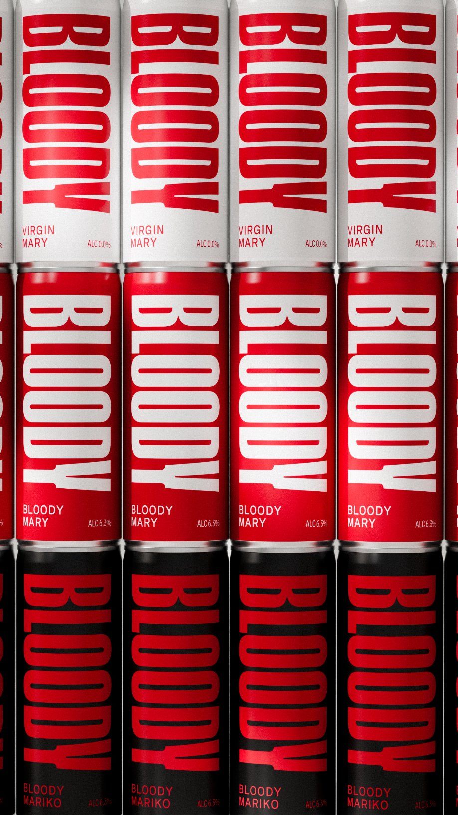
With its bright red can and immediate declaration of “BLOODY,” Bloody Drinks might appear at first glance to be a True Blood-style drink for aspiring vampires. While it’s thankfully just a canned cocktail, that initial moment of shock seems to be a big part of the point.
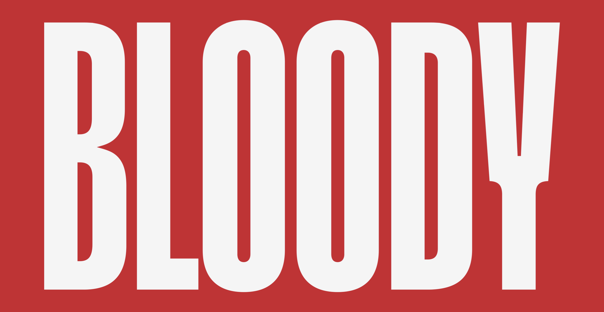
Glaswegian design agency Freytag Anderson helped the brand land an immediately attention-grabbing design with a simple yet striking color palette and bespoke typography by ABC Dinamo. The font comes with 12 different weights that change according to the amount of lines in a text, which feels like a pretty intentional callback to the moment in the mid-2000s when “Frankie Says Relax”-style shirts were all over the London runway. (If the amount of time between then and now scares you more than vampires, join the club!)
Get unlimited access to latest industry news, 27,000+ articles and case studies.
Have an account? Sign in