Roundhouse Studio’s Minimalist Design for Perihelion Wine Features Celestial Elegance
By
Published
Filed under
By
Published
Filed under
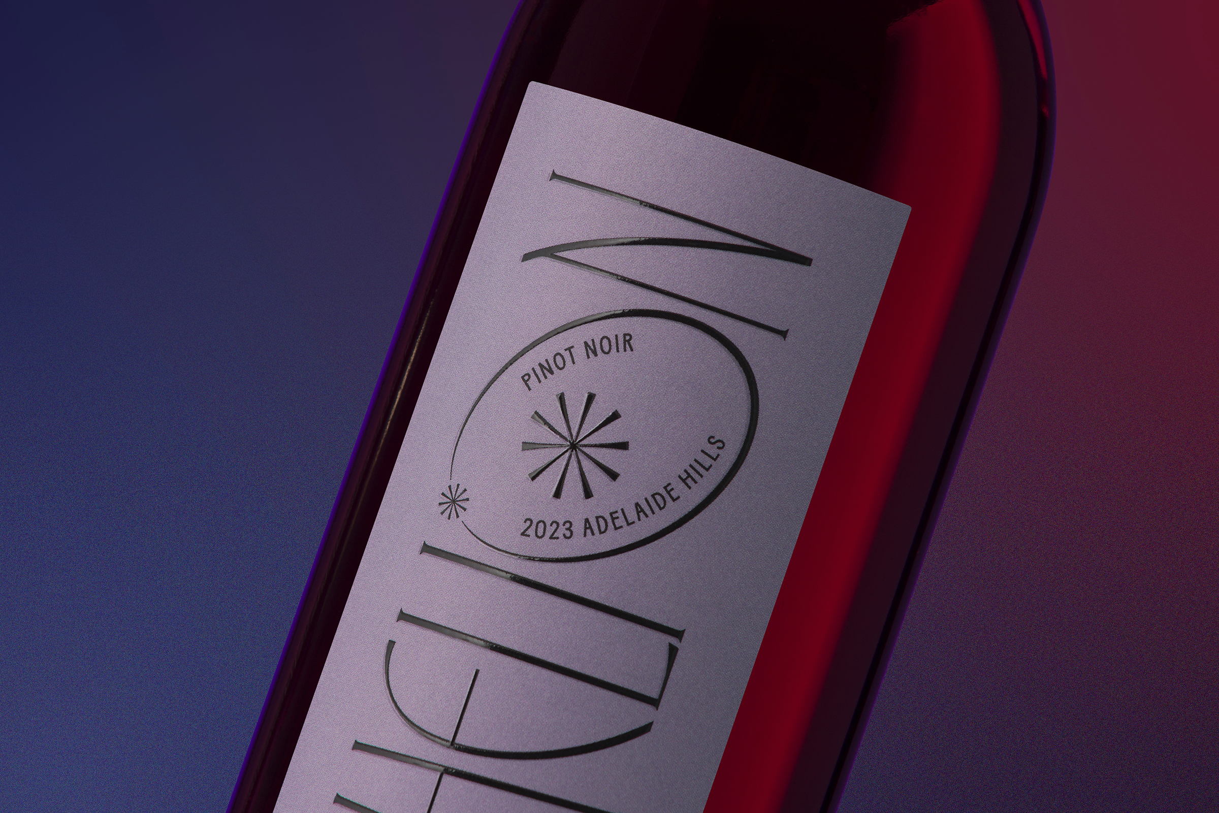
Roundhouse Studio’s packaging design for Perihelion takes inspiration from the celestial dance of Earth’s orbit, specifically the moment of perihelion when the planet is closest to the sun. In a nod to this astronomical event occurring during Australia’s summer, the label design focuses on the Adelaide Hills wine region, where sun-soaked grapes flourish under the Southern Australian climate. The label’s smooth curves and organic shapes, inspired by the solar system’s mystery, interact with light through a high-build finish, creating depth and accentuating the elegance reminiscent of a fantasy or sci-fi film title sequence.
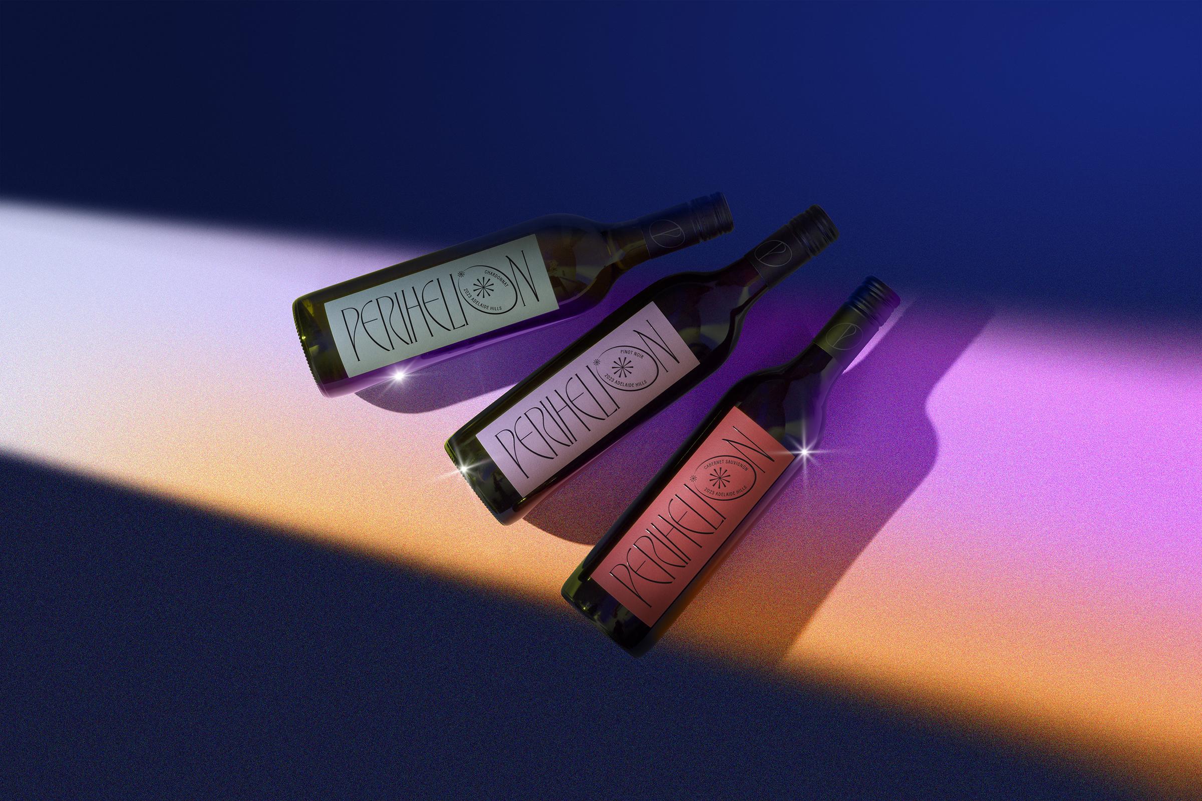
The term “perihelion” is the point at which an orbiting planet or celestial body is closest to the sun. In Greek, the word literally means around (peri) the sun (helios). Earth’s perihelion is during our Australian Summer, with January 3rd, 2024, slated as the next occurrence. It’s during this time that grapes plump and ripen under the sun amongst the verdant vineyards of the picturesque Adelaide Hills wine region. Our rich soil and sun-soaked South Australian climate delivers world-renowned, full-flavoured wines. The winemaker, Chris Coulter, created Perihelion as an export-targeted range, nodding to the ‘time in the sun’ Australian wines have been enjoying internationally.
Get unlimited access to latest industry news, 27,000+ articles and case studies.
Have an account? Sign in