Funkybucha Embraces An Experimental Ethos
by Chloe Gordon on 09/29/2023 | 3 Minute Read
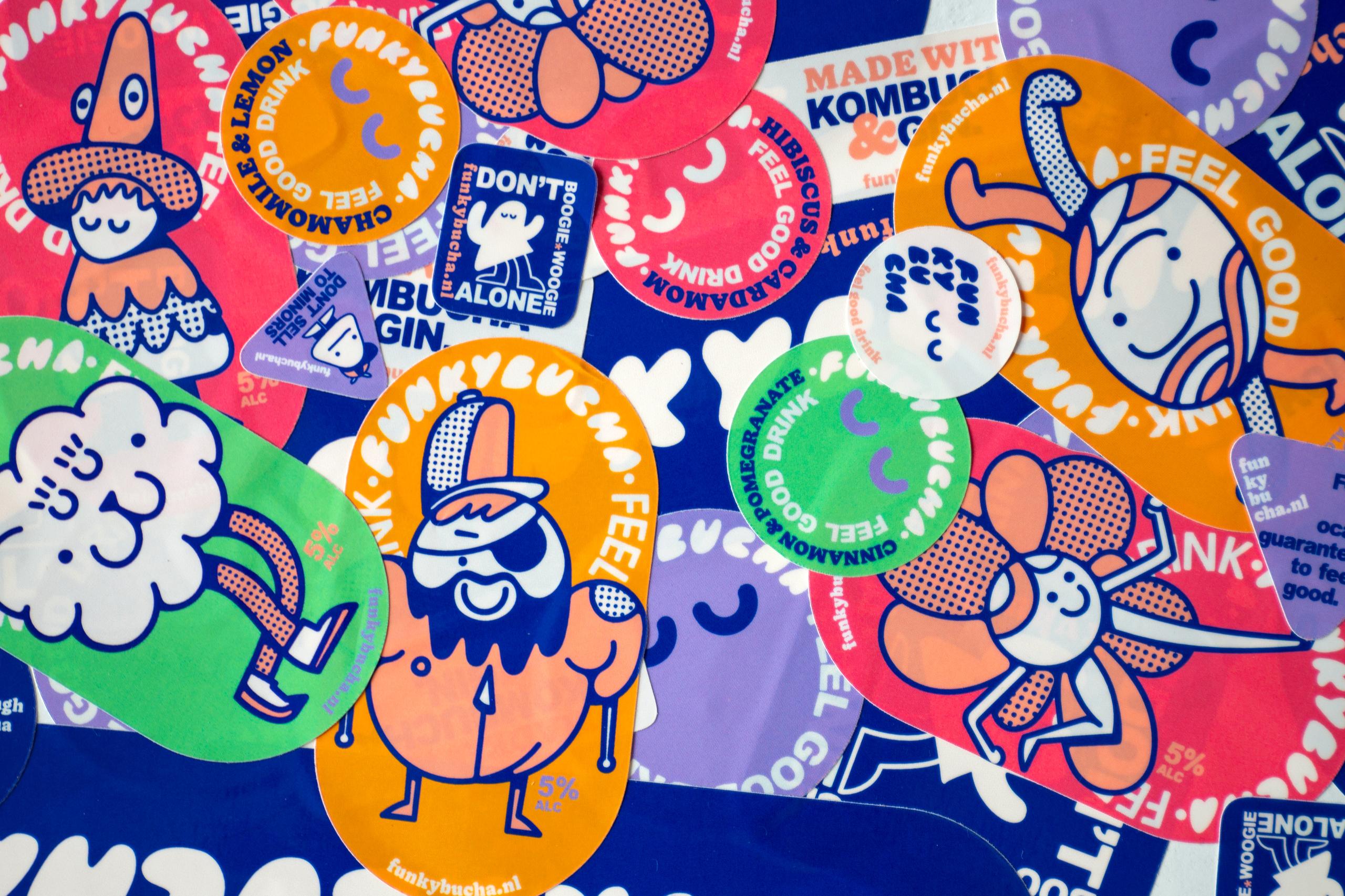
Franko Rosas of Oil Studio has crafted the packaging design for Funkybucha that mirrors the brand's innovative approach to alcoholic beverages. Funkybucha's blend of healthy kombucha with premium gin is symbolized through the packaging, where the two contrasting elements coexist harmoniously within the same can.
Embracing a playful and experimental ethos, the packaging design takes inspiration from the humorous names of live cultures found in kombucha and the distinct flavors of each product. What sets it apart is its non-conformity with traditional labeling rules; each can boasts individuality. Different stickers for each flavor allow for DIY-style customization, doubling as promotional branding materials. The design is clever, fun, and interactive, ideal for a brand based on the notion of whimsy.
Brand Development / Brand Illustration Funkybucha rethinks the way we consume alcoholic beverages, mixing healthy kombucha with less sugar and high quality gin. A new product requires a new approach. In Funkybucha two contrasting ingredients (gin and kombucha) coexist in the same can.
We tackled the brand as a fun experiment: basing each character on the funny-sounding names of live cultures in the kombucha, and the flavours in each product. We designed the packaging in the same playful spirit: each can is different, and doesn't follow the labelling rules (kinda like how funk made it to the dance floor). We created different sheets of stickers for each flavour and labeled each can DIY style. These labels also worked as promotional branding that we can hand out to people in Amsterdam to paste on their laptops, walls, and skateboards!


