Featured image for Does Vikre Distillery Go Full-On Quirk? You Betcha'

Does Vikre Distillery Go Full-On Quirk? You Betcha'

by Chloe Gordon on 09/04/2023 | 3 Minute Read

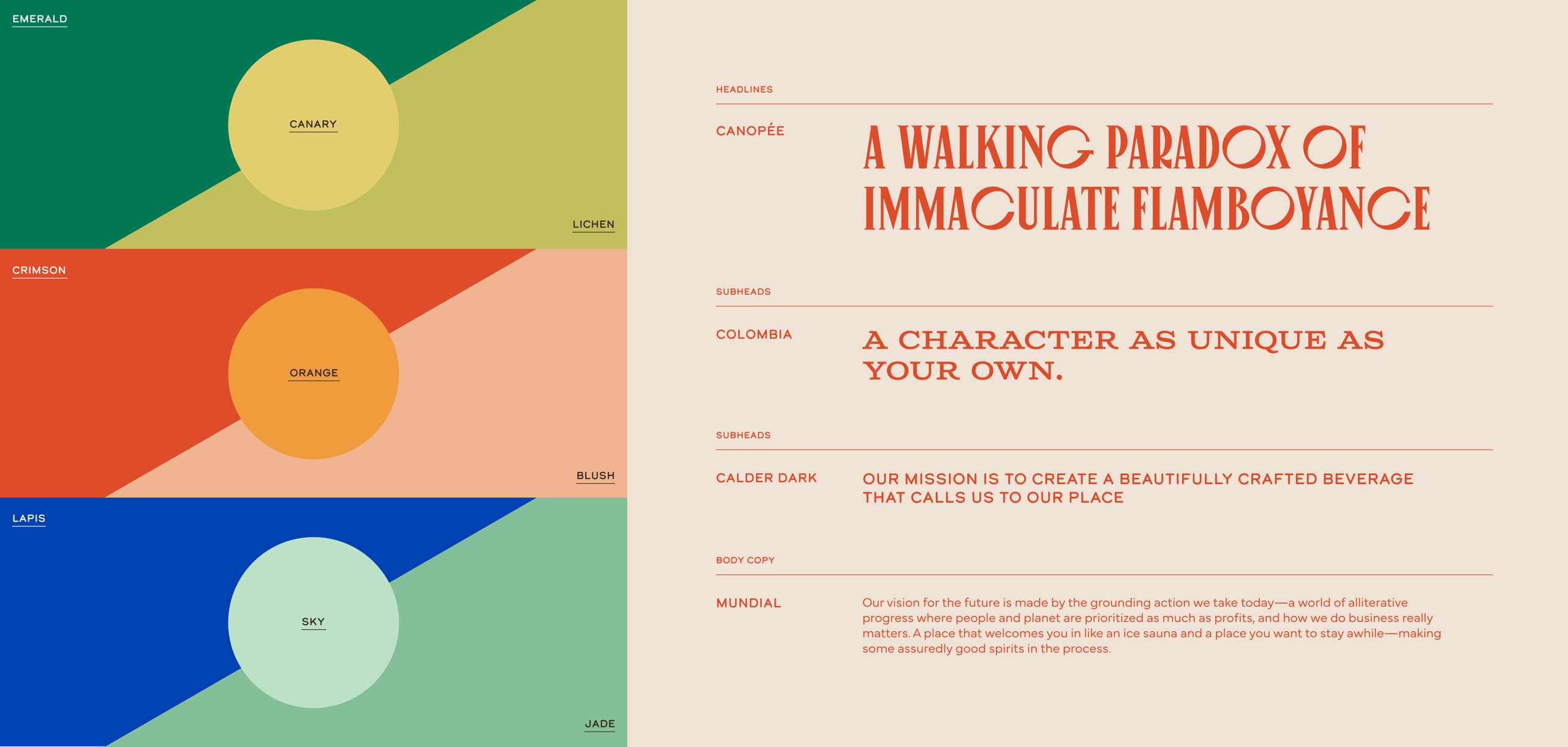
Nestled in the heart of Duluth, Minnesota, a city known for its offbeat charm and unspoiled landscapes, lies Vikre Distillery. The brand thrives on crafting handmade spirits with a unique character and sports a devoted following. 

Vikre Distillery turned to the branding and marketing agency SMAKK to reinvent its identity to match the charming nature of the town it originates from.

Vikre 2 Color _ Type.png

Emily and Joel Vikre, the brand's founders, are a husband-and-wife duo who have steered the brand towards a philosophy that values people, the planet, and prosperity. Their commitment to a zero-waste process, bottle reuse, giveback initiatives, and locally sourced ingredients has set them apart. Because of their philosophy, the team needed a more resonant way of conveying their sustainable mission while highlighting the brand's beloved quirky qualities. 

"SMAKK recognized the need for a deeper brand narrative that could pave the way for nationwide distribution, heightened brand recognition, and an enthusiastic following," notes Katie Klencheski, founder of SMAKK. "We aimed to craft a brand that mirrors their story, essence, and, most crucially, the sense of place that defines them. These individuals are dedicated to doing things correctly across all aspects of their brand. All these aspects needed to shine, from sourcing to sustainability, employee welfare, and customer experience."

Vikre 4 Products.png

The brand's visual identity exudes charm and whimsy, from the logo to iconography and retro-inspired graphics. Collages depict local landmarks such as Minnesota's Temperance River, enigmatic characters like the wild Norwegian grandmother, and essential ingredients like pine and juniper berries. These elements create a robust narrative while embodying Vikre's distillation practices and the essence of Duluth.

Vikre 7 Type Lockups.png

Each flavor's packaging system highlights a distinct persona designed to stand out on the shelf, with a straightforward hierarchy of information to enhance the brand's approachability. Further, SMAKK identified that younger generations prefer their spirits in moderation, emphasizing health and well-being. This focus led towards emphasizing Vikre's unique botanical ingredients and distinctive flavor profiles, making their drinks compelling, shareable, and a more health-conscious choice.

Much like a modern rendition of the Norwegian concept of "hygge" — the cozy, intimate feeling of space — Vikre's fresh identity epitomizes joyful gatherings, fostering camaraderie and offering libations as a gesture of warmth shared among loved ones. Because of its artful packaging system, Vikre's gin bottles instantly stand out amongst a sea of competitors while also creating a brand system that's approachable, endearing, and full of wit. 

Vikre 8 Type Lockups.png
Vikre 9 Desktop Pages.png
Vikre 11 Visual Assets.png