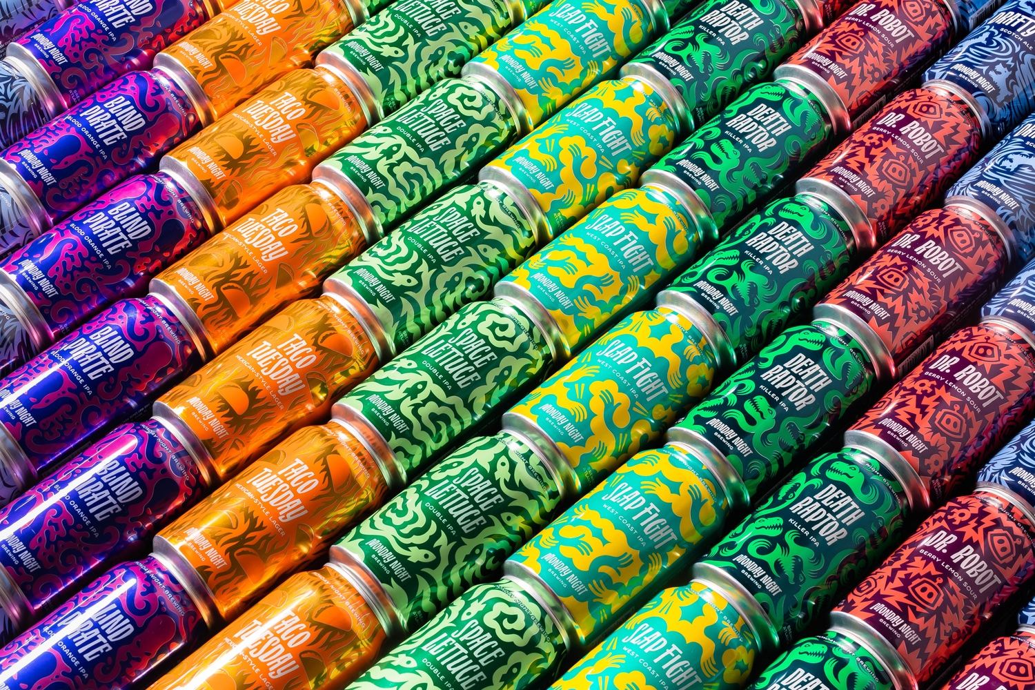
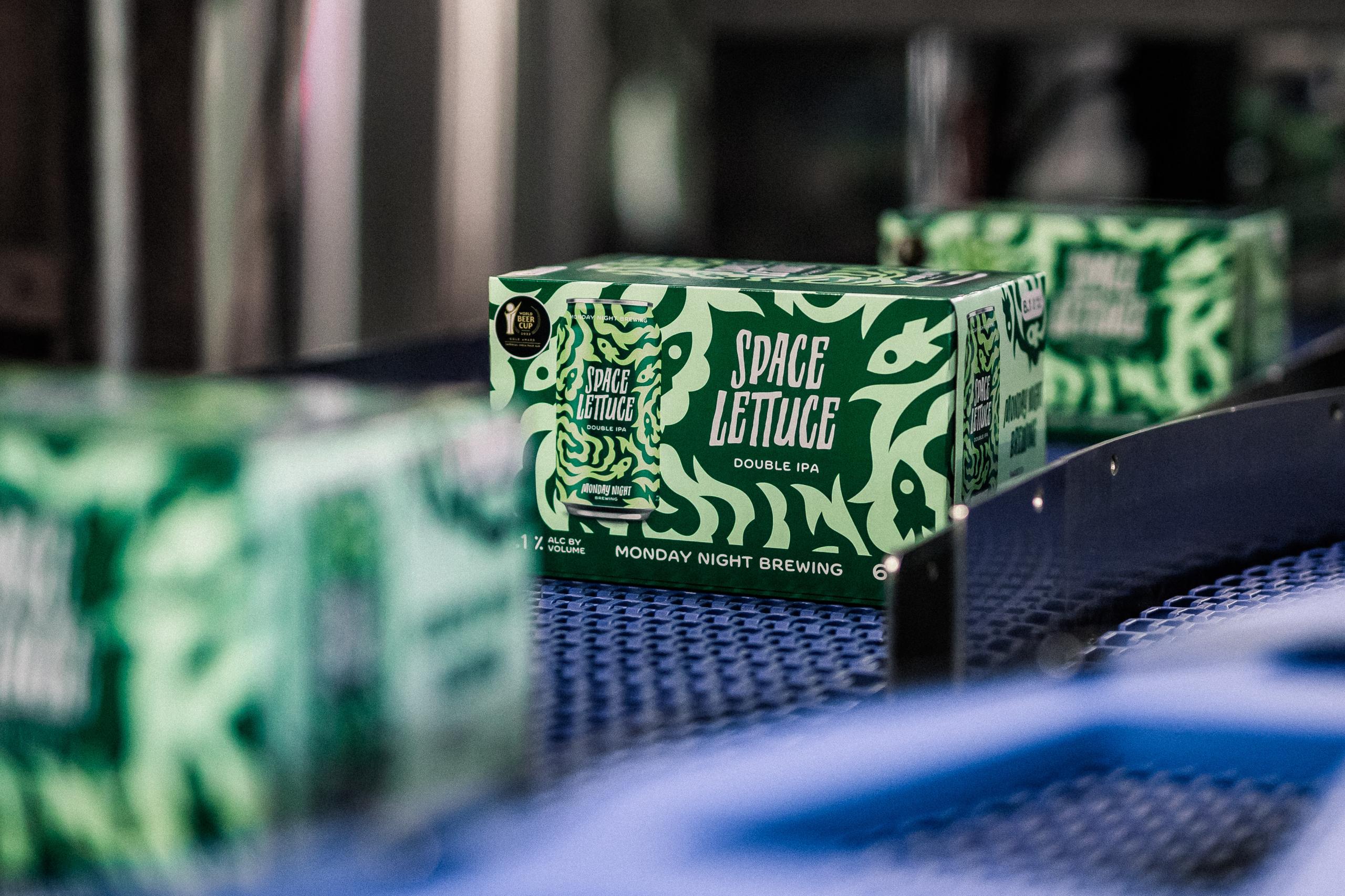
Matchstic is the agency behind Monday Night Brewing’s rebrand. The result is a design system born out of enthusiasm that values craftsmanship and creativity but also a genuine interest in the beer within. The brewery’s existing creative names inspire the color palette, and the contrasting colors are inspired by the day and night contrast in the brewery’s name. Additionally, the pattern on each can create a main focal point, acting as an extension of the beer’s name but also as a quirky defining characteristic across the range.
It’s not everyday we get to work with a brewery, especially a local legend. So when Monday Night came calling, we came running. As it turns out, the team was as fun to work with as their beer is to drink. We set out to capture not just the creativity and craftsmanship of the beer, but the genuine enthusiasm and humor of the people behind it.


