Monotype Unveils Their 2023 Type Trends Report

Published

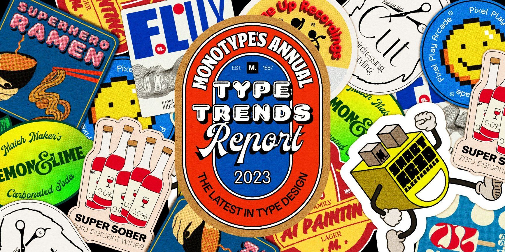
Must be January, because Monotype has just released its much-anticipated 2023 Type Trends report. The font experts at Monotype describe the annual state of the type union as a snapshot of the design landscape and a collection of work that not only excites them but celebrates the deep well of ingenuity and invention that runs through the creative community.

This year, Monotype’s report consists of ten significant trends with plenty of analysis and type specimens to boot. Collectively, they reflect the innovations and experimentations with 3D, motion, and AI, but there are also indications of playfulness, inclusion, and diversity throughout the typographic landscape.

“Type is a gateway to an entire conversation around technology and today’s trends,” said Monotype creative type director Terrance Weinzierl in a press release. “This report is an educational collection of work that fascinates and excites us and, most importantly, represents a ripple coursing through the ocean of design. Through these ten trends, we provide perspective of how our daily life is impacting letterforms.”

So, might these be the type trends you’re looking for in 2023? Let’s dig in.

Matchmaker

Matchmaker showcases the values of diversity, inclusion, and equality, inspired by the attitudes and values of millennials and Gen Z. But it’s also a reflection of life on Earth and the human experience; complicated, diverse, and profuse. You can find examples in the combination of organic forms with static type and pairing two font types to augment, contrast, create balance, or add new characteristics to a brand’s tone, whether it’s sophistication, something more casual, or honesty.

2- Smart Grid - GSK Logo.jpeg

Smart Grid

Smart Grid blends science and art with type organized around a grid. Smart Grid continues Monotype’s 2021 “Organic Modular” and 2022’s “Blockheads” type trends but evolves the grid trend with judicious softening and precise cuts. This progression of grid design adds humanity to the science and technology-inspired grid layout.

3- Super Hero - Thor.png

Superhero

Superhero is a trend inspired by comic books that employs shadows and outlines and rarely appears as a line on the horizon, skewed into however you need to read your bangs and pows. Superhero is big, bold, energetic, dynamic, and fun, and while it’s often brash or in-your-face it can also be utilized as something lighthearted and jocular. These kinds of fonts can get used to imbue a brand with joie de vivre or drive a message home with power.

4 - Super Sober - Joli Box.png

Super Sober

In contrast to Matchmacker and Superhero, Super Sober describes the soft, somber, and solemn approach. Combined with generous white space and neutral palettes, the minimal amount of type, usually in black or white, can’t help but stand out. Monotype describes Super Sober as “an empty bench in a crowded airport.” Essentially, it’s a style that calls attention to itself by whispering rather than shouting.

5 - Making the Cut - Verge Logo.png

Making the Cut

Making the Cut calls attention to the dicing up and removing of letterforms. The effect often provides a sense of motion and kinetic vibrancy, sometimes achieved by combining ink traps with Smart Grids to add a decorative element. Another way is to push ink traps to the extreme with sharp, pointed diagonals that create a focal point.

6 - Pixel Play - Kudo Ad.jpeg

Pixel Play

Pixel Play sparks those warm, nostalgic feels for the early digital experience. It evokes early video games and can add a hint of playfulness to a brand. Building from squares doesn’t mean simplicity but inspires creativity through restraint, similar to playing with LEGO.

7 - Flux - Aerial.jpeg

Flux

Flux is a trend Monotype describes as type in eye-catching motion. New typefaces are taking advantage of the freedom to move, bend, and transform afforded by the latest technology, such as new fonts designed for coordinated drones, AR, and digital screens. Even capturing the sense of movement in a static form applies, like extended form fonts.

8 - Volume Up - Illusion - ACE Booklets.jpeg

Volume Up

Volume Up is all about 3D modeling, something you can’t escape with the “meta-ing” of everything. Technological advances have enabled new 3D renditions with different surfaces, from fuzzy to shiny chrome. 3D type takes full advantage of AR/VR environments for a fresh take on typography. But in the 2D realm, you can often achieve those same results with optical illusions and effects, giving letterforms a richer texture.

Liquify

Liquify is a technique that describes the use of wild, organic shapes. “The more liquified, the better,” Monotype says in their report. “But legibility and readability hang on by a thread.” The result is often a psychedelic effect as type melts and morphs, often on the brink of intelligibility. Designers are also adding traditional analog techniques by hand to add imperfection to digital work.

10 - AI Painting - AI Book - AI Grid.webp

AI Painting

AI Painting describes robot-generated letterforms, similar to AI-generated art. Monotype’s report describes the generation of type by artificial intelligence as still in its early days, and the uncanny valley is still apparent. But the technology will progress quickly as designers and others experiment and tinker with the machines. 

Go here to check out the full Monotype Trend Report.

This placeholder is removed when the ad slot is configured.

This placeholder is removed when the ad slot is configured.

This placeholder is removed when the ad slot is configured.

This placeholder is removed when the ad slot is configured.

This placeholder is removed when the ad slot is configured.

This placeholder is removed when the ad slot is configured.