Featured image for Tabasco 'Lights Things Up' With Brand Refresh By Mrs&Mr

Tabasco 'Lights Things Up' With Brand Refresh By Mrs&Mr

by Rudy Sanchez on 08/09/2022 | 2 Minute Read

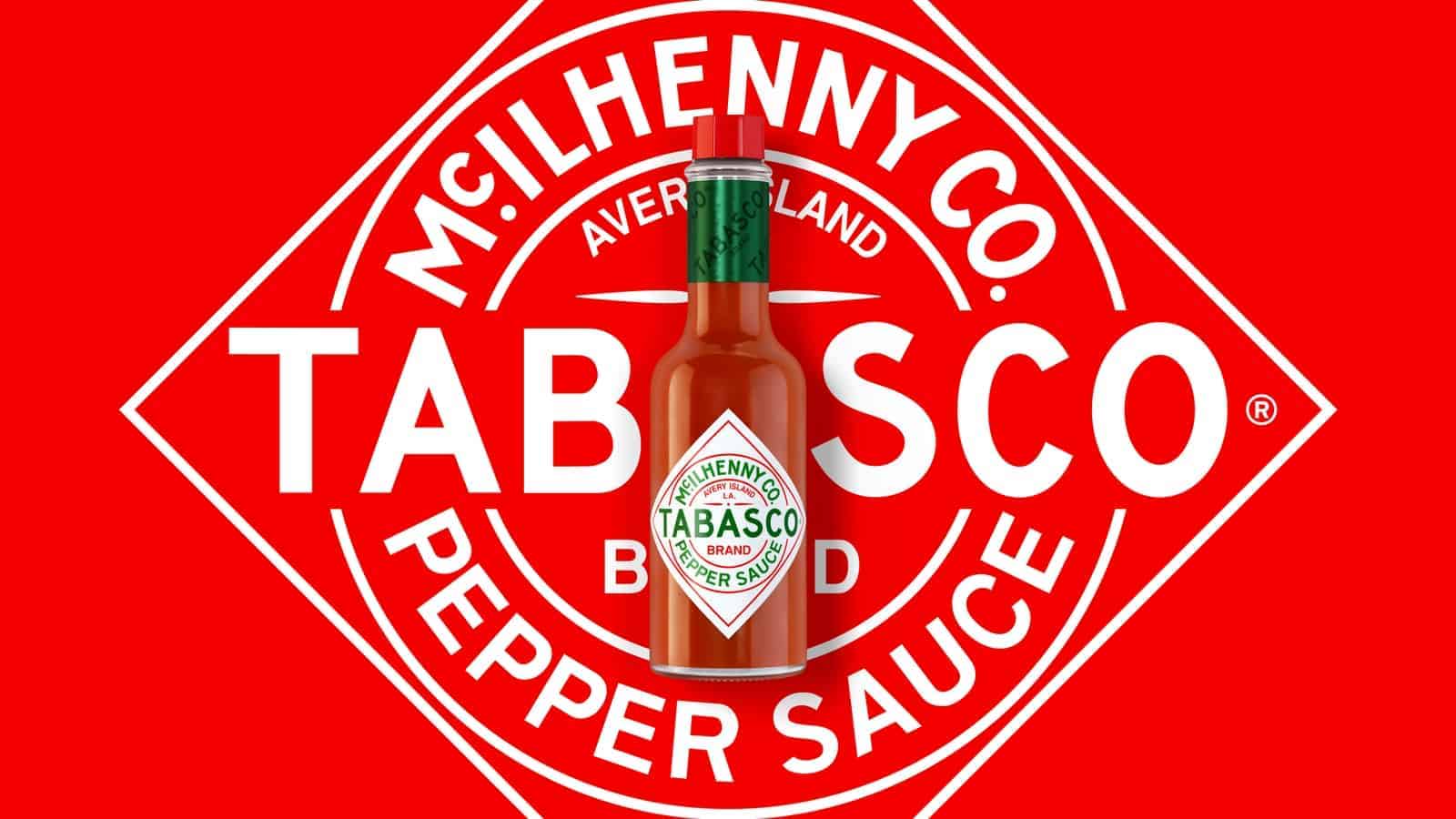
Tabasco hot sauce has been a long-standing stalwart of spice in kitchens and restaurant tables for decades. Founded in 1868, Tabasco is the popular, piquant Louisana sauce immediately recognized by its signature diamond label and red top, a packaging design the brand has used since 1927.

Along the way, Tabasco has expanded its line beyond the brand’s signature sauce into different hot varieties made with diverse spices and peppers, BBQ sauces, condiments, and an entire line of merchandise. 

Editorial photograph

But Tabasco didn’t have a unified visual identity across its brand. Tabasco turned to agency Mrs&Mr to create a new global, unifying identity system.

Editorial photograph

The brand's new tagline, “Light Things Up,” guides the new visual system. Tabasco sauces are generally less hot than other hot sauces, but the bright flavors with just a bit of heat complement various foods. Food photography gets paired with striking graphics, and the approach is unique in that you can tailor it to local markets. The brand’s color palette and typography are also updated.

Editorial photograph

Tabasco's signature bottle is also updated, though the change is subtle, an understandable approach given the packaging’s near-century-long history. The diamond label gets cleaned up a bit, and the most notable omission is the “Made in the USA” in the logo.

Editorial photograph

Tabasco has already rolled out the new look across the entire brand.


Images courtesy of Mrs&Mr.