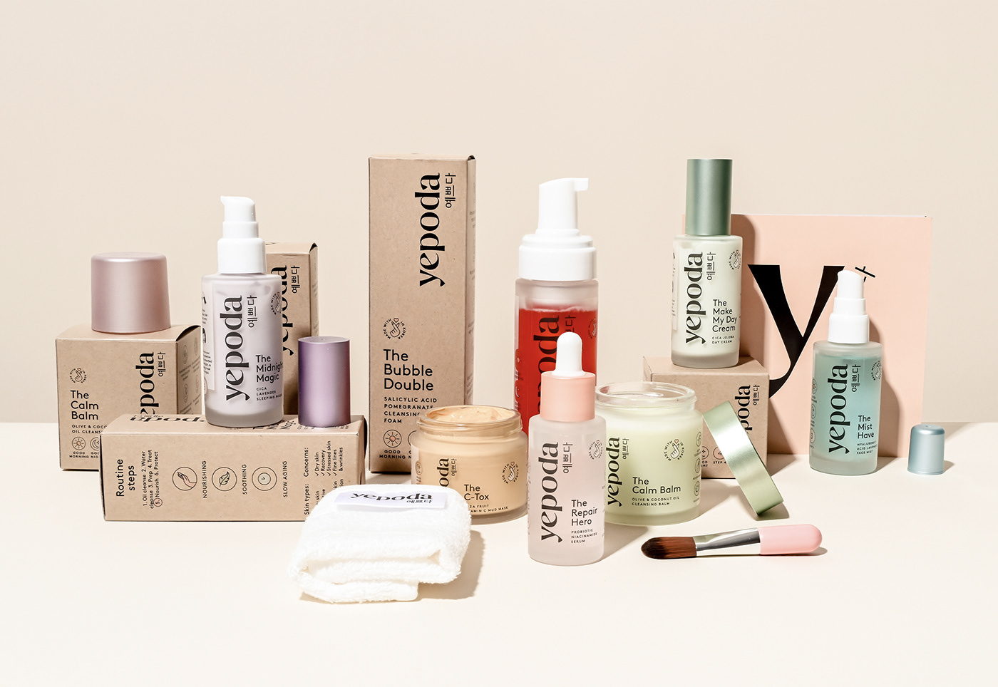
Kepoda’s skincare packaging, designed by OWLSOME STUDIO, introduces consumers to the ingredients inspired by accessible skincare. The packaging is simple, focusing on a clean and sophisticated design, highlighting a vertical logo that brings the user’s eye from top to bottom. Additionally, the color palette across the line is refreshing yet playful.


