Who doesn’t love the excitement of a fresh candy bar? The potential to satiate your sweet tooth is inspiring. And, when the packaging of the candy bar is as creative as Duluth Candy Company’s, the excitement is all the more genuine. Designed by Studio MPLS, the candy bar’s packaging blends stunning modern design aesthetics with authentic timelessness. Truly stunning.
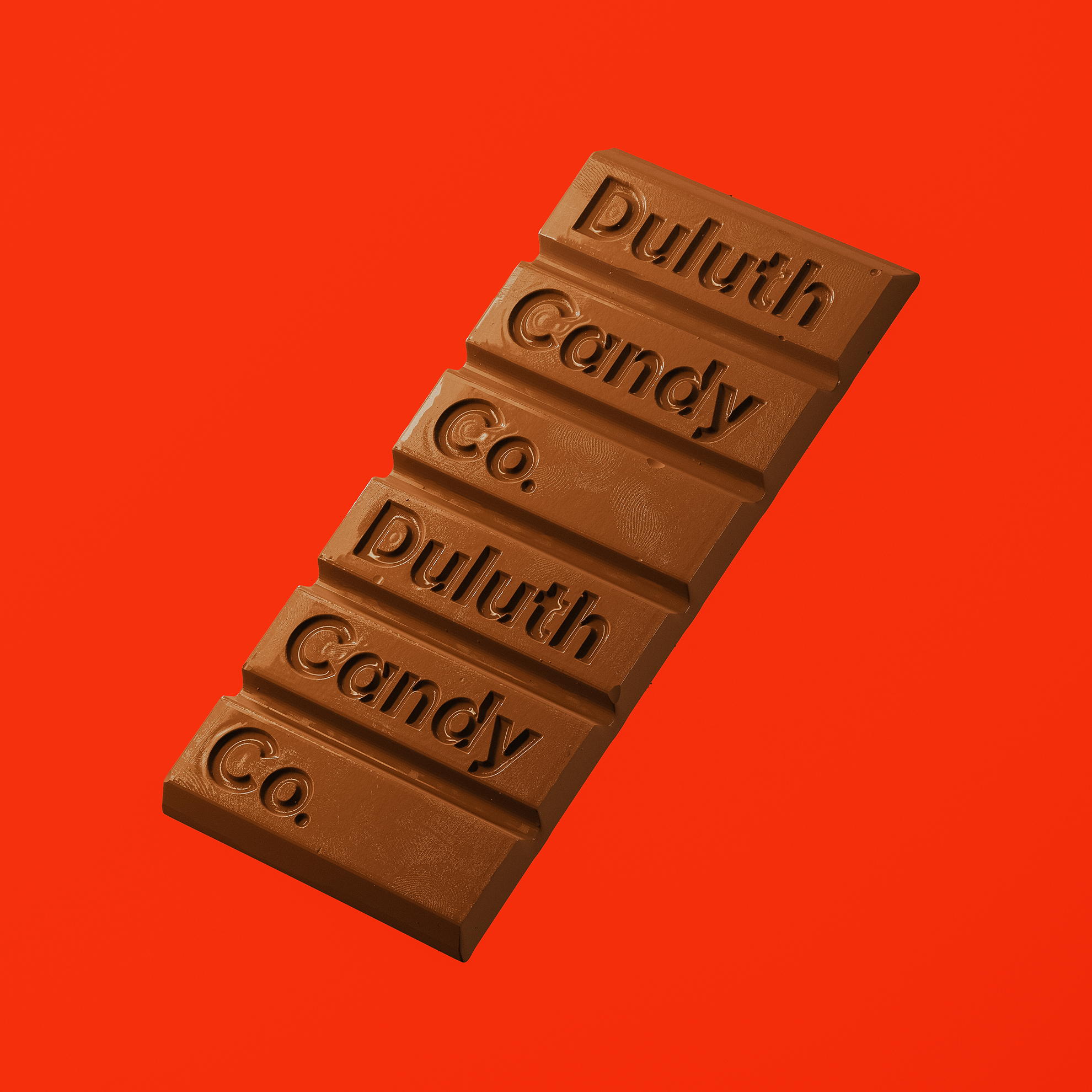
Naming, branding, and packaging for the United States’ most northern candy shop. Named after the blue collar city of Duluth, Minnesota — Duluth Candy Company blends a no-nonsense sentimentality for the past with modern, youthful wistfulness that our children and your grandparents can appreciate. A color palette that says “hey — we took like 8 hours to come up with this” and a logotype that says “we just don’t care anymore” are all we needed to nearly reach the 100 word minimum. Only sixteen words short!