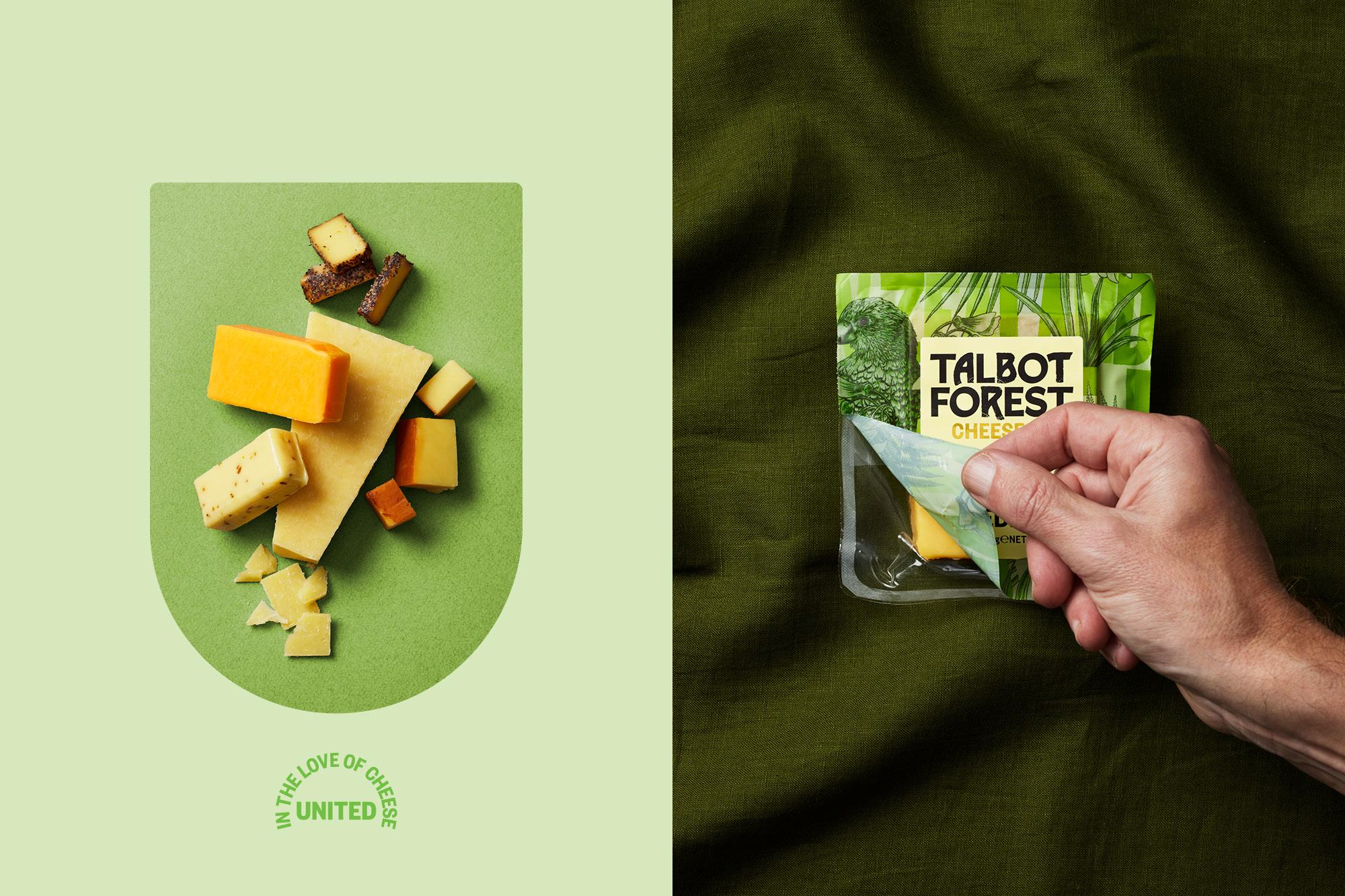
Featured image for United In The Love Of Cheese: Talbot Forest Cheese Co.

United In The Love Of Cheese: Talbot Forest Cheese Co.

by Chloe Gordon on 01/07/2022 | 2 Minute Read

When you're used to the annoying standard, it's easy to forget that changes can be made to create a better design or idea. Take cheese packaging, for example. So often, if you don't finish your cheese, you're left with plastic that's not resealable, causing frustration and excess waste.

Onfire Design worked with Talbot Forest to beautifully reinvent and redesign the brand's packaging. Not only does the new packaging better showcase the brand's personality through botanical illustrations and playful colors, but the new packaging system is less wasteful through a more resealable packaging design. Additionally, the gold details and chunky woodblock font add mounds of character that the brand previously lacked.


Editorial photograph

Named after the local forest in the South Island of New Zealand, Talbot Forest Cheese Co. was established in 2000 to produce high-quality, specialty cheeses. This small operation soon grew, annually making tons of various cheese styles. However, a lack of attention to the brand and packaging has resulted in a 'manufacturer' brand rather than the disruptive iconic Kiwi brand it should be.

We were tasked with its recreation and challenged to bring to life its story, quirky personality and unique perspective in cheese making. We found inspiration in its forest origins. Bringing this to life with a bold typographic woodblock pattern. Through which weaves botanical style local flora, fauna and birdlife illustrations; the size of which allows for multiple crops applied across the cheese styles. This creates an ever-changing forest scene in retail.

Editorial photograph

The previously dated brand logo lozenge was taken away, allowing for a new wordmark to be used at a much bigger scale, with a considered mix of refined and rough tree-like letterforms. Inspired by its new motto, 'United in the love of cheese', a shield-shaped label is applied with refreshed taste descriptions with a pale colour palette to aid product navigation. The result is a brand that sparks curiosity with a distinctive opinion and personality in a category awash with various iterations of the now commoditised craft story.

Editorial photograph