Featured image for 'TikTok Designer' Emily Zugay Redesigns Logos For Chuckles and Gets Brands In On the Action

'TikTok Designer' Emily Zugay Redesigns Logos For Chuckles and Gets Brands In On the Action

by Rudy Sanchez on 09/24/2021 | 2 Minute Read

Change can be difficult, and logo refreshes are no exception. When it comes to iconic and globally recognized brands, a polarizing switch to a beloved logo can send fans into a veritable tizzy. And in the digital period of the Anthropocene age, everyone is a critic with a platform, whether they ought to be or not.

Of course, it’s easy to lob negative critiques at brands from the peanut gallery, but simply saying “this sucks, I hate it” doesn’t add value to the conversation. One could sit in front of their keyboard, thesaurus at the ready, and bang out a few hundred words bloviating about a redesign project for some blog, or, if you’ve got the comedic chops of Emily Zugay, you go with deadpan satire, to dazzling effect.
Editorial photograph

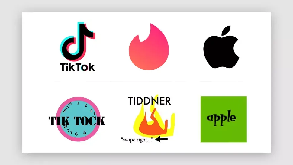
Ms. Zugay’s “redesigns” are as much a scathing critique of a particular logo as they are on how logos and brand designs are created and discussed. In her Toks—I’m told that’s what the kids call TikTok posts—Emily presents her redesigns in a monotone and expressionless manner similar to the ennui of a tortured artist, and her apathetic performance is reminiscent of MTV’s Daria, Bob’s Burger’s Tina Belcher, and April Ludgate from Parks and Recreation.

Reaction for Zugay’s “redesigns” has been overwhelmingly positive, with brands such as TikTok and McDonald’s changing their expensive, and forged in Dante-levels of email rounds, logos with Emily’s lo-fi send-ups. 

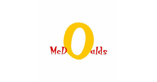
For McDonald’s, Emily decided to take focus away from the Golden Arches, emphasizing the O and not the M, because reasons ("I don't think that you meant for your logo to look suggestive, but right now, this looks like two knees to me. I don't want to be thinking about knees when I'm eating my McChicken"). She didn’t mince words in her critique of Starbucks’ long-tenured logo either and took a blunt, MS-Paint-shaped hatchet to the Seattle-based company’s shingle, gutting the siren, keeping the stars, and replacing Starbucks-Sans with something akin to...Papyrus?

It’s unclear whether these social media brand managers are simply chasing attention or are earnestly in on the joke.

In any case, Emily’s redesigns have, at the very least, provided some lighthearted respite from the overwhelming negativity typically conjured whenever a brand changes it up.