Cacaosuyo’s Inca Inspired Packaging Design Is Refined And Elevated
By
Published
Filed under

By
Published
Filed under
Cacaosuyo, which translates to “cacao territory,” seeks to represent the legendary origin of fine chocolate. The refresh’s goal was to give the packaging a look that would be refined enough to be in a museum. Throughout the packaging, a system of icons represents the Andean trilogy (condor, puma, and snake). The gold diamond in the middle of each bar’s label gives the packaging a refined look and feel. Cacaosuyo has done a fantastic job of differentiating themselves from the other fine chocolates in the industry while still staying true to the origins of chocolate, something not easy to accomplish but seemingly done effortlessly.
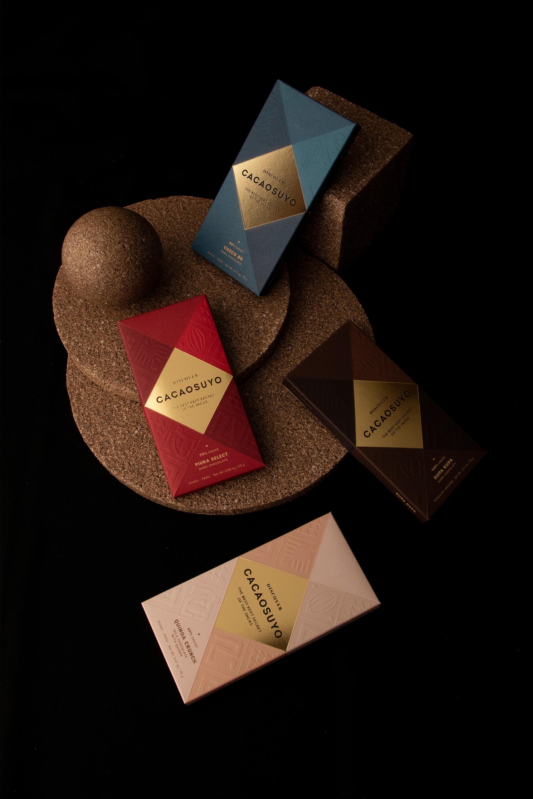
There are many studies that suggest that Peru is the origin of cacao, specifically, it’s Amazon rainforest. Cacaosuyo, which means “cacao territory,” is a brand that seeks to represent the legendary origin of fine chocolate from the country where the Incas once lived. We had to do the repackaging of a brand that has been awarded twice as the best chocolate in the world but whose packaging did not reflect this proven quality; and the objective was to enter new international markets. Likewise, the category of fine chocolates is very competitive in design in the world, so the challenge was difficult in itself, but even more so when Cacaosuyo was the current world champion.
Get unlimited access to latest industry news, 27,000+ articles and case studies.
Have an account? Sign in


