Maüa Brings You The Best Of Both Chocolates

Published

Filed under

Barceló Estudio was contracted by Maüa to develop a modern and trustworthy packaging design and identity for its assortment of Mediterranean and Tropically sourced chocolates. Designers created a textile pattern that would serve as the label’s main image and would also be pressed on the chocolate itself. This combination of traditional patterns portrays the brand’s commitment to culture and excellence, while maintaining a trendy edge. The sideways logo, as well as the bright red stamp are the elements that stand out the most, juxtaposed by the serif typeface with the information on the chocolate’s ingredients and sources. 


Editorial photograph

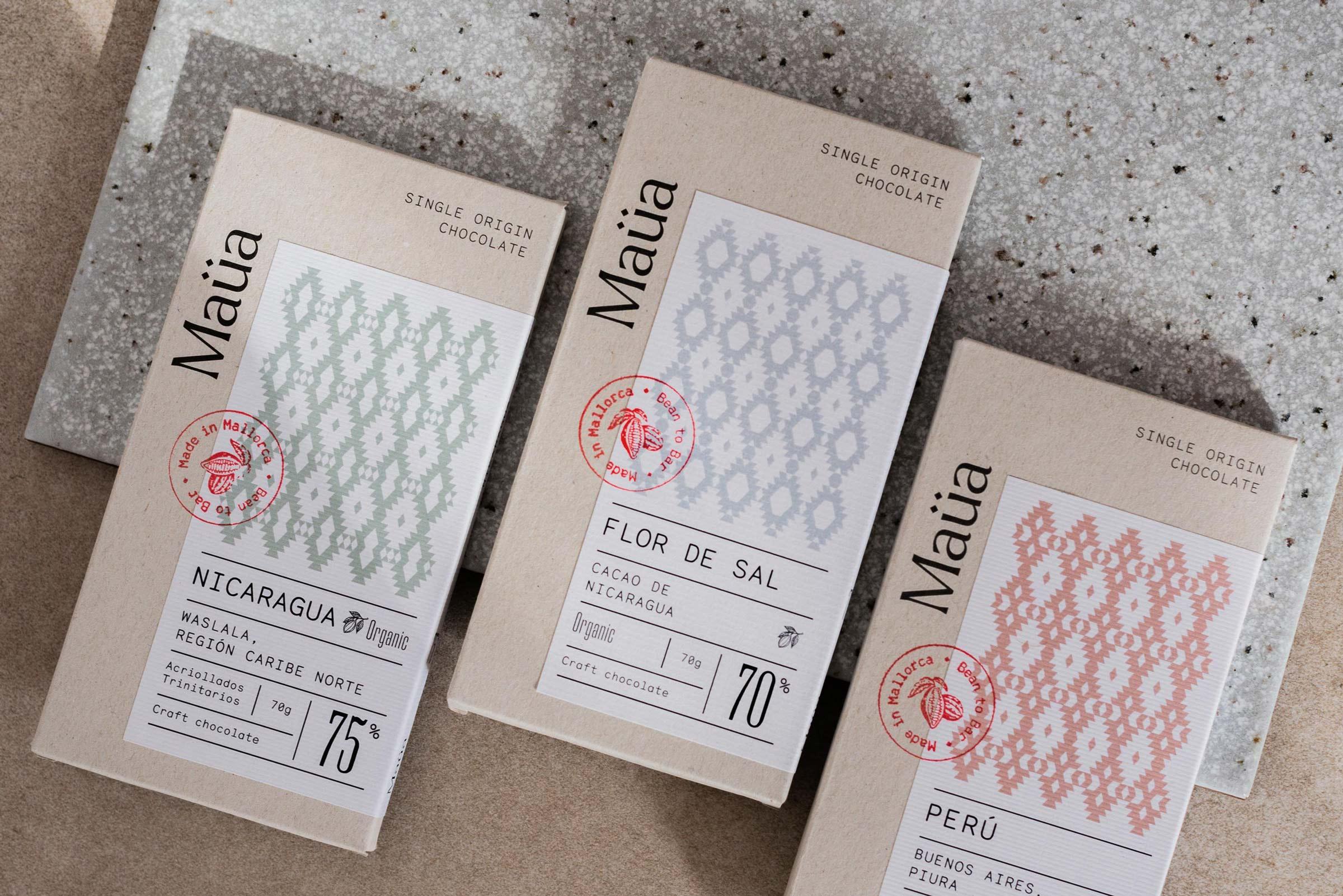
Maüa is a brand of craft chocolates that represents a fusion of cultures, flavors, and tradition with the best of Mallorca and the tropics. The products are made with organic ingredients and ecological raw materials to create high quality products.

Editorial photograph

To represent this fusion, a symbol has been created by mixing something as typically Mallorcan as the textures of “llengos mallorquinas” with a type of tapestry very typical of the tropics. The product variation generates such a wide range that it requires a good flexibility from the brand. It is for this reason, that through the different symbols, colors, and patterns, a variable and versatile identity has been created.

Editorial photograph

The symbol is constructed with a rhomboid-based grid and its variations always follow very specific guidelines. 

The description of all the ingredients is written with a Monosten typography, which imply a handcrafted, rustic, and natural feel that contrasts with the Old School Serif typography of the complementary graphic elements that provide the information on the percentage value of the cocoa.  A ‘Bean to Bar’ seal was designed as well to offer a more intimate, trustworthy, and quality character.

Editorial photograph

For the chocolates, specific packs have been created for each product, including different labels for each respective variety.  They are made with a disruptive composition in a traditional box that adds a natural, fresh, and artisanal value. The use of timeless packaging makes it possible to generate a more enduring element over time, as it can be adapted for different collections and new product ranges without having to change the whole brand identity. Simply with a new label design, new packaging is easily established.

Editorial photograph

The project has been designed by Barceló Estudio and manufactured at Imprenta Nueva Balear, a traditional and local printing house in Palma (Mallorca). For its production, a cardboard Montana White and Natural Gray 300 g support has been used. For the labels, the printing has been done on Fedrigoni Papers Essentials Adhesives Adhoc Corolla Premium White 80g.

Editorial photograph

This placeholder is removed when the ad slot is configured.

This placeholder is removed when the ad slot is configured.

This placeholder is removed when the ad slot is configured.

This placeholder is removed when the ad slot is configured.

This placeholder is removed when the ad slot is configured.

This placeholder is removed when the ad slot is configured.