Take A Bite Out Of Capeesh Cucina’s Upscale Branding

Published

Filed under

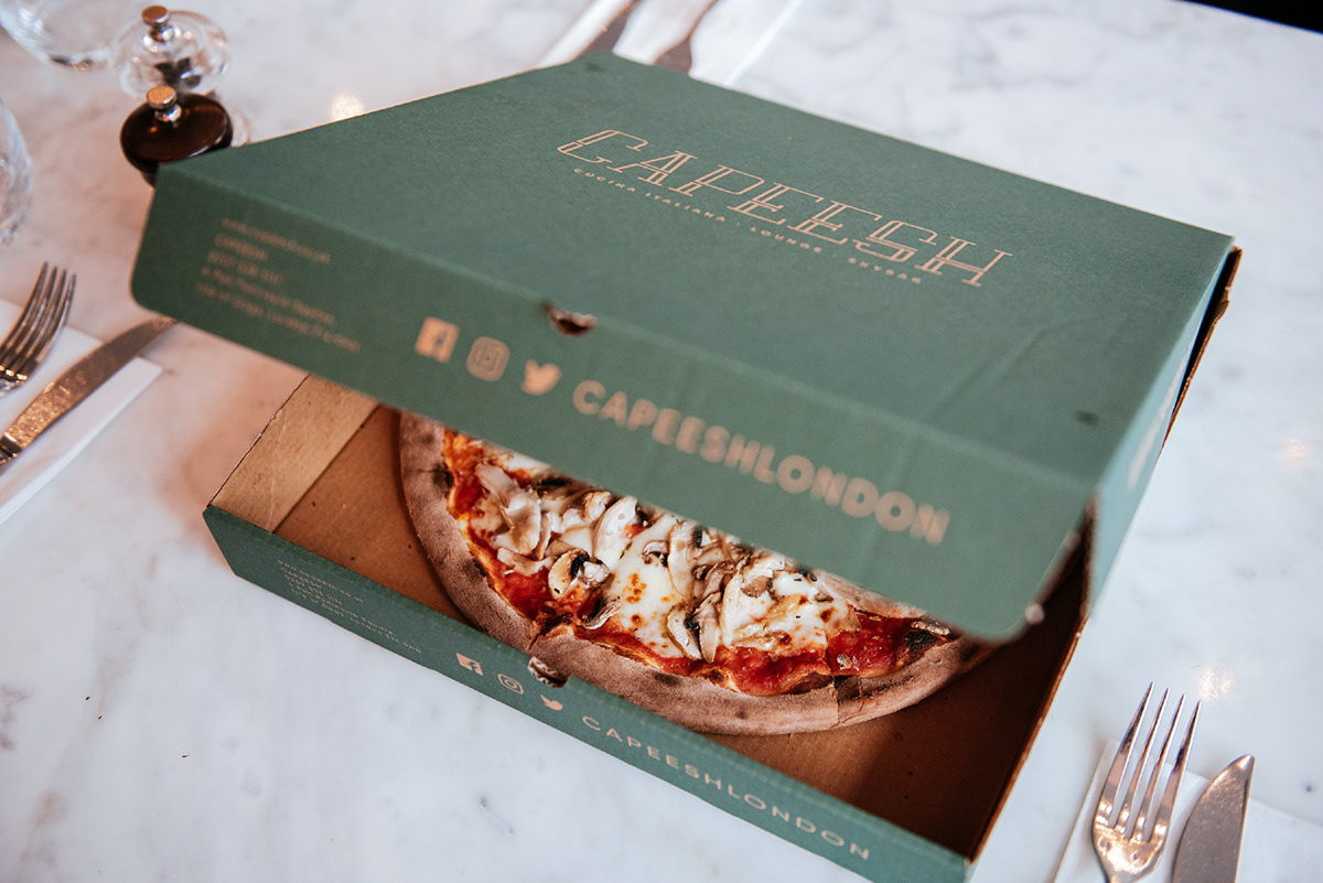
Capeesh might be a pizza restaurant, but this isn’t your $1 a slice kind of establishment. This Italian eatery, designed by Marka Works Branding Agency, proves that pizza can be elegant and sophisticated. With rich hues of emerald green and a typeface reminiscent of the roaring 20s, we’re getting a glimpse of pure sophistication. I never believed that I could feel posh while chowing on pizza, but I stand corrected. 


The brand design for Capeesh, an Italian eatery, keeps it low-key to highlight the deliciousness of their food. The brand name utilizes an sophisticated, and elongated serif typeface that is reminisce of The Great Gatsby.

Editorial photograph

Utilizing negative space and a rich, hunter green, this is a brand that jettison’s other pizza box designs that traditionally utilize vibrant reds, whites, and blacks. The more subdued color pallate conveys that Capeesh is an upscale eatery you want to take a bite out of. 

Editorial photograph

This placeholder is removed when the ad slot is configured.

This placeholder is removed when the ad slot is configured.

This placeholder is removed when the ad slot is configured.

This placeholder is removed when the ad slot is configured.

This placeholder is removed when the ad slot is configured.

This placeholder is removed when the ad slot is configured.