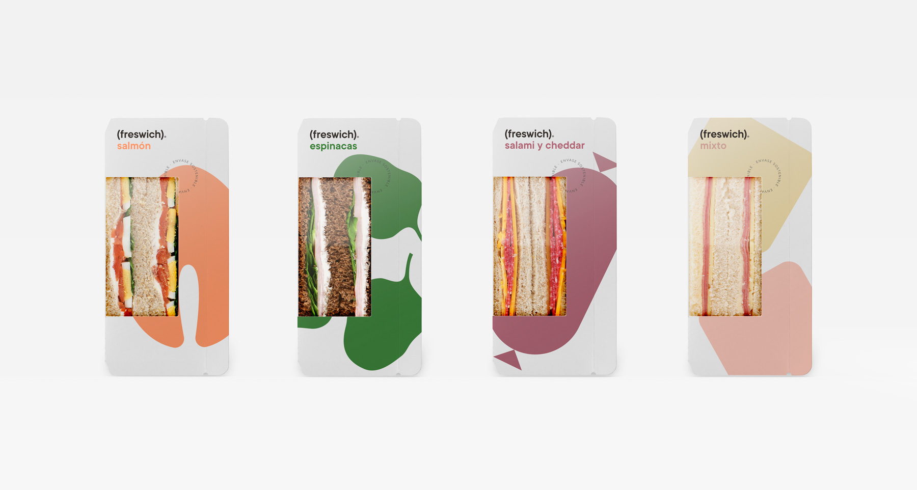
Featured image for FRESWICH Understands The Power Of Simplicity

FRESWICH Understands The Power Of Simplicity

by Chloe Gordon on 03/11/2021 | 2 Minute Read

FRESWICH's packaging might be simple, but it's far from boring. Each box design signifies the sandwich it contains. For example, the white box is for the basic range, the beige box is for vegan, and the black box for "chef" range sandwiches. We love the purposeful simplicity behind such a classic meal.

These aren't your mom's peanut butter and jelly sandwiches; we have a feeling that they're better. Just don't tell her we said that.


What to name a brand of sandwiches that stand out for the freshness of their ingredients? “FRESWICH”. It’s fairly obvious, but we mustn’t forget that it’s often the most obvious things that work best, and when it comes to the difficult art of naming products, this is a golden rule.

Editorial photograph

This very desire to be straightforward and simple led us to create a logo in which the word “freswich” (written in lower case, true to the humble simplicity of a mere sandwich) appears in parenthesis as an obvious representation of the parenthesis formed by the slices of bread that make a sandwich, and also the parenthesis in time involved in stopping what you’re doing to enjoy a bite. The symbolic image of the main ingredient is realised in a single colour on the background (white for the basic range, beige for the vegan, and black for the “chef” range) in a way that helps identify each variety and, additionally, leaves the front of the pack uncluttered, emphasising the clear window through which the sandwich reveals its contents.

Editorial photograph

Share

Facebook Twitter Email