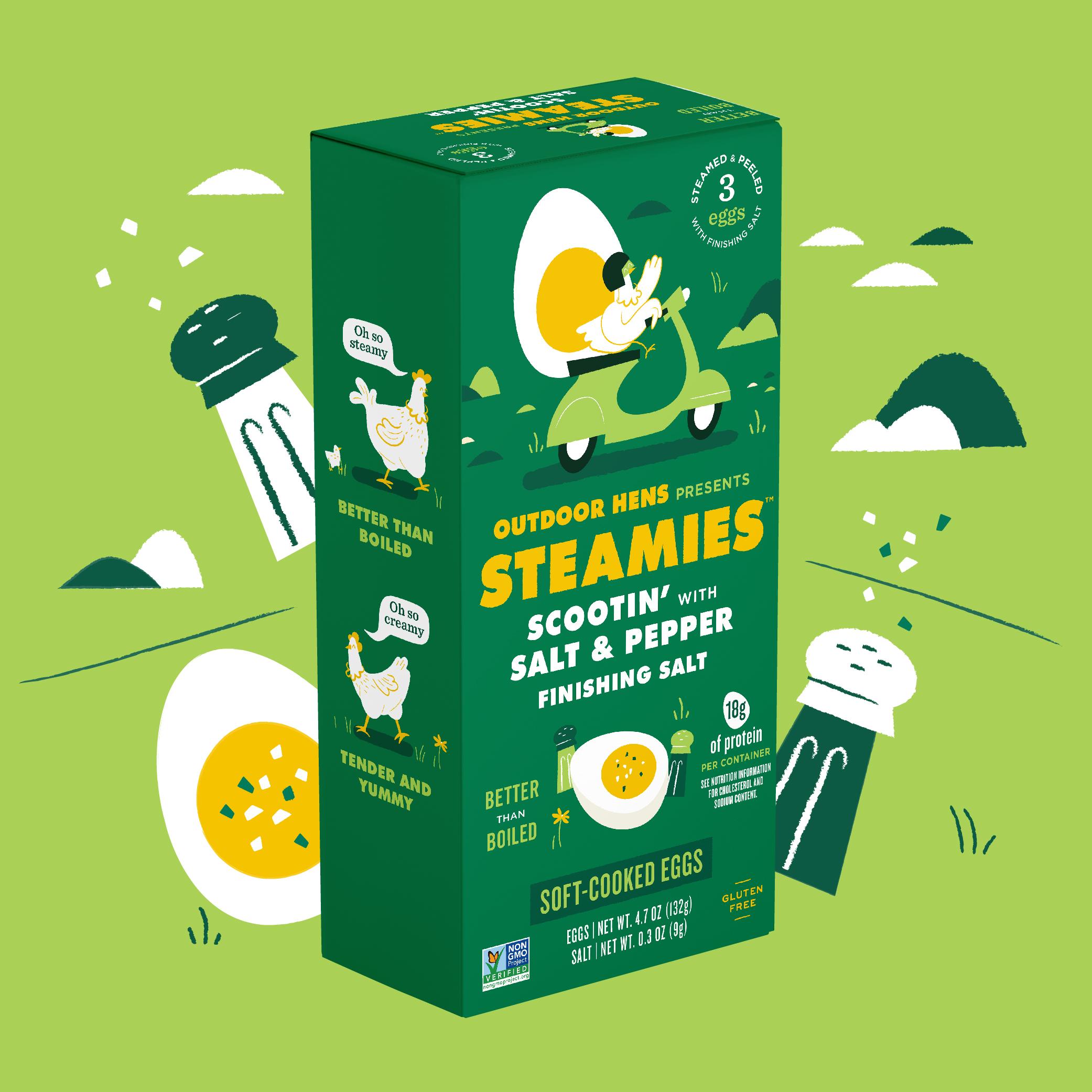
Are you clucking kidding me?! We’re digging the design for Steamies, a new line of steamed eggs. The illustrated chicken has places to be on that moped, reinforcing the idea that you should gobble up these little bites on-the-go. The vibrant colors represent different flavor variants, while the typeface is a sunny yellow, allowing for strong consistency across SKUs. Whether this chicken is on a plane, tractor, or bike, it’s saying peace out and straight vibing.
Bye-Bye Boiled. Hello Steamies! With the success of Outdoor Hens on the grocery store shelves, St. John Family Farms was ready to expand their brand with a new line of steam-cooked eggs: Steamies. We developed naming and packaging for Steamies that highlights the all-natural flavor found in every protein-packed bite. As an on-the-go snack, we focused on designing playful packaging that brings the spirited Steamies brand to life. Each flavor was given a whimsical name, as well as an energetic illustration of an adventurous hen. Our copywriting team developed an ownable brand language to best communicate Steamies’ small-batch, farmed with passion, and carefully steamed qualities. Paired with the playful packaging, we built a strong, cohesive brand identity.