Featured image for Everyday Humans Is a Gen Z Dream

Everyday Humans Is a Gen Z Dream

by Shawn Binder on 09/23/2020 | 2 Minute Read

Editorial photograph

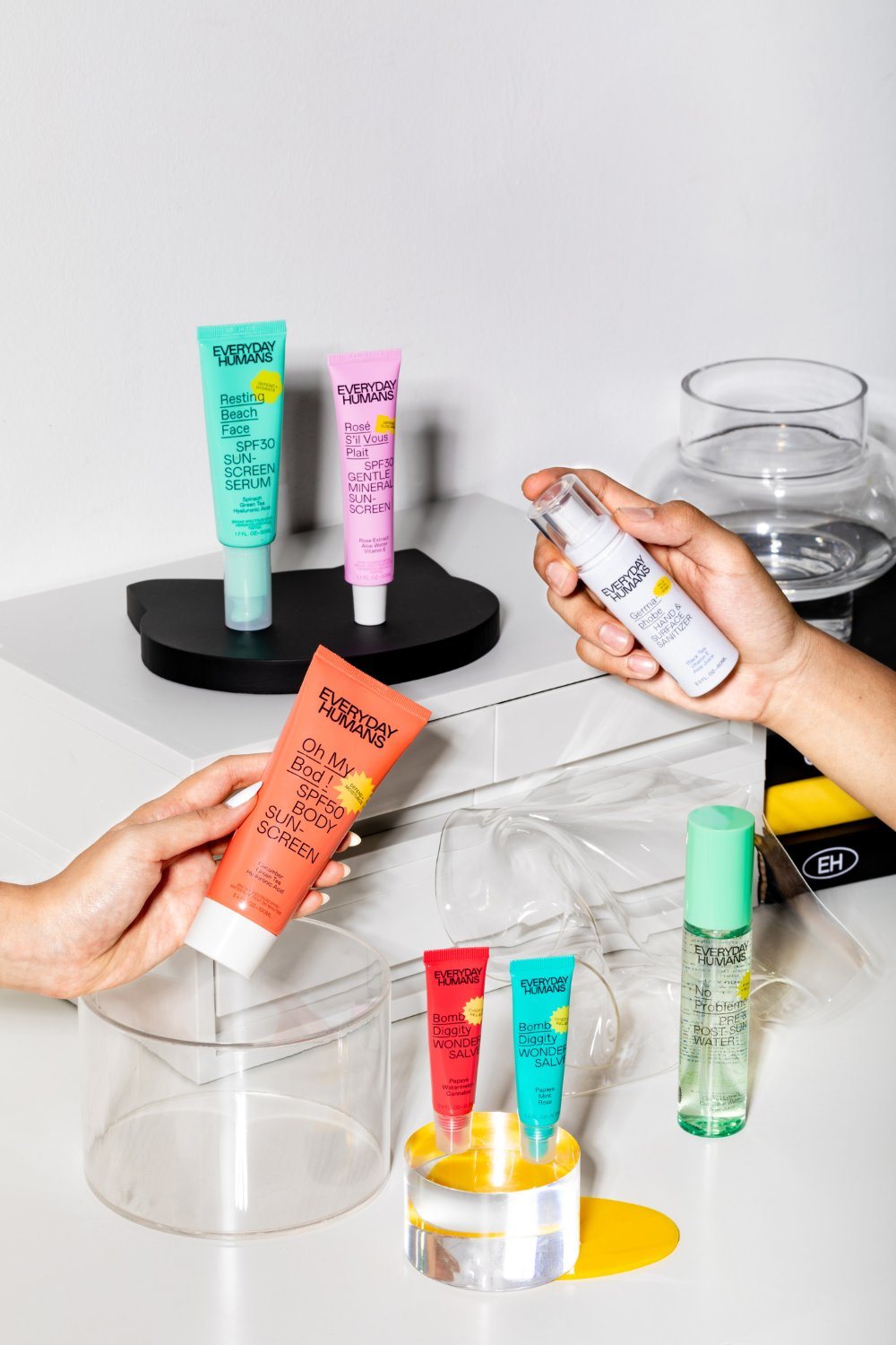
You ever been accused of having resting beach face?

We’re smitten with Everyday Humans, a rebranded skincare line that is cool, inclusive, and decidedly Gen Z. The packaging lacks pretentiousness, yet utilizes a vibrant, pastel color system, sleek modern typography, and quick copy that makes it an Instagram-kid's dream. Skincare that cares for everybody is a mission we can get behind.

The brand also stands behind their mission to care for everybody in the environmental sense as well. Utilizing greener alternatives as much as possible, which include using post consumer resin (recycled plastic) for their tubes, biodegradable PET for their bottles, and FSC-certified recycled paperboard for their cartons.

Editorial photograph

Everyday Humans designed and built the brand identity, packaging system, website and launch campaign in-house with a network of creative collaborators around the globe. 

Due to the founder Charlotte C Pienaar’s ambition to be omni-channel from the get-go, the brand’s independent creative director and Established NYC* alum Julia Neiva, was tasked to create a relatable brand identity and packaging design system that would be inclusive of both Gen Z and millennial consumers, while able to visually appeal both on shelf and online.*Agency behind Fenty Beauty, Marc Jacobs Beauty. 

Editorial photograph

We want to always provide the skin-loving you deserve, and will never go near the Never List of ingredients like parabens, sulfates, phthalates, mineral oils, artificial colors and fragrances—notorious chemicals that are hazardous for your skin and health. Everyday Humans’ sunscreens are also free of oxybenzone, octinoxate and PABA, which are toxic to you and to coral reefs. What you get are clean, dermatologically tested formulas that are safe and beneficial for your skin.

“The color palette is developed in a way so it is flexible and fun, yet keeping a level of functionality. This led to the creation of a twofold system. For the packaging the colors are based on the natural ingredients in the products, whereas the brand world is mostly black, white with touches of yellow and serves as a canvas for the packs.” 

“We are a lifestyle skincare brand that started with sunscreens, but we don’t want to narrow ourselves to only one niche, so we intentionally built a design system and identity that would allow us to naturally segway into other product categories,” — Founder Charlotte C Pienaar, Everyday Humans founder