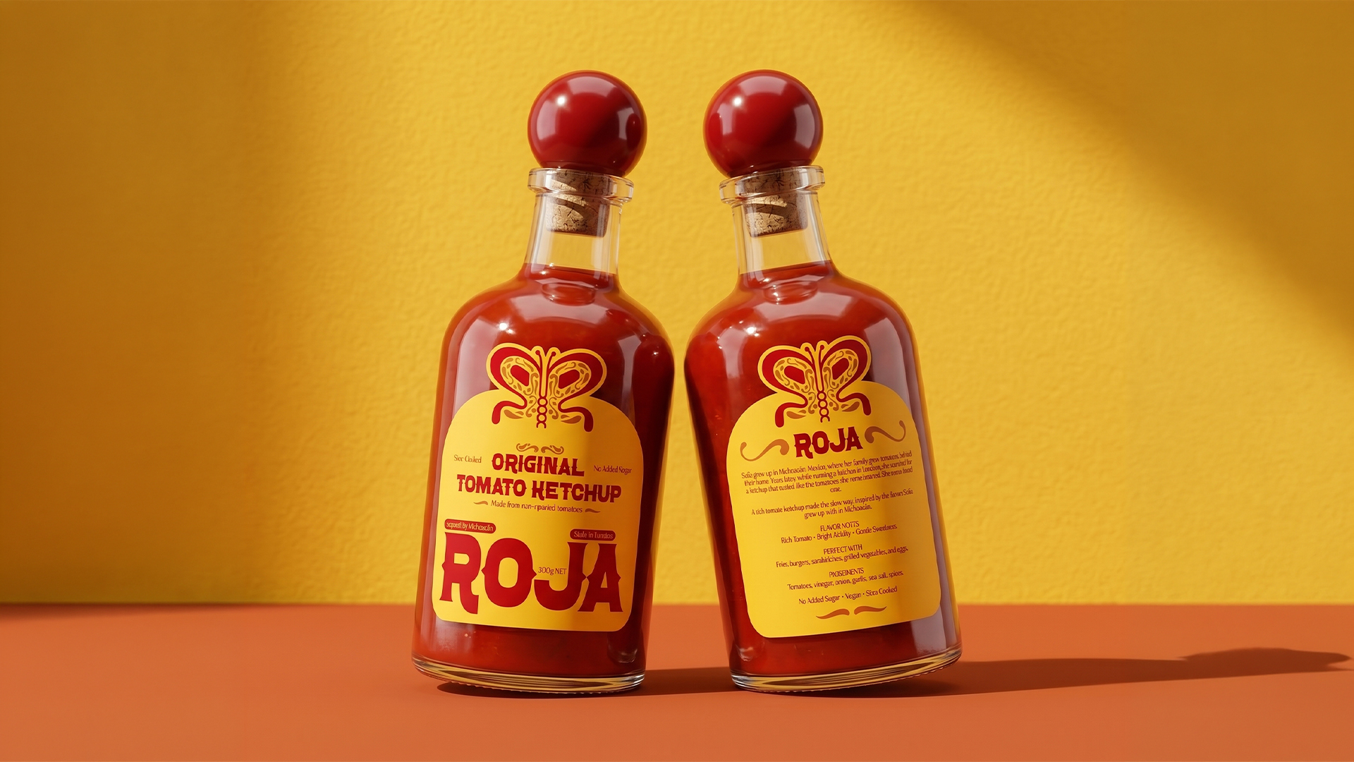
Fans of drinking in the park, rejoice! These new cocktails in a can are capital C cute! The blend of fonts and the smart decision to make the most identifiable feature of the brand a large c that features illustrations of each flavors work together to create a ready-to-drink cocktail that is visually stimulating. We want to try every one of these unique flavors on a blanket in the sun.
Cantails was created by brothers Myles and Kit Donneky, who wanted to deliver mixologist-approved cocktails-in-a-can into the retail market. They approached me to redesign their packaging, which needed to be more eye-catching on-shelf, and to create a stronger visual identity.
Working together, we chose an illustrative route which brings to life the products’ quality ingredients and bold flavours.