Sun-Maid Undergoes First Major Refresh Since Disco Was Cool
by Rudy Sanchez on 05/13/2020 | 3 Minute Read
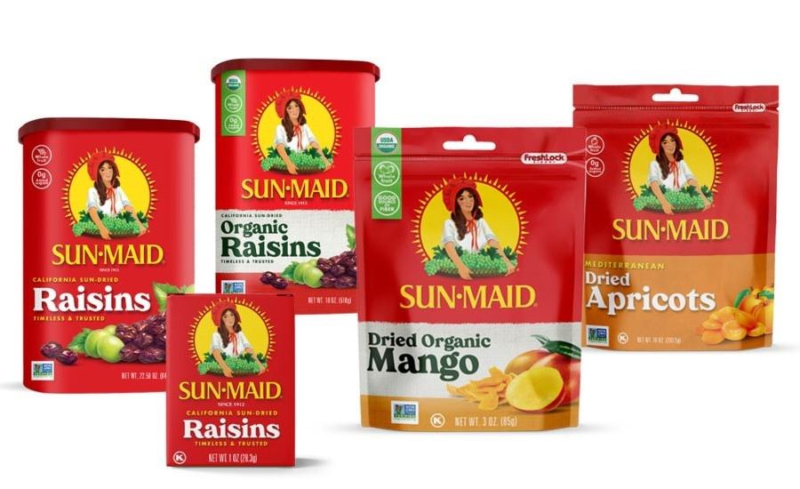
Sun-Maid Growers of California, a cooperative of farmers in the Central Valley of the Golden State, has had its mascot of a smiling young lady holding a basket of grapes since 1915. The iconic mascot and brand have gone through a few refreshes since its inception, but the last time the co-op made any significant changes to the visual identity of the brand was in the 70s, well before the California Raisins sandwiched themselves between episodes of Perfect Strangers and 227.
Well, big raisin decided that it was time for a refresh aimed at today’s consumer as Sun-Maid didn’t want to lose the significant brand equity they had built for over a century.
“Our main goal was to preserve the iconic look and feel of the brand,” explained Harry Overly, President & CEO of Sun-Maid. “We wanted to find a good balance between our past and where we’re going to reach the modern millennial shopper.”
With that in mind, Sun-Maid enlisted the services of the talented folks at Quench, who worked carefully to create a refresh that appealed to millennials but also didn’t alienate long-time consumers, many of whom have come to identify the brand with not just quality raisins, but also with our collective national identity.
"Through testing, we learned that consumers were wary about changing the packaging," explains Keith Seaman, creative director & designer, Quench. "They had a strong emotive connection to it."
"One consumer told us in research groups that messing with the red box was like 'taking the stars off the American flag.' Therefore, we had to make a decision to make the design an evolution versus a revolution. Forthcoming new products also needed to play nice within the design system, so [the new branding] had to accommodate that requirement, as well," he adds.
Keeping consumer expectations and fondness with the beloved brand's current packaging and identity in mind, the refresh is subtle. Quench went after the details, replacing supporting visual elements, and adding contemporary touches t0 a five decades-old look.
"We started by looking back," Keith said. "With more than 100 years of designs, Sun-Maid had plenty to reference. We then moved forward by adding modern design hints." First, they reworked the sun behind the girl, taking the rays from inside and moving them out. Looking at the logo, it almost looks like the brand hired an art conservator to chip away at the dust and reveal and clean up the Sun-Maid girl to make her boldly stand out. Gone is the raisin sash and cluttered mess of raisins and grapes. Now, the raisins sit off to the side, complemented by the new typeface that appears on pack.
“A bold and humanist serif typeface set large really gives the packaging a retro and approachable feel, and by relying on the brand's classic red color and product illustrations, we created a consistent package design across the entire family of products,” Keith said
Ultimately, Sun-Maid’s refresh feels classically timeless without shedding any of its heritage. It continues to signal the same message of quality and provenance to longtime raisin snackers while looking contemporary enough to attract new customers.