Featured image for A Minimalist Design and Complicated Printing for Woodker Vodka

A Minimalist Design and Complicated Printing for Woodker Vodka

by Andrew Gibbs on 02/11/2020 | 2 Minute Read

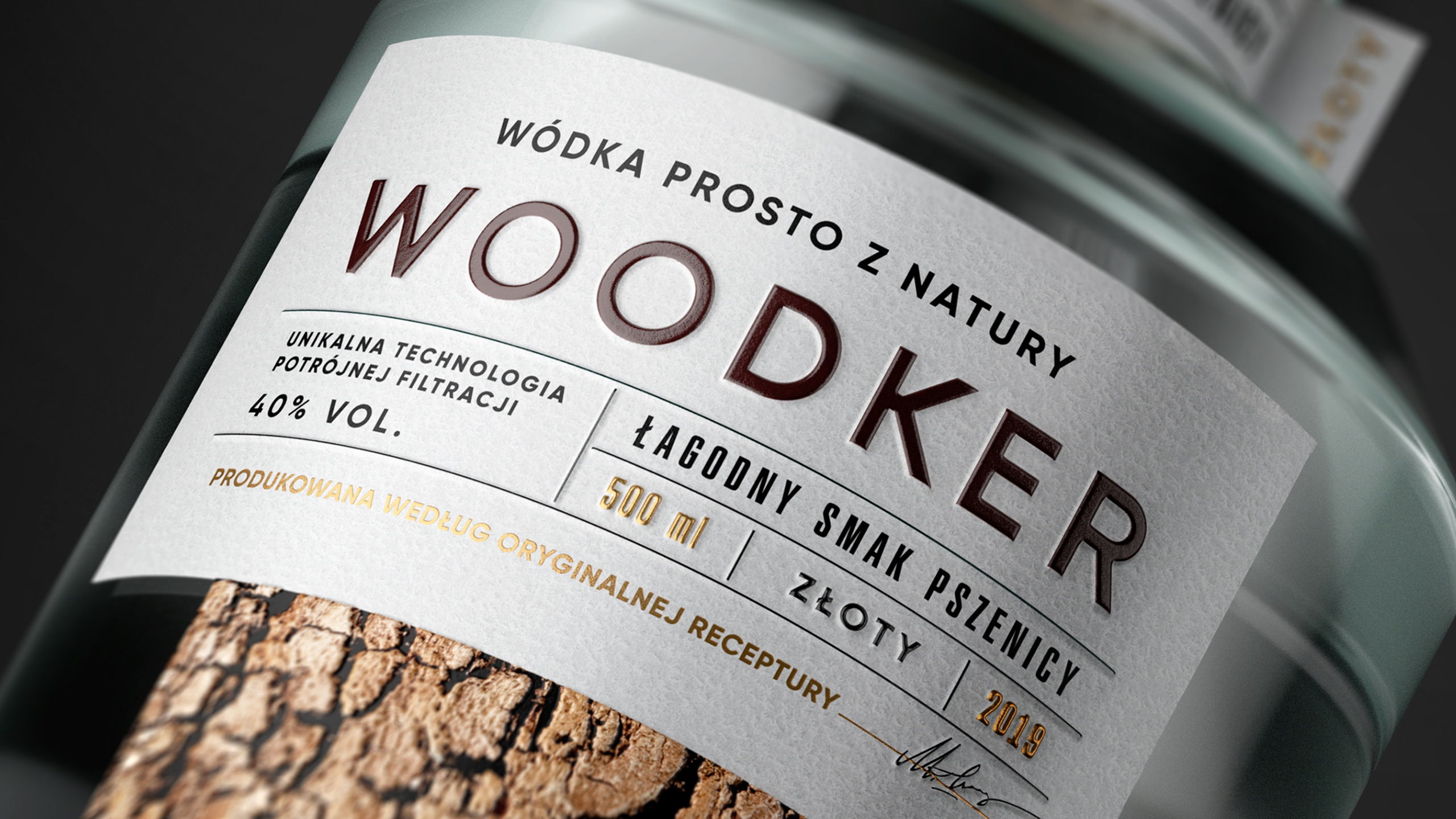
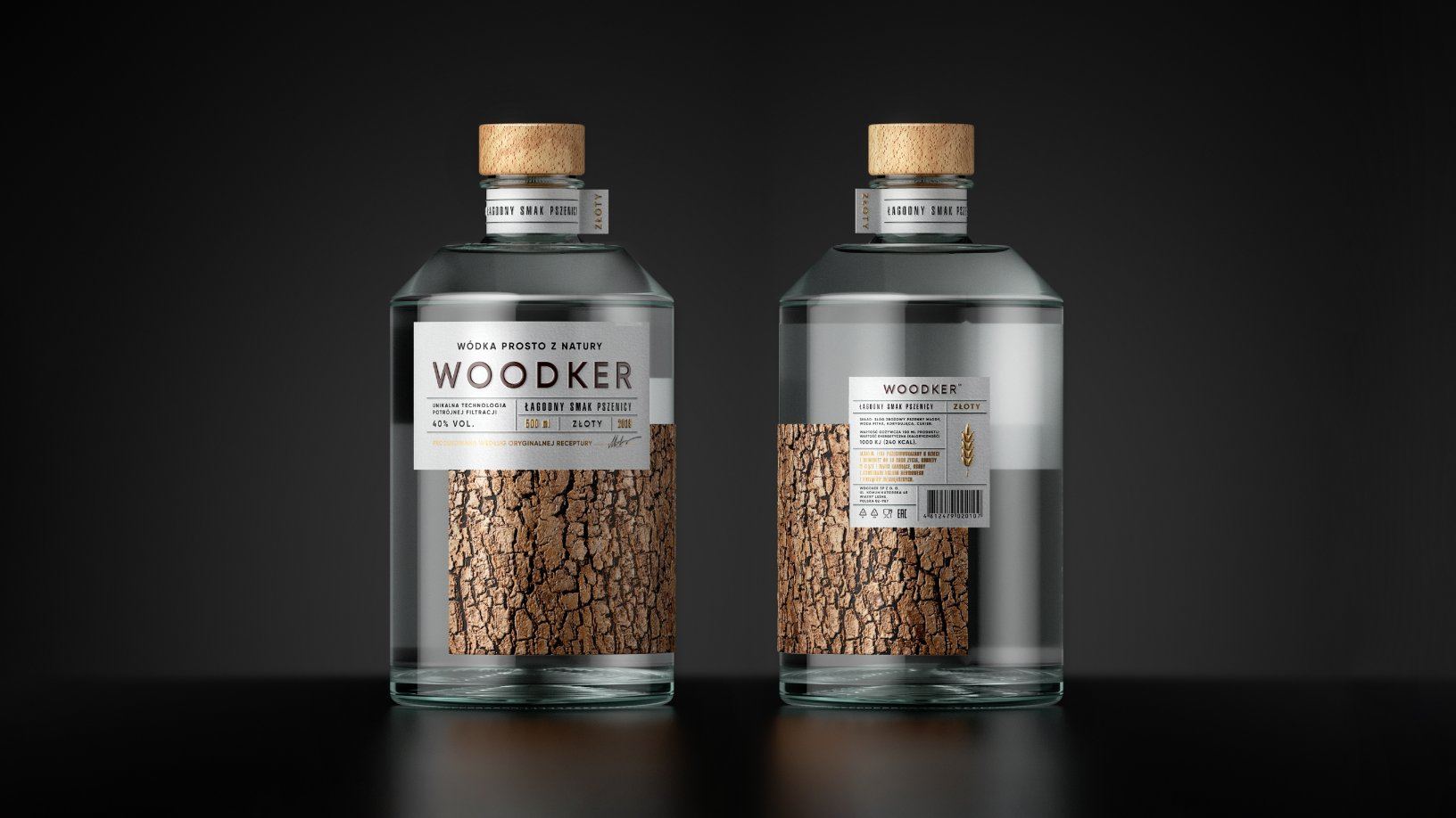
There are some vodkas in this world you would hop on a plane to try. And there are some you want to gaze at in awe.

Woodker, with its complex and tactile printing process, manages to look like PG Branding slapped a piece of bark on every bottle. And yet, even with this element of nature seemingly affixed to every label, they managed to make the packaging feel utterly minimalist:

Editorial photograph

"Our team has developed new brand, an authentic Eastern European spirit.

Woodker is a Polish brand, and we’ve noted this fact in the brand name. 'Wódka' is a Polish word for vodka, but you will also find 'wood' in the wording, so the combinatorial was asking for it. Two meanings in one recognizable and memorable word.

Editorial photograph

Minimalist design and a complicated printing solution helped us to emphasize the premium quality of this product."

Editorial photograph

This is high-proof triple-filtered vodka of excellent quality, purified with natural coal filtration. We were inspired by the naturalness of this drink, and we’ve decided to show this nature-based character in the packaging as well. The main dominant of our label is a textured photo of bark. The bark pattern is different for every tree, and our label is also tactile-different from every other brand on the market."

Editorial photograph