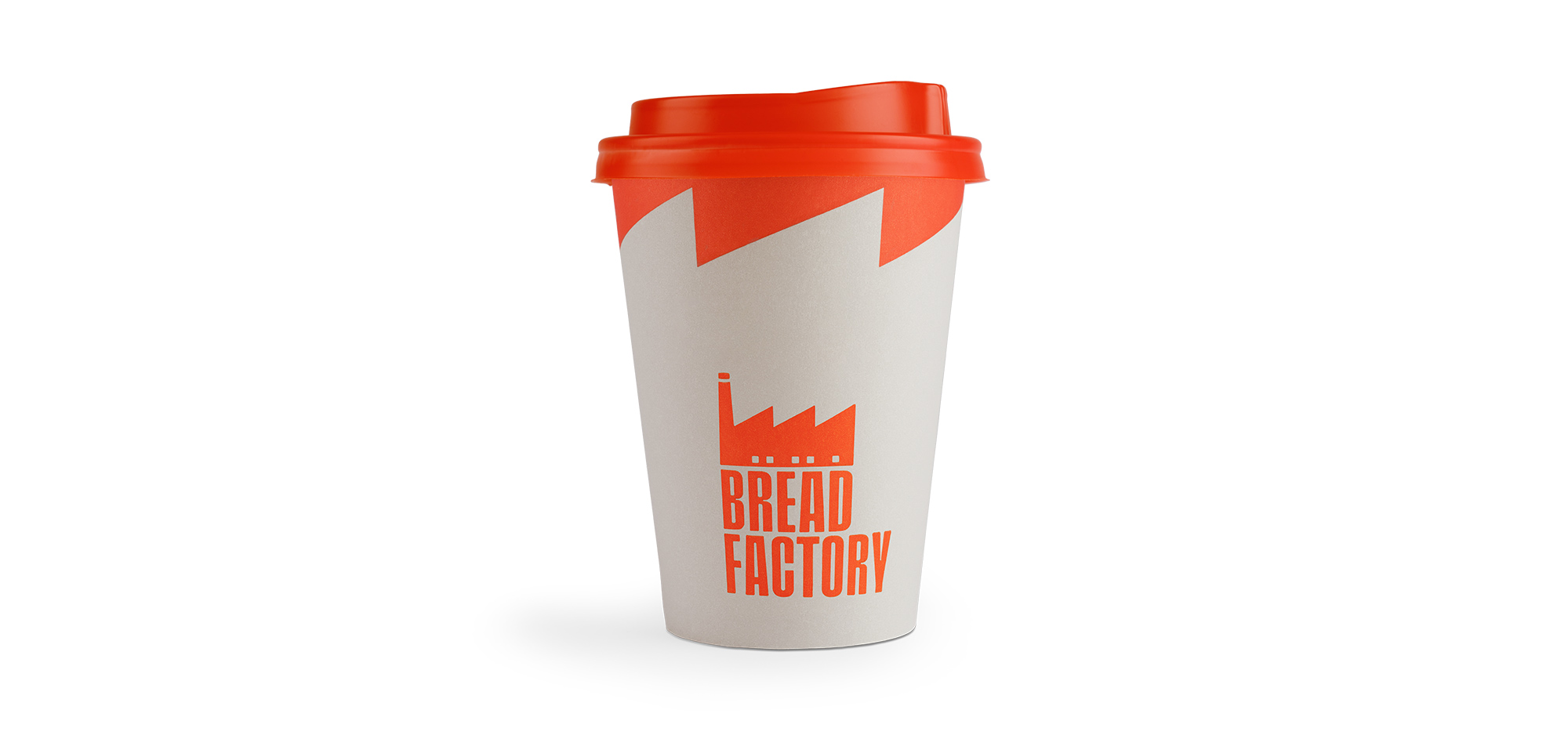
We’ve got bread on the mind! The design for this pastry/ coffee shop is effective and direct. The logo is an illustration of a factory, only this time it has sharp edges for a roof. This jagged design translates to other elements of the design, like the top of the cup. The illustrations across the other branding and merchandise have a distinct modern feel. They’re modular, approachable, and youthful. The extra tall typeface used throughout the brand design is modern and fresh. Bread Factory is perfect for fresh bread, coffee, and design.
Bread Factory is a multi-purpose hall combining a bakery, a pastry shop, and a restaurant. Now the brand has six branch stores, and they assigned us to design a brand that had a fresh look & feel. While keeping the concept of the factory, we chose an abstract path in order to create a bold logo. This allowed us more freedom and flexibility on its uses. Alongside this, we selected a stylish color palette that enhances the formation of an easily discernible identity. The custom, double-width typography we created is inspired by the aesthetic of hand-made signs, expressing the handcrafted procedure of the brandâs offerings. The conceptual eye-catching illustrations that can be found on the packaging are generating exuberant feelings, complementing the brandâs new inventive universe.