Dieline’s 2021 Trend Report

Published

The best thing about trend reports is that you get to talk about the future. Every cliche about capital-B BIG ideas and reaching for the stars applies, and you really don’t have to discuss the year before.

And then 2020 happened.

We’ll spare you the recap since we’re all still very much living through it. But it’s worth mentioning that it was a year that fundamentally broke us, and the global pandemic laid bare how many of the systems we rely upon are in desperate need of repair, in addition to rampant economic inequality and systemic racism. Our problems are many, and if you need to go check out the Calm app on your phone at this very second, believe us, we get it.

But that’s also what’s beautiful about design. We get to build the kind of world we want to live in and be a part of, one that fosters a community and looks ahead to a brighter tomorrow. When a problem presents itself, from climate change and the uncontrolled flow of plastic packaging to a global shortage of hand sanitizers and disinfectants, design and innovation can show us a way to push forward, no matter the obstacle. We shouldn’t have to throw our hands up in the air and blame it on the status quo.

Life giving you lemons? Drink Ocean Spray. When your truck breaks down on the side of the road, sometimes you just have to hop on that longboard, throw on some Fleetwood Mac, and get to work, no matter what. You find a way to keep going. And that’s what 2021 is about, really—a better future. Design can vastly improve our lives, and if it can help create an equitable, just world, then that’s worth fighting for.

Now, typically, we look into our crystal ball and tell you what you can expect from the world of branding and package design for the upcoming 365 days. However, this year we’re switching things up, and we’re going to tell you about the trends that emerged in 2020 that are here to stay for the foreseeable future, the ones headed for the trash heap, and what you can expect in 2021 and maybe even beyond. Yes, you’ll find some of the usual suspects, like what color or font trends to look out for, but we’ll also discuss where we’re heading and explore what the world of tomorrow could look like with some of design’s most influential thinkers.

So, without further ado, grab yourself a coffee and dig in to Dieline’s 2021 Trend Report.

Presented by Moxie Sozo


The Fading Trends of 2020

by Bill McCool

Summer in a Can

Most of us got deeply familiar with our couches this past year. Consumers threw down some serious dollars to make their homes just a teensy bit more comfortable, given all of the time we’d be spending indoors. Let’s call it pandemic hygge, OK?

But we were also looking for an escape, and if that came in the form of a canned beverage, then so be it. Whether it was an RTD cocktail or a cannabis-infused seltzer, brands were selling a moment in a can, a proxy for a bar or a vacation, two serious no-nos in a post-COVID landscape. You might not be able to go out, but at least the aluminum vessel can become your canvas for accessing pretend beach vibes from your couch.

And we’re telling you that it needs to stop. 

Listen, we see you, and we love you, Hey Mama Wines, Vervet, Cantails, Golden Rule, Jiant, and Delta Distillers. But even from the comfort of our Söderhamn, we know that we’re not exactly going anywhere besides the grocery store any time soon. You can slap as many palm trees or exotic fruits as you want on that Hazy IPA or can-a-rita, but you’re not selling me a vacation, even if it’s just the idea of one.

Editorial photograph

Editorial photograph

Editorial photograph

Editorial photograph

Editorial photograph

Editorial photograph

Editorial photograph

Editorial photograph

Editorial photograph

Editorial photograph

Editorial photograph

Editorial photograph

Editorial photograph

Editorial photograph

“I think it’s the kind of thing where you have to wonder, is this ethical?” asks Armin Vit of Brand New and Under Consideration. “Is it okay to make people feel like they’re somewhere else when they’re not? Is it lying? At the same time, that’s also part of what we do, which is trying to convey a mood. And if that means taking you to the beach with little drawings of palm trees and pastel colors, then I think it’s fair game because people buy it.”

Is it okay to make people feel like they’re somewhere else when they’re not? Is it lying? At the same time, that’s also part of what we do, which is trying to convey a mood. And if that means taking you to the beach with little drawings of palm trees and pastel colors, then I think it’s fair game because people buy it.”.

Armin Vit

The beverage industry and all its myriad components and marketing arms will always try to sell you on the idea of escape—that’s just natural. And we can’t blame you when it comes to reaching for one of these drinks because we’re guilty too. We lived through 2020. Hell, you just lived through the Trump administration. Can’t we take a breath?

“It does get tiring because then everything starts to look the same,” Armin says. “All of these white cans with blue type. You don’t even know what you’re drinking. You don’t know if you’re drinking gin and tonic, a hard seltzer kombucha, or just plain water.” 

Much like the threat of some Americans that refuse to wear face masks in public (and take the COVID-19 vaccine), we know it’s probably not going to leave us any time soon. But we wouldn’t be all that sad to see this one drift away into the sunset, preferably to the numbing lull of Christopher Cross’s “Sailing.”

Soft Pastels

Orchid Bloom. Champagne Blush. Spa Blue. Grey Lilac. Paradise Green. Pink Icing.

No, they’re not the latest Kylie Jenner lip balms or scrapped Celestial Seasonings flavors-they’re just a smattering of the soft pastel hues you’d find perusing a collection of Pantone swatches. What’s more, they’re everywhere, and countless packaging and branding projects used them to drowsy effect.

And it’s easy to see why. Our eyeballs required some much-needed chill this past year, and it almost makes you wonder if the color gurus at Pantone feel genuine regret about making blue the 2020 color of the year. Who wants cold, calculated, and corporate (i.e., Facebook) when we need to calm the fuck down?

Editorial photograph

Editorial photograph

Editorial photograph

Editorial photograph

Editorial photograph

Editorial photograph

Editorial photograph

Editorial photograph

Editorial photograph

Editorial photograph

Editorial photograph

Editorial photograph

Editorial photograph

Editorial photograph

Editorial photograph

Editorial photograph

The thing is, though, they work. Take a look at any bland introduced in the past year or so, and you’ll find a soothing, non-offensive color palette coupled with minimal branding for an unfussy, muted identity. And while that sounds like a knock on a lot of the brands you’re scrolling through on Instagram, they’re quite adept at picking up on what consumers want right now. You could see it across the beauty and health industry with haircare brand Odele, refillable pump toothpaste Iki, Roy’s, fertility upstart Mylo, skincare company Bloom & Blossom, and hormone supplement Eden, as well as in beverage cooler with the alcoholic Rapscallion Soda, and the totally on-point conceptual drink Socially-Distanced Pals (you know, the imaginary Zoom beverage of choice).

“I love that color palette,” says Armin. “I like action movies and gore, but give me a good pastel color palette, and I’m all over it. There’s something pleasing and soothing and gentle about it that makes it hard to resist for both designers and clients. I think that can be maintained, but maybe just add a contrasting color.”

“I like action movies and gore, but give me a good pastel color palette, and I’m all over it. There’s something pleasing and soothing and gentle about it that makes it hard to resist for both designers and clients. I think that can be maintained, but maybe just add a contrasting color.”

Armin Vit

Of course, that doesn’t mean there will be a turn to EXTREME Mountain Dew greens. As every designer knows, these things happen in waves, and soft pastels were an expected response to a dumpster fire of a year, and we predict a mostly swift 180, a turn from all things sober sherbet and SweeTart valium. 

Or at least a little more variety.

Geometric Sans Serifs

So, will 2021 finally spell the end of the homogenization of every tech company when it comes to their wordmark, and, by extension, the countless brands and startups looking for a trustworthy and coherent visual identity?

Well, when everything starts to look too similar, you can always count on designers to, you know, actually design. Particularly when everything starts to look an awful lot like the cookie-cutter suburban homes of Tim Burton’s movie Edward Scissorhands in that everything is uniform, tidy, and to code. All it takes is a disarmingly sweet maniac with Freddy Krueger blades for fingers to transform a bush into a T-rex.

Brands, particularly tech companies like Google, Airbnb, and Spotify, want to instill a sense of consistency and trust, and they don’t deviate from the norm of their logo—these are folks that won’t stir the pot under any circumstance. After all, they’re not MTV with their consistently mutating logo. Additionally, we design now for our phones, and it’s the principle way we interact with brands, so a contrived simplicity works in their favor.

But is there anything alluring or captivating about the text that introduces, say, a Spotify-curated playlist? Or even a hard seltzer or new cannabis edible when it announces its presence in such a mechanical way? Is there any mystery or a feeling of eagerness and suspense when everything looks so drab and neutered?  

Editorial photograph

Editorial photograph

Editorial photograph

Editorial photograph

Editorial photograph

Editorial photograph

Editorial photograph

Editorial photograph

Editorial photograph

Editorial photograph

Editorial photograph

Editorial photograph

Editorial photograph

Editorial photograph

For starters, consider getting off Instagram. Stop following the same agencies and artists you love, and get back to creating. “I really think this is mostly a problem for designers,” Armin says. “It doesn’t really affect the general population like, you know? My aunt doesn’t go, ‘oh no, another geometric sans serif.’ They don’t care. For designers, we’re trying to create distinction, and I think it’s important to realize that maybe enough is enough.”  

It doesn’t really affect the general population like, you know? My aunt doesn’t go, ‘oh no, another geometric sans serif.’ They don’t care. For designers, we’re trying to create distinction, and I think it’s important to realize that maybe enough is enough.

Armin Vit

There’s also the real possibility that the companies—but especially the tech companies— which keep ushering out the same logotypes are no longer trading in on feelings of credibility. Facebook is a steady vehicle of disinformation and hate speech, in addition to finding out that your aunt and some of your old high school pals have some pretty appalling beliefs. You have to wonder if you really can have a shred of confidence in these organizations. If your logo needs to project an air of trust, but your product does anything but, shouldn’t you go back to the drawing board?

That is not to say that your protein bar or kombucha needs to reconfigure its branding because you leaned a little too hard into a Helvetica or a Futura. But in the end, your work will be that much more significant and will truly stand out in a sea of sameness if you’re mindlessly connecting the dots. 

Even if that’s what your client wants. Following the same playbook as everyone else makes you just another scroll away.

Down With the Rich (and the Ultra-Luxe)

What does luxury mean, particularly in a country with more than 25 million folks impacted by the pandemic? This year alone, almost 1 in 4 households in the US experienced food insecurity at some point, so is now really the time for inessential, hedonistic goods?

Well, if you can use more than one finger to number your properties, OK, I guess? But if you’re the brand pedaling these out-of-reach items, then it’s high time to reevaluate the retail landscape we’re currently living through and how your brand lives in the world.

For starters, you can’t act like it’s business as usual, as your messaging will sound utterly thoughtless. If anything, COVID-19 has us reevaluating what luxury means, and now, more than ever, that signifies an eye towards craftsmanship, longevity, and sustainability. Its mission says no more overpackaging and definitely no more selling ceremonies. Experiential branding and being fawned over in-store—that personalized touch—could take significant time to resume once again.

What does it mean to buy a Hermes bag when the only place you can show it off is while speed shopping through Whole Foods? Who cares what you’re wearing—it’s casual Friday every damn day now. We’re only wearing athleisure from now on.

These objects, these highly-sought things, are just that—things—and they quickly lose their luster when confined to your couch, stuck watching Tiger King with the rest of us plebians. And, for that matter, do you even remember watching Tiger King?

Editorial photograph

Editorial photograph

Editorial photograph

Editorial photograph

Editorial photograph

Editorial photograph

Editorial photograph

Editorial photograph

Editorial photograph

Editorial photograph

Think about Kim Kardashian’s 40th birthday getaway with her close pals and the subsequent backlash she received as out-of-work folks had to not only worry about where they’d find their next roll of toilet paper but how they were going to make the rent or find childcare if they were an essential worker. And, you know, props to Kanye for the even more grotesque, insanely bizarre, and deeply weird hologram he purchased Kim of her father for an estimated $400,000 that referred to him as “the most, most, most, most, most genius man in the whole world.” No, the rich aren’t like us, but they also blow their money on some hilariously offensive shit.

Look, there will always be these eat-the-rich moments, where we witness wealth get frivolously spent on trivial nothings—but coronavirus upended business as usual, and it’s difficult to imagine that all of this will seemingly disappear as promised.

So, the brands selling these out-of-reach, dreamed upon things need to adapt to a new world.

The very notion of luxury is changing before our eyes, as Amazon debuted their own “luxury stores,” with Oscar de la Renta being the first name brand to sign on to their digital app and store-within-a-store scheme. It even features a virtual red velvet rope with only a select few invited to shop. More brands will follow suit, says the e-retailer behemoth, but it also points to these organizations pivoting to digital in a big way, even if it means coming under the Bezos umbrella.

Additionally, they can’t just sit on the sidelines anymore. LVMH made hand sanitizer at the start of lockdown (and came housed in Givenchy soap bottles) while high-end UK retailer Mulberry stopped making handbags and started making surgical gowns for the NHS. Is that largely performative? Perhaps. But it’s the message that a luxury brand needs to send in these unprecedented times. Showing that you care, that your brand can have a mission firmly rooted in purpose? Now there’s a message consumers want to hear.

If 2020 taught us anything, we don’t know the world to come, even when we’re speculating from just a few weeks out. But what we can say is that everything has changed, and even the luxury market will have to adapt if it wants to continue to thrive in this unknown landscape.


Here To Stay: The Emerging Trends of 2020 That We Will See More of in 2021

By Theresa Christine Johnson

Social-First Branding

Wake up on your Casper mattress, slip on your Warby Parkers, and deck yourself out in Everlane denim. If you know these brands, then you know. They are the clean, unobtrusive brand designs that simplify our lives, that pop up in our Instagram feeds, and that we consume like candy.

“Brands that are dubbed ‘social first’ have identified a consumer experience that engages millennials with a reassuring look that feels familiar and credible,” said Jolene Delisle, Head of Creative and Founder of The Working Assembly

How do brands do it? With a sans serif, white space wonderland of a trend, dubbed “blanding” by Fast Company, that has grown in popularity in recent years. We should have seen it coming with the popularity of companies like Apple, Airbnb, and other brands that use simple visual cues to make an immense impact.

But it’s not merely the brand (or bland) itself—it’s the tool where it thrives: social media.

Editorial photograph

Editorial photograph

Editorial photograph

Editorial photograph

Editorial photograph

Editorial photograph

Editorial photograph

Editorial photograph

Editorial photograph

Editorial photograph

Editorial photograph

Editorial photograph

Editorial photograph

Editorial photograph

Editorial photograph

When Instagram first introduced ads to its platform in 2013, the notion almost seemed ridiculous. Who goes shopping on social media? As we headed into 2020, though, 130 million accounts tapped on shopping posts to learn more about products—every month—and with the app’s recent update to include a dedicated Shopping tab, that number will very likely increase.

The visual content for social-first brands is indeed striking on our phone’s screen, and it makes us hesitate during our endless scrolling to want to learn more. And as Jolene mentioned, this particular style is commonplace enough that almost any brand adopting it will feel trustworthy and reputable.

The homogeneous trendy start-up design needs to evolve to broader human themes for solutions that feel fresh and resonate with a larger group of people and transcend age or generation

Jolene Delisle

If designers aren’t careful, though, they’ll make a brand that looks like every other bland out there. “The homogeneous trendy start-up design needs to evolve to broader human themes for solutions that feel fresh and resonate with a larger group of people and transcend age or generation,” Jolene added. If, in fact, more and more people start to turn to social media for their shopping needs, then brands won’t want to blend in—they’ll need to stand out.

Accessible Wellness

Why does self-care, especially concerning our health, feel like such a burden sometimes?

Maybe it’s because, until recently, we associated health and wellness with the aseptic aisles of the pharmacy and the ugly pill packs our doctors would prescribe. Today, though, you can purchase any supplement under the sun, Byte allows you to straighten your teeth without painful visits to the orthodontist, and condoms have gone classy thanks to Champ, Wink, and Seed.

Taking care of our bodies and our health is no longer a mundane task, but an experience we can relish in—something that starts with the branding and packaging.

They’re moving away from the sterile, and there’s an attitudinal shift that spreads across age and demographics. Designers are injecting elements of humanity into the identity, making health brands feel more approachable.

Jolene Delisle

“We’ve seen health brands doing well that feel celebratory and personable,” Jolene explained. “They’re moving away from the sterile, and there’s an attitudinal shift that spreads across age and demographics. Designers are injecting elements of humanity into the identity, making health brands feel more approachable.”

Editorial photograph

Editorial photograph

Editorial photograph

Editorial photograph

Editorial photograph

Editorial photograph

Editorial photograph

Editorial photograph

Editorial photograph

Editorial photograph

Editorial photograph

Editorial photograph

Editorial photograph

Editorial photograph

Editorial photograph

Editorial photograph

Editorial photograph

Most exciting in this space are brands tackling the taboo, particularly women’s sexual and reproductive health. Women have been taught to remain hush-hush about these matters, and it’s no surprise when, in the United States and many other countries, something as simple as access to birth control is controversial. But this year alone, we’ve seen more and more brands with a focus on menopause, sexual health, menstruation, period pain, and fertility. Periods now even have a dedicated Pantone color, and this gives us hope to see these topics become everyday discussions surrounding health.

The most vital aspects for brands in this space? Honesty and scientific integrity. When people’s health is at play, a playful branding that veers from the traditional, boring packaging often associated with health brands is fine—but trustworthiness and transparency remain critical.

The COVID Shift and Packaging

We will be feeling the effects of the Coronavirus pandemic for years to come. Our lives have drastically changed, our mindsets have shifted, and everything we thought to be true was tested. Simply put, we have been going through—and continue to go through—a worldwide trauma.

We’re learning more and more about COVID-19 every day, and one important thing we’ve learned is that it spreads primarily from person to person through droplets in the air. Melissa Bronstein, senior director of infection prevention for Rochester Regional Health and a registered nurse, told USA Today that the risk of contracting it from touching surfaces, like packaging at a grocery store, is “exceedingly small.”

The Centers for Disease Control and Prevention website also stated, “In general, because of poor survivability of these coronaviruses on surfaces, there is likely very low risk of spread from food products or packaging.”

That is good news for packaging designers—no new regulations to have to follow, no significant changes to comply with. That said, new coatings with antimicrobial properties have started to enter the market. Developed by San Francisco creative agency Designsake Studio, Matter uses silver ion technology that reduces the possibility of microbes and viruses that might land on packaging, and it can minimize the presence of harmful microbes and bacteria by 99%. Even though COVID-19 isn’t a threat to your packaging, you can expect to see more brands using coatings similar to this. 

Editorial photograph

Editorial photograph

Editorial photograph

Editorial photograph

Editorial photograph

Editorial photograph

Editorial photograph

Editorial photograph

Editorial photograph

Editorial photograph

Editorial photograph

Editorial photograph

Editorial photograph

Editorial photograph

Editorial photograph

Editorial photograph

Editorial photograph

Of course, COVID has still managed to have a significant effect on packaging (and no, we’re not talking about all the hand sani options you now have). Think of every disposable face shield, set of gloves, takeaway food container, and sheet of bubble wrap from online shopping. The need for personal protective equipment alone during pandemic times has driven increased plastic pollution, and single-use plastic doesn’t merely get consumed for convenience but safety.

It will not, however, be COVID that will alter the general public’s attitude towards single-use plastic—that has always been up to climate change. The signs are painfully present, and designers must take responsibility and innovate for the sake of our planet.

As much as we can come up with solutions that are safe—but still keep our waste low—is where we will win. Look for biodegradable, compostable, and reusable to continue to be prevalent, and we’ll have an uptick with consumers demanding to understand more about carbon neutrality or footprint from brands.”

Jolene Delisle

“As much as we can come up with solutions that are safe—but still keep our waste low—is where we will win,” Jolene said. “Look for biodegradable, compostable, and reusable to continue to be prevalent, and we’ll have an uptick with consumers demanding to understand more about carbon neutrality or footprint from brands.”

Bold, Saturated Colors

Move over, pastel packaging

While there will always be a special place in our hearts for lavender, mint green, and pale pink, the wave of color trends inevitably ebbs and flows. So as seafoam and baby blue and muted mauve wash out to sea, we’ve already begun to see bigger and bolder colors wash up.

Love Can beverages are the epitome of hip, cool cocktails in a can. Madies snacks stand out with vivid hues and simple but effective geometric graphics. The vibrant packaging for Roman sparkling water finds inspiration in the drink’s flavors. Lost Farm edibles leans into psychedelia with rich color combos that are a total trip. Feel My Vibe hand cream pops with funky visuals, patterns, and eye-catching holographic elements.

We get it—2020 has been a tough year, and at this point, we just want to feel something, man. Color psychology is a very real thing. Different colors make us feel a variety of emotions, and the saturation and brightness of something affect our moods, too. The year started on the right track, if the richness of Pantone’s Color of the Year, Classic Blue, was any indication. But things got pretty awful, very quickly. It’s no surprise that after eight months of bathing ourselves in hand sanitizer and primarily communicating with friends and family through our screens that we’re shifting away from more muted, “sad colors” and seeking out something that feels full of life. 

Editorial photograph

Editorial photograph

Editorial photograph

Editorial photograph

Editorial photograph

Editorial photograph

Editorial photograph

Editorial photograph

Editorial photograph

Editorial photograph

Editorial photograph

Editorial photograph

Editorial photograph

Editorial photograph

Editorial photograph

Editorial photograph

Editorial photograph

Editorial photograph

No wonder Pantone chose the powerfully bright, illuminating yellow as part of their color of the year for 2021, though we wish they had left the gloomy cloud of ultimate gray on the cutting room floor. Sure, we get the combination of those two hues, but we could use all the sunshine we can get. 

Of course, the generational influence of Gen Z comes into play with the popularity of colors. When there’s a design element that resonates with 32% of the global population—a group of people with a purchasing power worth $143 billion—then designers and brands are going to want to pay attention.

Gen Z is more at ease when sharing their opinions and is open to facing them head-on. They want brands that are confident, unapologetic, and without an ulterior motive, which bright colors and unfiltered photography can help convey.

Jolene Delisle

“I think Gen Z is driving the change towards bolder colors versus the pastel and gentle hues preferred and dominated by millennial-serving brands,” explained Jolene. “Gen Z is more at ease when sharing their opinions and is open to facing them head-on. They want brands that are confident, unapologetic, and without an ulterior motive, which bright colors and unfiltered photography can help convey.”

The Do-Good Trend

When the Minneapolis police murdered George Floyd, people protested police brutality and racism worldwide. Even amid a global pandemic, citizens took to the streets in the thousands (and even tens of thousands). They donated money to bail funds, to Black Lives Matter, and countless other organizations. They focused their ire on government officials and demanded change.

But whether brands realized it at the time or not, people were watching them, too. Were companies going to stand up against the injustice as well?

“Consumers are increasingly more skeptical and expect more than just another hashtag or rainbow gradient when it comes to social good from brands,” Jolene explained. “We’ve seen an increase this past year of ‘cancel culture,’ and I don’t think that is only reserved for founders and CEOS. That will also continue to apply to brands.”

“Brands who are going to win are those who unapologetically and without an ulterior motive take a stand, approaching topics and movements head-on, and aim to make actionable efforts,” she added.

Performative social good is no good. Just like human beings, brands can’t call themselves allies or accomplices only when it’s convenient. Consumers see right through brands when they slap some images of frontline workers on their product, make an insignificant change to their logo, or post a little black square on Instagram and call it a day. Believe it or not, dear brands, those aren’t actions. Consumers are out here doing the hard, uncomfortable, sometimes grueling work, and they expect you to, too.

Editorial photograph

Editorial photograph

Editorial photograph

Editorial photograph

Editorial photograph

Editorial photograph

Editorial photograph

Editorial photograph

Editorial photograph

Editorial photograph

Editorial photograph

Editorial photograph

There were a number of incredible brands that stepped it up in 2020, both for the George Floyd protests and other issues as well. Patagonia and The North Face are active participants in the Stop Hate for Profit boycott of Facebook ads. Cannabis brands have joined The Floret Coalition, which aims to raise funds and awareness for organizations prioritizing the needs of underserved and underrepresented communities. Nike, the brand behind Colin Kaepernick’s divisive ad, urged their followers, “Don’t do it,” regarding systemic racism.

Most notably, Ben & Jerry’s did not shy away from calling out these issues for what they are—white supremacy. And it fits for their brand. They have a history of corporate advocacy that’s more than just a social media post or a one-time donation, and the founders have even been arrested before for their social activism.

And therein lies the secret to the kind of activism consumers want to see from brands. An ingrained central to the very being of the brand, something that speaks to their core values. Activism that is ongoing. Activism that isn’t easy.

It is going to matter more and more who is the team behind the work and how authentic the company lives by the principles they are promoting, this includes the designers, the photographers, the vendors, everyone. We’re going to see brands being more transparent about the makings of their products, campaigns, and team makeup. We will also be more privy to understanding where their dollars are going and how the company is actually making an impact.

Jolene Delisle

“It is going to matter more and more who is the team behind the work and how authentic the company lives by the principles they are promoting,” Jolene added. “This includes the designers, the photographers, the vendors, everyone. We’re going to see brands being more transparent about the makings of their products, campaigns, and team makeup. We will also be more privy to understanding where their dollars are going and how the company is actually making an impact.”

Self-Reflective Branding & Social Representation

Brands have prioritized diversity and inclusivity in 2020 more than ever before. We’re seeing an uptick in gender-neutral packaging with brands like Fenty and Skims that cater to all skin tones, and even within the design community, we’re asking, Where Are the Black Designers? Without a doubt, there is an increased awareness of issues of gender equality, sexuality, and race.

We’ve likely got Gen Z to partly thank for this. As much grief as you might give the younger generation, they’re also probably going to save us. They’re the ones who will have to deal with the effects of climate change long after the Boomers have passed away. Gen Z demands actions from brands, not flashy ad campaigns. They’re also shaking up gender norms. It’s true—they’re a refreshing bunch.

But it’s also about damn time.

Brands have a responsibility to adhere to justice, they have a responsibility to present themselves with the highest possible norms of the time, and to lead as opposed to follow.

Debbie Millman

“Brands have a responsibility to adhere to justice,” said Debbie Millman, designer, writer, brand consultant, and host of the podcast Design Matters. “They have a responsibility to present themselves with the highest possible norms of the time, and to lead as opposed to follow.”

Editorial photograph

Editorial photograph

Editorial photograph

Editorial photograph

Editorial photograph

Editorial photograph

Editorial photograph

Editorial photograph

Editorial photograph

Editorial photograph

In June of 2020, several brands suddenly realized their packaging was racist. Except was the realization so sudden? Perhaps, in these instances (including Land-O-Lakes, Eskimo Pies, Aunt Jemima, and more), it was that consumers wouldn’t stand for racist branding and packaging anymore—in which case, sure, the brand made the right call, but ultimately it wasn’t leading the way. 

The most effective tool buyers have is their wallet and refusing to purchase what a racist brand puts on the shelf matters. After all, what’s more important—equality or honoring the so-called heritage of a brand? 

“Consumers have made it clear that this is unacceptable,” Debbie said. “Brands knew it was unacceptable. Who is more familiar with their brand history than the brand owners?”

Ben’s Original, née Uncle Ben’s, was another brand that underwent a much-needed change—but even then, they kept “Ben” in the name. It’s as if they want to cling to the recognizability of their brand, even though they built the brand on racist stereotypes. Rather than look at the change as an opportunity to learn, evolve, and grow, they made a feeble attempt at a rebrand that Debbie finds insulting to consumers. Quite simply, she said they did not rise to the occasion. 

I think they had an opportunity to take a stand and make reparations,” Debbie said. “And they didn’t. Ben’s Original is about the weakest possible cop-out that they could have come up with. So that’s disappointing, and a real missed opportunity.

Debbie Millman

“I think they had an opportunity to take a stand and make reparations,” Debbie said. “And they didn’t. Ben’s Original is about the weakest possible cop-out that they could have come up with. So that’s disappointing, and a real missed opportunity.”

Without a doubt, we will see more racist branding called out in 2021 (there’s plenty of them still out there). If brands can manage to own up to the damage they’ve done and make a meaningful change, that says something. 

If brands can’t, then that says something, too.

Nature Illustrated

March 2021 will mark one year since the COVID really hit the fan here in the US, and after all this time inside, you’re probably looking to be anywhere but here. 

The good news is that packaging can take you there.

“I think illustration is going to be a necessary reality for brands who need to get fresh content made,” explained Jolene. “Stay at home orders and social distancing both make video or photographic production difficult.”

We don’t mind, either. Watching nature documentaries has been proven to boost your mood, so why can’t your tonic water, coffee, wine, or weed do the same? It can, and it has. We’ve featured gorgeous nature illustrations in our Trend Report in years past. But going into 2021, things will likely look a little different. In fact, they must look different, Jolene urged. Consumers want to go where they haven’t been before—and while that sounds pretty easy considering we’ve gone all of nowhere this year, it’s not.

Editorial photograph

Editorial photograph

Editorial photograph

Editorial photograph

Editorial photograph

Editorial photograph

Editorial photograph

Editorial photograph

Editorial photograph

Editorial photograph

Editorial photograph

Editorial photograph

Editorial photograph

Editorial photograph

Editorial photograph

Editorial photograph

Editorial photograph

Editorial photograph

Editorial photograph

Editorial photograph

“Much like the fatigue consumers are feeling about all the ‘millennial pink Instagram brands,’ we are experiencing something similar in the illustration world,” she said. “Much of it is looking the same or copping a few trendy looks. In a time when everyone is in front of screens consuming so much of the same thing, how do we continually stand out, providing people with beautiful design that provides escapism that truly takes them somewhere new versus the same thing they have seen so many times before?”

In a time when everyone is in front of screens consuming so much of the same thing, how do we continually stand out, providing people with beautiful design that provides escapism that truly takes them somewhere new versus the same thing they have seen so many times before?

Jolene Delisle

But it’s less a matter of where we’re going (seriously, consumers are down to be transported just about anywhere these days), but who is going to take us. And that, Jolene advised, is where we will see the shift in the nature illustration trend.

“Look for brands this coming year to invest in newer, younger, and more diverse talent providing more unknown illustrators a more public platform. The recognizability of well known social celebrity illustrators will actually become a bit of a detriment with people demanding and craving new illustration styles they haven’t seen before.”


2021 and Beyond

By Bill McCool

No More Faux-Sustainability

After years of brands telling us about their sustainability commitments and goals for 2025, 2030, 2050, and a whole bunch of other dates kicked further down the road, all we want now is a little truth. 

More and more brands are hawking faux-sustainability, boxing their goods in “recyclable” packaging that will never get recycled and likely sit in a landfill or make its way to the ocean. Even worse, those same brands will also say they want to incorporate more bioplastics into their packaging, or they develop something that’s industrial compostable. And, well, good luck making sure that packaging finds its way to the correct facility.

Brands are slapping whatever greenwash-y label they want on their packaging. While there may be a kernel of truth to their sustainability claims, this is not the way.

Many brands are striving to live their best plastic-free life, and some have succeeded. Think Seedlip and their gift packaging made from mycelium, LEGO ditching single-use plastic bags, or how Lush did away with packaging entirely. However, a great deal of them would prefer to settle for half-measures, finding roadblocks in scalability along with a severely broken recycling system. The reality is that while those barriers do exist, brands should be honest about them instead of pretending that they aren’t there.  

And frankly, some brands are just doing it for the PR. Coca-Cola isn’t giving you a paper bottle (which, incidentally, is a prototype with a plastic liner) any time soon, and Molson Coors really wants you to know that 99% of its packaging is “sustainable” because they incorporate some post-consumer plastic in their six-pack rings. But you can’t recycle mixed materials, Coca-Cola, and if your MRF doesn’t take LDPE plastics, Coors, no one is likely mailing in that sixer circle to RingRecycleMe. The greenwash effect is real and good intentions shouldn’t be this lazy.

What we need now, more than ever, is unconditional transparency and honesty. Brands announce reusable packaging programs, but what happens after they pilot a revolutionary system? Do they go away? Do they fail and get swept under the rug as if nothing happened at all? Does anyone even remember the recyclable coffee cup Starbucks promised consumers back in 2015? We need more dialogue and messaging with consumers. 

Editorial photograph

Editorial photograph

Editorial photograph

Editorial photograph

Editorial photograph

Editorial photograph

Editorial photograph

Editorial photograph

Editorial photograph

We need brands that are brave enough to be completely honest, even when they fail. And that means laying waste to some of the lexicon the packaging industry has built up in recent years and doing away with the notion of sustainability. 

Sustainability is an ally of the status quo. Most of the systems we’ve all lived and worked within just aren’t sustainable anymore.

Brian Collins

“Sustainability is a ridiculous word,” said Chief Creative Officer of Strategy and Design Brian Collins of agency COLLINS. “Sustainability is an ally of the status quo. Most of the systems we’ve all lived and worked within just aren’t sustainable anymore.”

“Look, would you ever describe your closest, most important relationship as sustainable?” he asked. “’How’s it going with your husband? Oh, he’s sustainable?’ How awful.”

“I’ve heard people say, ‘we’re now entering a new world.’ That’s bullshit. We’re all on Apollo 13. A broken spaceship. Taken down by something we couldn’t even see. So, right now, we have to grab duct tape, tubes, wires, glue, and leverage all the stuff we have around us to save the ship and everyone on board. There’s no room for passengers anymore. We’re all crew. We all have to optimize what’s working and dump what isn’t to move forward, fast,” he adds. “This can no longer be about dreary ‘sustainability.’ This is now about saving us and making things better as quickly as possible.”

This can no longer be about dreary ‘sustainability.’ This is now about saving us and making things better as quickly as possible.

Brian Collins

Ultimately it comes down to responsibility. Is it the responsibility of brands to produce biodegradable or recyclable packaging, or is it the responsibility of consumers to properly dispose of their packaging? Since the launch of the first-ever plastic soda bottle, the onus of recycling and disposal was on the consumer—that was their property now. 

That model can no longer stand. We see this finally starting to shift. Consumers have been duped for years but are finally pushing back against brands and demanding they produce packaging that can get disposed of responsibly and ethically. Consumers are becoming hyper-aware of packaging waste, and many brands are waking up to this change, realizing that the tide is turning. Many of the larger CPG brands are signing up for Loop, the global circular shopping program that uses refillable containers, particularly now that they’re expanding their reach with retail partners and expanding their services in 2021

You can even look to Winc’s new clean-and oh, so bright-wine brand Wonderful Wine Co to see how some of the upstarts are putting their transparency on display. Each bottle comes in clear, lightweight glass that requires 20% less energy to make, reducing 26% of their carbon emissions. What’s more, over a third of the label is dedicated to touting its vegan and pesticide-free credentials, among many others.

Forward-thinking brands realize that this is the future, and if they’re smart, they’ll figure out that this is an opportunity to gain a new subset of consumers who prioritize sincere and transparent brands. 

Unconventional Type

For years now, we’ve seen crisp, clean fonts with minimal noise and backgrounds, a siren call to the unfussy branding we’re all well-acquainted with, and admittedly, probably enjoy more than we care to admit. But this is the year where the dam could break, and we could see plenty of packaging with bold, even aggressive typography. In fact, you could say it’s already happening. You only have to look for it, and honestly, it’s probably a great time to be Oakland’s Oh No Type.

If it’s barely legible, then you’re probably on the right track. A good rule of thumb here—keep adjusting the weight until you can just hardly register what it says. And why? The longer it takes you to read the label, the better because you’ll have stopped someone dead in their tracks so they can register what it is. 

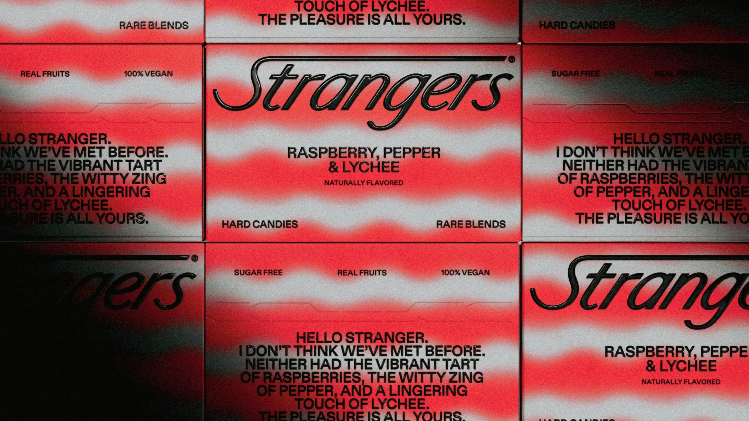
If that sounds a little annoying, well, you’re probably right. And that’s why you’re going to make it beautiful and strange and out of this world because people should, you know, actually like it? Look no further than vegan snack Byte Bars or Omsom and their South-Asian pantry staples—paired with a vibrant color palette, the upstarts and their out-there type gives you some bold branding coupled with a wild personality. 

Editorial photograph

Editorial photograph

Editorial photograph

Editorial photograph

Editorial photograph

Editorial photograph

Editorial photograph

Editorial photograph

Editorial photograph

Editorial photograph

Editorial photograph

Editorial photograph

Editorial photograph

You can also see the trend starting to play out in the world of craft beer, with the decidedly retro Soma Brewing, as well as the surreal, trippy concept that is 530. Even the typically sedate world of hard seltzer has a wilding-out brand designed by Moxie Sozo in the form of Sparkalicious with its punk-ish vibe. There’s also CBD hot sauce brand Hot Sloth with its immensely pleasing layout and various shapes and sizes, as well as that near-perfect name.

The only downside to using fonts and types of this ilk is that they might not play well in retail, and it’s not because they don’t have an aesthetically pleasing look. Obviously, consumers aren’t browsing the way they used to, so they’re better suited for social-first brands and merrily scrolling along on your device. While the longevity of these unconventional types might be up in the air, they do give designers more leeway to break the rules, and that’s always a good thing.

AI Design

Back in 2018, the painting Portrait of Edmond de Belamy sold for $432,000, which isn’t much of a story, frankly—da Vinci’s Salvator Mundi sold for more than $450 million the year before, so in rich-folk speak, we’re not talking gobs of wealth. 

But this was no usual artist. The painting was created using artificial intelligence (AI). 

Art Collective Obvious fed their Generative Adversarial Network algorithm (GAN) a steady diet of portraits from the 14th to 20th century, and after studying these images, it was able to create its own new images, and the brush strokes look so life-like that that’s no real way to tell if it was something created by a genuine person.

When we hear the term AI, chances are we think of sci-fi allegories and machines coming online to annihilate us, and if you saw the demo for the personal assistant nightmare turned conversationalist pal NEON at CES last year, maybe you’re right. But as it turns out, AI and machine learning are now deeply entwined with our day-to-day lives, and it’s not just limited to Alexa or Siri.

For starters, there’s Nikolay Ironov, an AI designer created by the Russian design firm Art. Lebedev Studio. For a year, Ironov churned out branding work for clients, and none of them were wise to the fact that it was AI trained on hand-drawn vector images. And here’s the thing about Ionov—after perusing a few of its logos, you almost see an individual aesthetic that emerges, and it’s actually not that bad. Or at least, what we’re seeing is not all that terrible because his handlers have filtered out the not-so-great ones. But aside from editorializing, all the studio needs to do is enter the brand’s name along with some general information about the company, and it spits out an endless stream of logos.

And speaking of logos, there’s also Zyro, a free tool that will generate one for you while you brew a pot of coffee. They also have a selection of pre-made logos generated by the AI, where all you need to do is add your colors. Are they great? Not really, but it could do in a pinch. What’s impressive is that it gives designers and brands alike a chance to peruse their options in a more economical manner. Instead of waiting for a team of creatives to imagine a slew of options, Zyro does it for you on the cheapest of cheaps.

Editorial photograph

Editorial photograph

Editorial photograph

Editorial photograph

Editorial photograph

Editorial photograph

Editorial photograph

Editorial photograph

That’s the same principle behind London studio Rare’s DAN (Data Analysis and Natural Language Process). Once you add all of the data and input about a particular project, it speeds up the initial design process, giving their studio access to many ideas that inform the beginning phase of a project. Again, there’s a human element to it, where designers comb over the generated concepts, and it gives them a direction for how they approach their work so they can design faster and more efficiently.

We’re already seeing some of the shortcuts that are available to designers now. Adobe Sensei is now deeply intertwined with the software company’s creative cloud. If you’re editing a video in After Effects, and you’re trying to remove an object, simply select the unwanted target, and the Content-Aware Fill Tool will do it for you, saving countless unnecessary hours from any given project.

While some enjoyed the designs from Art’s Ironov, you do have to wonder if it’s actually art? If you removed the human element, what are we left with? Are we now moving away from a humanistic form of branding? Now that platforms are designing for hyper-focused demographics and aesthetic buckets on social media platforms with laser-focused algorithms, who’s to say you can’t generate an entire visual identity with machine learning?

When you consider the numbers—how much it costs to create a logo from whole cloth, and the amount of research and bodies that go into it, plus all of those billable hours—and it turns out you can have a computer do it in a few minutes, it does give you pause.

More than likely, it’s another tool in a designer’s utility belt, hammering out minor details and filling in blanks where needed, or maybe it becomes a tool for DTC brands looking for an identity of the cheap. What we can tell you is that AI design is here to stay, so maybe be a little kinder to our robot overlords, will ya’?

Regenerative Design

Regenerative Design has come into fashion in recent years, particularly in the architecture and agricultural world, a holistic, whole-system approach to tackling some of the biggest problems we face today. In essence, instead of stripping us of vital materials and energy, we restore and renew them. They are design principles that give back instead of taking and look to align society with that of nature, knowing that our destiny is one and the same.

Those same principles no longer have to limit their usefulness to just farms and buildings—it can also be applied to the entire design industry, especially when it comes to sustainability and circular economy. Creatives can no longer be bound to the ideas of the past, particularly Design Thinking and Human-Centered Design. These methods and practices likely cannot stand up to the test of climate change, systemic racism, and a global pandemic that, as of this writing, has claimed the lives of nearly 1.5 million across the globe. And that’s not even counting the many millions more left unemployed, food insecure, or unable to make the rent.

Whether or not Design Thinking or Human-Centered Design are good isn’t the point. We don’t need to go so far as to say they’re bullshit, though they certainly have their weaknesses and penchant for plastering post-it notes. What we can say, however, is that, after 2020, these methods no longer feel relevant to the world we actually live in.

And why? Well, there’s no edit button or period of evaluation when it comes to the actual method. There’s no examination of the outcomes or exploring what those solutions might mean in five, ten, or one hundred years. It’s iterate, iterate, iterate—and, hoo boy, those outcomes might not be as rosy as intended. It’s that old chestnut from Jeff Goldblum in Jurassic Park: 

“Your scientists were so preoccupied with whether or not they could that they didn’t stop to think if they should.”

Spotify allows you to stream almost every damn record in existence. But what does that matter when Spotify pays notoriously low and downright criminal fees to musicians for streaming, particularly in a world where touring is currently not an option? A plastic water bottle is convenient, durable, and, best of all, clean and safe to drink. You can find them anywhere when you’re parched, but it comes at a steep cost to the environment in terms of the resources used to produce it, as well as the almost certain likelihood of it going to a landfill for the next 500 years. Yes, you can get an Uber for less than the cost of a cab, but you’re getting a lift from someone who doesn’t receive health benefits or sick days and is possibly making less than minimum wage.

Editorial photograph

Editorial photograph

Editorial photograph

Editorial photograph

Editorial photograph

Editorial photograph

These are some of the things human-centered design and design thinking has given us, and often, it benefits the well-off and not the many.

Regenerative Design is about igniting virtuous cycles of goodness. It’s expansive, comprehensive, generous, and dynamic. It is driven by a deep understanding of complex systems, networks, patterns, processes, and potential.

Brian Collins

“Regenerative design should sit at the heart of everything we do,” said Brian Collins.

“Regenerative Design is about igniting virtuous cycles of goodness,” he said. “It’s expansive, comprehensive, generous, and dynamic. It is driven by a deep understanding of complex systems, networks, patterns, processes, and potential.” 

One of the critical problems with design thinking, however well-intentioned it is, is that it has been rendered meaningless, a cacophony of empty corporate buzzwords. “Language means something, right?” asked Brian. “So, as we work to adapt regenerative thinking—as an ongoing value—I hope such an idea might open up more designers’ imaginations to restoration, reviving, recovering. That’s what we have to do now—make things better than we found them.”

“Language means something, right? So, as we work to adapt regenerative thinking—as an ongoing value—I hope such an idea might open up more designers’ imaginations to restoration, reviving, recovering. That’s what we have to do now—make things better than we found them.

Brian Collins

And that’s the point of it, really. Everything has changed, profoundly so, and many of us are still trying to go about our day-to-day lives without acknowledging that. The systems that we have in place can no longer withstand the burdens we have placed on them. “That world is gone,” said Brian, “and it was taken out by a virus that we can’t even see.”

In a recent essay from Collins and his colleague J.A. Ginsburg, they map out the ways we can start to address the many crises we’re staring down with a pretty meaningful yet uncomplicated series of questions that generally amounts to: is it helpful? If the answer is yes, great—if it’s not, don’t do it. 

  • Improves the quality of the air, the water, and the land? Do it. If it doesn’t, don’t.  
  • Fosters human rights and dismantles racism? Do it. If it doesn’t, don’t. 
  • Supports health—personal, public, animal, plant, planet—do it. If it doesn’t, don’t.  
  • Promotes science, education, and the arts, do it. If it doesn’t, don’t. 
  • Strengthens First Amendment rights, aka, the freedom of speech and the press; the right to peaceful assembly; the right to petition the government for redress? Do it. If it doesn’t, don’t.
  • Generates prosperity for the many instead of the few? Do it. If it doesn’t, don’t. 
  • Invests in both the short-term and long-term future? Do it! If it doesn’t, don’t. 

These are fundamental tenets every creative should follow, no matter the project. It’s just like when you go camping—you have to leave it better than you found it. 

We’re in trouble. The problems that we face are significant and deeply rooted, and designers have to design better. That doesn’t mean targeting niche groups; that means designing for everyone. And at the heart of it must be the promise of renewal and equity, creating solutions that are future-proof and utilize what we have available to us.

You know, the future might be a nice place to visit. We should try getting there sometime.


A Final Note

Where Are The Black Designers, Really?

In the aftermath of George Floyd’s murder and the country’s ongoing struggle with systemic racism and oppression—in addition to the protests and ongoing conversations many communities and industries are having about creating a more equitable, just society—it became clear that even the design world was not immune to this long-overdue critique.

Not that any of this was news. Plenty of folks have sounded the alarm about this for years, and in the 2019 AIGA Design Census, they found that just 3% of designers identify as Black. The current landscape we find ourselves in is no longer acceptable or sufficient. 

And while we recognize that this is a trend report, this is very much not a trend. It needs to be our collective future, and it’s something that needs to happen now. Designers are in the business of culture—you cannot contribute meaningfully to that culture if your agency is predominantly staffed by white creatives.

If you’re looking around the office or Zoom call and all you see are white faces staring back at you, then it’s glaringly obvious that your agency or practice has a substantial problem. If your team or network isn’t diverse enough, then it won’t represent a wide range of folks and, more than likely, you’re not hiring BIPOC designers. That is why you can’t hire for “culture fit” or through “word of mouth.” If you employ the designer you want to have a beer with after work, and that person is white, you are doing it wrong because your network is homogenous and doesn’t foster a diversity of thought.

Hire BIPOC designers. Elevate them to positions of management. When you recruit designers, don’t just find them in college, invest in their communities, and make an effort to reach them in high school and even earlier. Create mentorship and allyship programs, start online classes for children in underrepresented communities with non-existent art programs. Above all, hold yourself accountable and be transparent about how you’re trying to actively help.

Of course, these things don’t happen overnight. We can’t just snap our fingers and have a more diverse workforce. We all need to hold ourselves accountable for making genuine change by implementing increased representation of BIPOC creatives—it’s not a sprint, it’s not a box to check, and it’s not a press release telling folks you’re listening. It is an ongoing process.

Structural racism is very much alive and well, and we must all do the work to dismantle these oppressive systems wherever they exist.


Editorial photograph

Special thanks to Moxie Sozo for making Dieline’s 2021 Trend Report Possible

This placeholder is removed when the ad slot is configured.

This placeholder is removed when the ad slot is configured.

This placeholder is removed when the ad slot is configured.

This placeholder is removed when the ad slot is configured.

This placeholder is removed when the ad slot is configured.

This placeholder is removed when the ad slot is configured.