Soma Brewing Goes Big With Their Flavor Variants
By
Published
Filed under

By
Published
Filed under
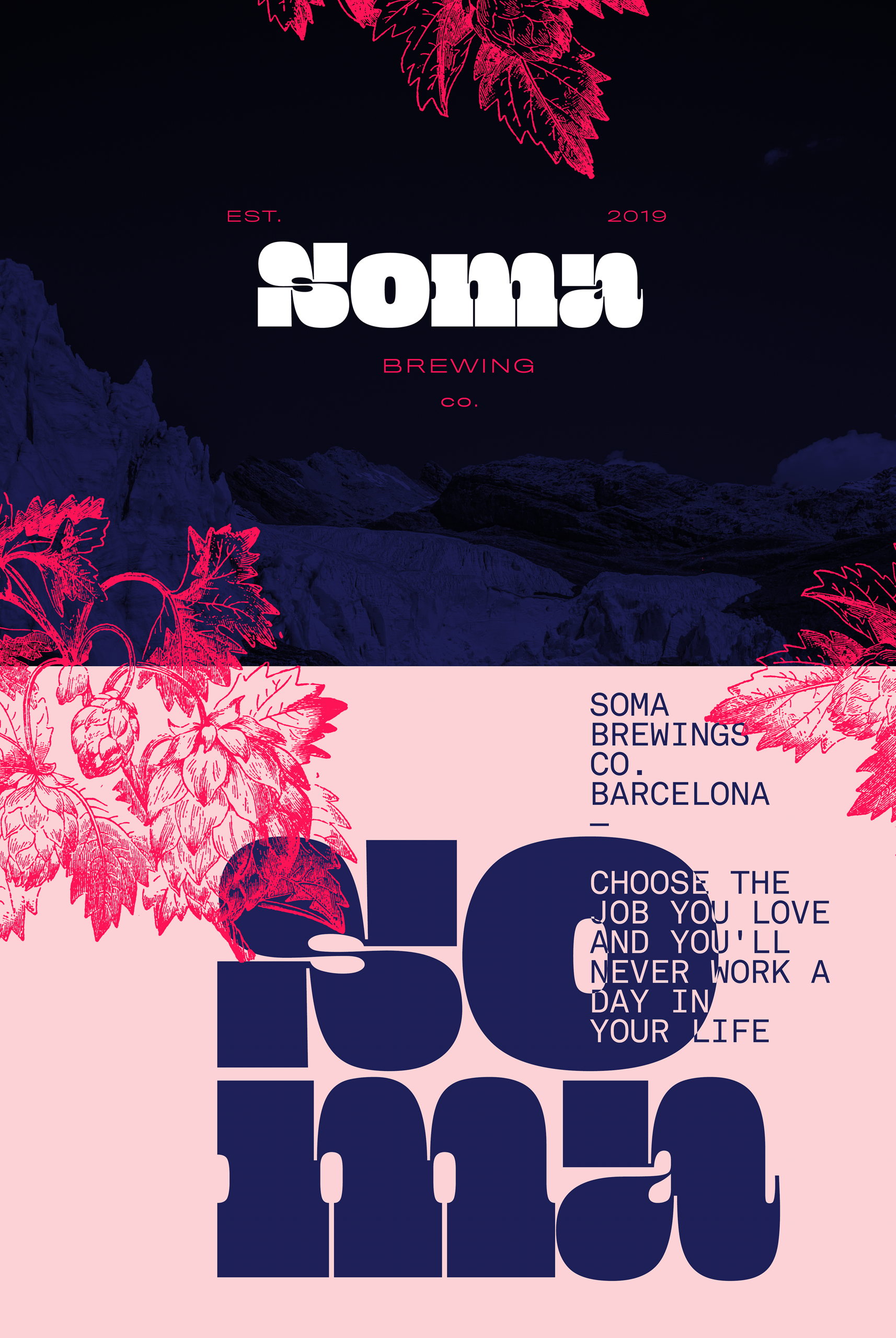
The chunky, retro typeface is the consistent element that allows the branding across each flavor variant to add to a cohesive brand experience. Each beer is adorned with a striking two-tone color pairing and a bold letter or number that takes up most of the design space. So confident that each brew has it’s own personality, the flavor notes are regulated to the neck wrapper.
Soma is striking in it’s simplicity, a statement that one design element can go a long way.
Get unlimited access to latest industry news, 27,000+ articles and case studies.
Have an account? Sign in