Featured image for Designing Branding and Packaging to Sell a Product—And Sell the Business

Designing Branding and Packaging to Sell a Product—And Sell the Business

by Theresa Christine Johnson on 11/18/2020 | 6 Minute Read

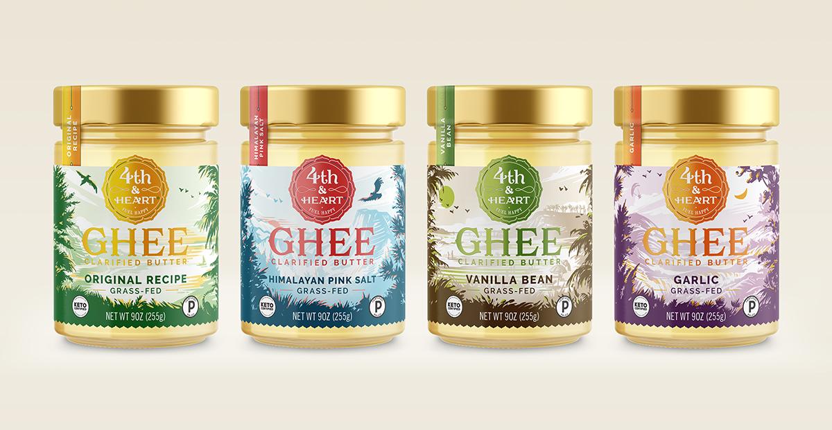
You may know how to design packaging to get people to grab items off the shelf, but what if a brand has another goal in mind? Success may not only lie in the number of products sold but also in the appeal a brand has to potential investors or larger companies looking to acquire it.

If the plan is to sell a company, the sooner brand owners and designers know this, the better. You can’t just flip a switch, advised Evan Faber, CEO and chief strategist at branding agency Moxie Sozo, which has helped position several brands for acquisition, including Fourth & Heart and Duke’s. Part of the exit and what the potential return relies on the brand itself—so a better, more realized brand means a stronger exit.

Editorial photograph

“Brands would be well advised to be honest with designers, and designers should be curious about what the exit strategy is,” Evan said. “Design that will return the most for the client fills opportunity gaps, for the consumer and for potential acquirers or investors. Packaging is one of the biggest drivers of brand value, so it makes sense to start the conversation early.”

“Who are you looking to court down the road, in terms of strategy?” Evan asks. Ultimately, that's the question many upstart brands really need to ask themselves. "You have to create something desirable in the eyes of the consumer, and that will need to translate into what another larger brand or potential partner sees as well.

Editorial photograph

Derek Springston, CCO and partner at Moxie Sozo, emphasized the importance of a brand having an ownable visual language. He refers to something he calls the Logo Test—which basically means, can you cover up a brand’s logo and still recognize it? Take a bottle of Coca-Cola, for example. You don’t need to see the logo on the front to know what it is; instead, the curve of the bottle and the distinct pop of red does that for you.

“Part of how we approach creating the digital language is having very ownable additional elements in said logo,” Derek said. “We do a lot of illustration, so that can be one way to go about it. A simpler way is to have the color palette so differentiated in the category that it sets you apart.”

Editorial photograph

Consistency is also critical. Once you’ve landed on an ownable visual identity, try not to get caught up in the trends and instead trust that you’ve put in the work to make the brand unique.

“Be focused,” Derek added. “There’s always going to be distractions. There’s always going to be new brands popping up around you, and they can challenge you to ask, ‘Am I truly differentiated? Am I going down the right path?’ But to change course constantly as a brand is confusing in the market, so staying the course is a challenge.”

Editorial photograph

Case Study: Birch Benders

Founded by a husband and wife team, Birch Benders started at local farmer’s markets. Their product line originated with pancake mixes that were delicious, convenient, and made of high-quality ingredients, and they wanted to make a name in the natural food space. With only one other major competitor at the time, Moxie Sozo knew they could come in with a powerful packaging position that embodied what Birch Benders was about but also gave them room to grow. Charles Bloom, partner and creative director at Moxie Sozo, established the illustration style for Birch Bender’s packaging, which has, in turn, translated to new products in the line like toaster waffles.

Editorial photograph

“We thought pancakes should be friendly. They should be fun,” Evan explained. “We really doubled down on that—creating a visual language that’s fun and playful and just approachable—and we were able to break into other categories really seamlessly.”

Food company brand Sovos announced they would acquire Birch Benders in August of 2020.

Editorial photograph

“Eight years ago, we partnered with Moxie Sozo to create Birch Benders' branding and brand identity,” said Lizzi Ackerman, co-founder and CMO of Birch Benders. “They told the story of our brand through powerful, whimsical worlds and characters, and we’ve developed a thriving family of products under our artful design system. We couldn’t be more thrilled about our acquisition by Sovos Brands and believe that our distinctly joyful look and positioning greatly contributed to Birch Benders’ success.”

Editorial photograph

Case Study: Ancient Nutrition

Consumers care about ingredients, but it’s the packaging that prompts them to pick up an item and look at the ingredients list in the first place. But instead of cramming as many ingredients as they could onto the jar, Moxie Sozo opted for a clean design with whole foods supplement company Ancient Nutrition.

“They go above and beyond on ingredient and product sourcing,” Evan mentioned, “but it’s tough to sit there and compete on ingredients. So we knew what the triggers were for purchasing, and we lined up the packaging architecture so that it flowed in a way that connected consumers with the value proposition.”

Editorial photograph

The supplements space is always innovating, so that was an added challenge. Ancient Nutrition had to remain very in tune with how the market was changing with a fail-fast-and-succeed-more mentality. As a result, Moxie Sozo had to be nimble while keeping things straightforward with the messaging. As a result, they gained traction in the market and investors as well.

Editorial photograph

Case Study: Duke’s Smoked Meats

One of the big advantages for Duke’s was they were their own unique, new product—smoked meat sausages with the familiarity and convenience of jerky. That made it easy for them to find a place at convenience stores and shops like Walmart, which would have otherwise said no to another jerky on their shelves.

The other advantage? The flavor.

Editorial photograph

“Jack Links has this big and bold black packaging, and Oberto started using photography on their packaging,” Derek said. But few other brands were highlighting how good the product tasted or the care that went into making it. “That was where we really saw their opportunity space with their sausages. It was about hitting that taste appeal for that particular product, and then they were able to get it in front of the right people.”

Once Duke’s hit checkout counters in smaller format packaging, they began getting calls from larger brands and eventually were acquired by Conagra.

Editorial photograph

Are these the only surefire ways for a brand to get investors? Is this a definitive guide to situate a brand to be acquired? Certainly not. Really, they're great tips to get standout on the shelf for any upstart brand that wants to make a name for itself. However, Evan said, it’s that kind of mentality that’s important—not necessarily the exact idea itself.

“All these design considerations would benefit brands, designers, and agencies to be talking about, without losing that fire of creativity which drives innovation and the art of branding.”

Go here to learn more about Moxie Sozo!

You may also like