Jane Edibles Are The Friend That Is Up For Anything
by Shawn Binder on 08/14/2019 | 2 Minute Read
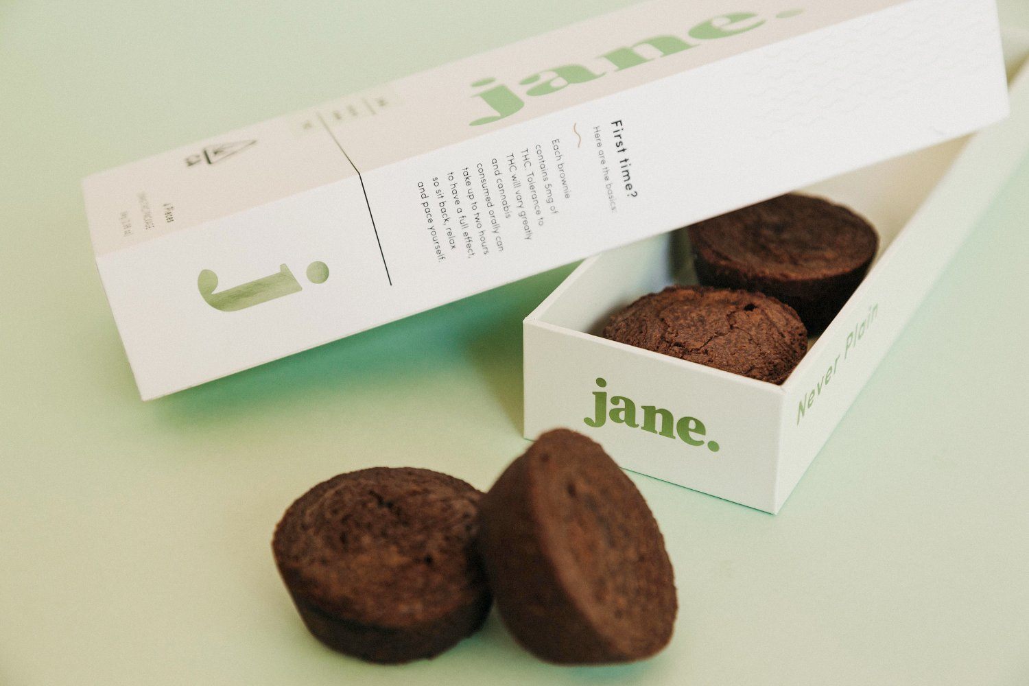
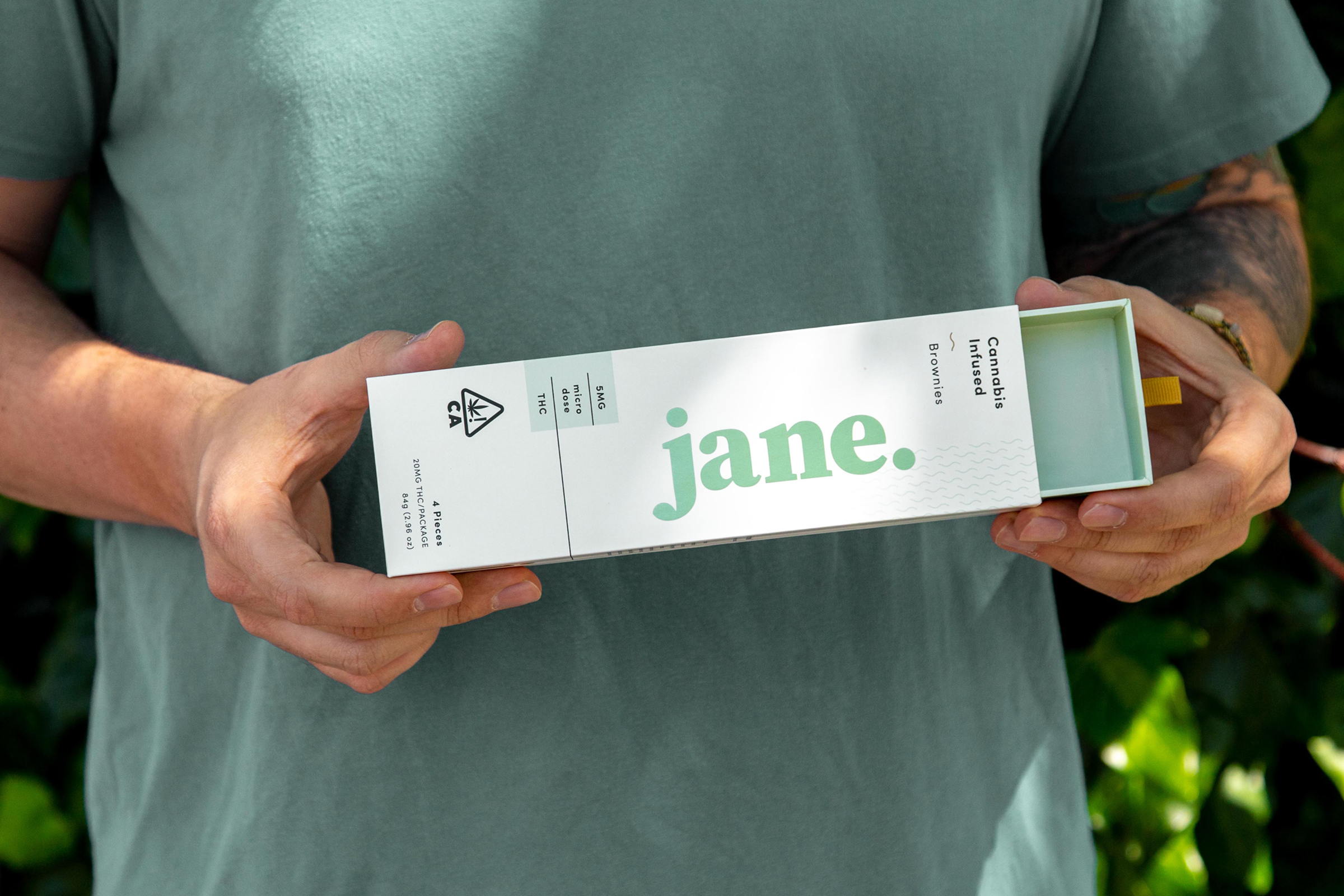
Weed is great and all, but have you ever eaten it in brownie form? No, we’re not talking that homemade Betty Crocker stuff your roommate in college fed you too many of freshman year, we’re talking the good ish. Enter Jane, a cannabis company that is challenging the way we view weed edibles, and taking us on a stylish journey in the process.
Sacramento design firm, Honey, was approached to help Jane discover their identity by developing a name and persona that matched the founders’ collective vision for a relatable and aspirational brand identity. Meet Jane—she is your best friend’s best friend, the one that’s up for anything. At the end of the day, Jane just makes life a little more fun.
It was critical that the design of the brand matched the persona of Jane. Green is a direct reference to the cannabis plant, however Honey used a light, minty foil that elevates what is traditionally seen in the edible landscape. The “Never Plain” tagline is a play on the oft-heard phrase about the flavor and experience, while the wavy line elements represent the experience of enjoying a cannabis brownie–fun, chill, and easy.
Regulations around cannabis packaging are ever-changing, and this project was no exception. Through iterations Honey explored various sizes, child-safe mechanisms, and prototype forms. Ultimately, the custom sleeve and drawer concept that was developed brought the brand to life across multiple surfaces and yielded a few hidden design secrets throughout.
Now when things get crazy, you have your best friend Jane to blame as a good influence.
- Creative Director:: Ashley Rodseth
- Senior Designer:: Dustin Avilla
- Account Director:: Maggie Giordanengo
- Project Manager:: Meghan Lawson
- Design Agency: Honey