We all like pretty things, but here at Dieline we especially love pretty things. That’s kind of our jam.
And this thing? Well, it’s the prettiest thing of all.
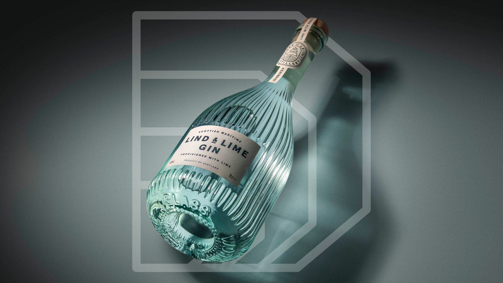
This year, our panel of judges waded through over a thousand packaging submissions from agencies all over the world. After a few rounds of thorough consideration and much head-scratching, our judges finally landed on this year’s overall Best In Show winner-Lind & Lime Gin by Scotland branding agency Contagious. This beautiful, bespoke bottle was more than two years in the making for Scottish distillery Port of Leith and drew inspiration from the industrial buildings and old kilns that once dotted Leith’s shores. Plus, it quite literally stands out on the top shelf of any bar with its elegant silhouette and illuminating presence.
It’s also the very first spirit (they previously made a sherry) produced at Leith’s Tower Street Stillhouse and a beautifully designed first foray for a brand that will eventually start to craft their own whiskey. The expert labeling at the top of the bottle pays homage to James Lind, a Royal Navy surgeon’s mate in the 18th century who tested and discovered that citrus fruits could prevent scurvy, hence the addition of lime to the spirit and the name.
We spoke with Contagious’s Head of Packaging James Hartigan to get the scoop on how they brought Lind & Lime Gin’s Best in Show-winning design to life.

Walk us through the design process you went through for this project.
Our process was very much the same for this project as all our projects we design at Contagious. We always take time to understand what the client needs, what their expectations and targets are and ultimately how can we create something to look great but also achieve their strategic goals as a company.
We don’t like to consider the packaging as something in isolation to the rest of the brand. The packaging forms an essential part of the brand, but it’s not the be all and end all, and our job was to make the Port of Leith Lind and Lime fit into the brand world we helped create for the client—so every touchpoint is considered.

To incorporate an enormous amount of attention to detail—which is a theme in all of our projects—we explore the brand and project for a long time to make sure we understand the challenges we face and identify what the actual problems are that we need to solve. Once we understand that, we put forward our strongest routes, which were whittled down from a tremendous number, supported with visuals and renders to present to the client, but also help them sell the concepts onwards to their stakeholders.
We worked collaboratively with Port of Leith during these phases, as they wanted to be involved in the process as they were new to it. We took them from the conceptual phase to 3D-printed models, glass testing, labeling, production management and final delivery.

There’s nothing typical about the architecture of the bottles you’ve created, and this is a constant across your body of work. How significant is bespoke bottle design to you?
Bespoke bottle design, if you like, is the ultimate way to bring a brand to life through packaging because you can really differentiate yourself from the competition within the sector, but also articulate the brand physically, in this case, with the bottle that sits perfectly within the entire brand world for Port of Leith Lind & Lime.
But sometimes, for various reason, bespoke bottles aren’t viable, whether it be timescales, cost or availability, but our thinking and process don’t change. Ultimately, it’s what is right for a particular brand and that moment in time. Port of Leith Distillery is a young company, so it was a brave decision for them to commission a bespoke bottle but it has paid off for them, and they’re reaping the rewards. Being able to specify the texture, the tint color of the glass, and the number of ribs helped so much with the design, and that may not have been possible with an off the shelf option.

I understand you worked with an Italian glass manufacturer to create the bottle. What was that process like? How many iterations did you undergo to get the silhouette you were looking for, or even configuring the right mixture of glass?
The process was very straightforward as the company had a Scottish based representative who we worked with closely; there were two 3D printed models, one glass test and then final production. We try to manage as much production as possible where we can, using our expertise to make the process as streamlined and hassle-free for clients as possible, enabling Contagious to retain control on the quality of the final products.


What was one of the biggest goals you set out to achieve with Lind & Lime, and how did you accomplish it?
Answering the clients brief and helping them to achieve their strategic goals while producing a final product that is beautiful, that people want to pick up and touch makes Lind and Lime stand out within a crowded sector.

How did you incorporate the brand’s story into the logo and materials at the top of the bottle?
We worked on the brand identity for Port of Leith Distilleries which debuted on their first product release an Oloroso Sherry. The marque incorporated the elements found on the crest of Leith but in a modern interpretation. We leveraged the visual language we helped develop for the brand and weaved these into the Lind and Lime bottle while wanting to accentuate the elegant neck of the bottle.

What was the most challenging part of this project?
The most challenging part is how to combine so much attention to detail and craft while making the final product look effortless and sophisticated. We wanted the bottle to seem timeless, but make sure every single touch point of the bottle had a reason to be there.

If you could pick one aspect of the finished design that you like the most or feel especially proud of, what would it be and why?
I would say the color. In testing, we tried plain flint and rendered fully opaque bottles, but the hue of the glass (which is not sprayed) helps it jump off the shelf while still being a subtle color.


