What’s With All These Custom Brand Typefaces?

Published

Filed under

12-Col-White-box-animation-21.jpg

By: Nayoung Kim

We are living in a maximal world with myriad products and services that do the same job. Customers encounter endless moments of decision-making on a daily basis, and brands cannot be just about business and money anymore. To win this game, they need to stand out amongst countless competitors.
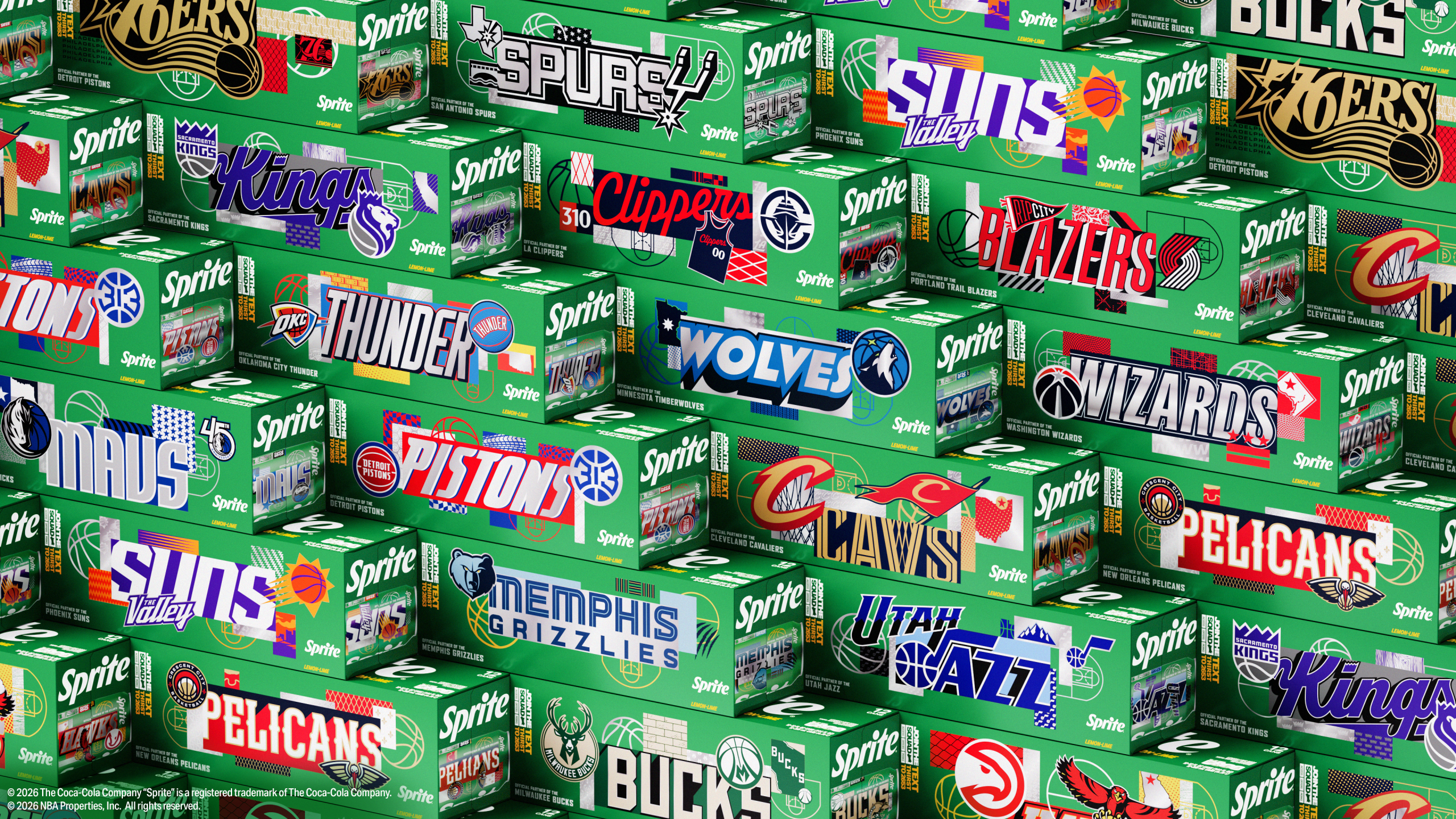
But how do they differentiate themselves when they are essentially selling the same thing?

That’s where visual identity comes into the picture. It’s how brands showcase and celebrate their individuality. Especially notable is the brand typeface; one of the most widely used elements across all platforms, the fonts a brand uses have huge potential to change its entire look and feel. It’s no surprise that many major brands have decided to invest in custom brand typefaces that communicate their personality in the best way possible.

Playing the Typeface Game

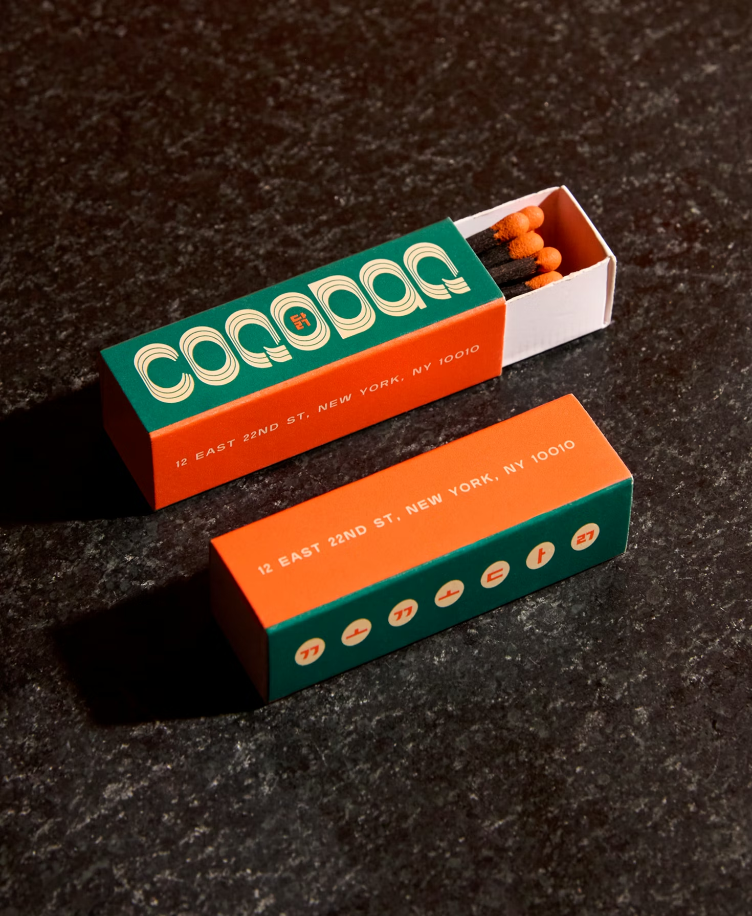
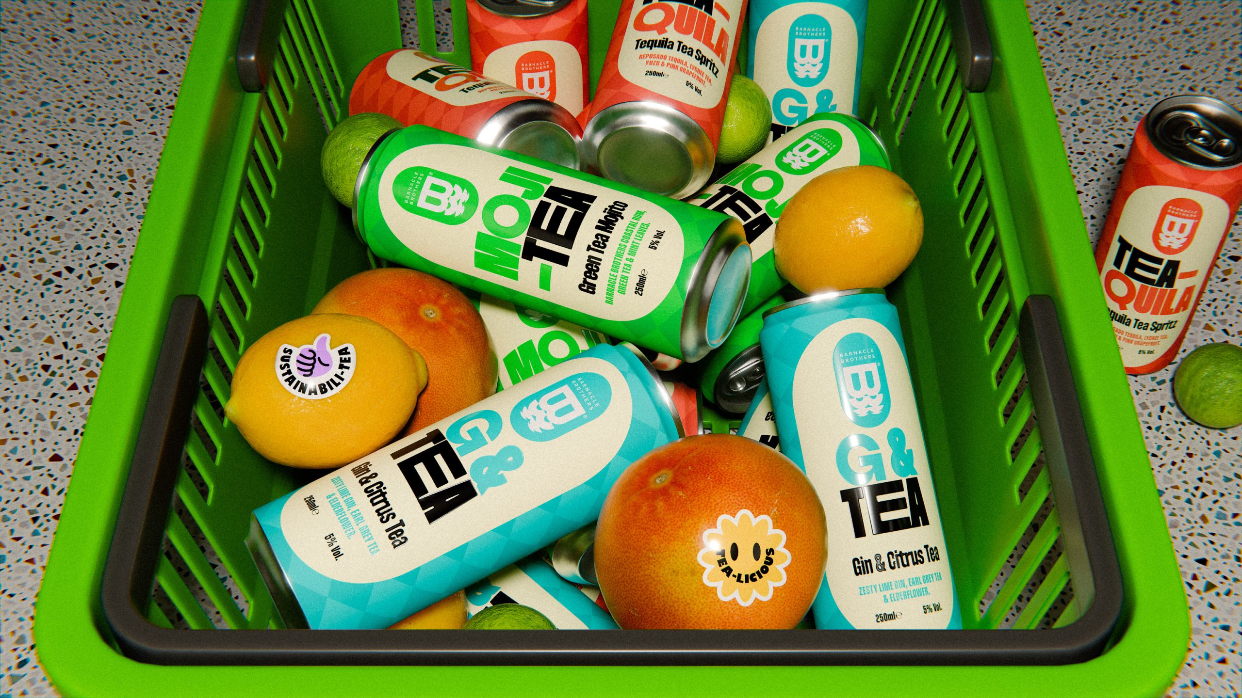
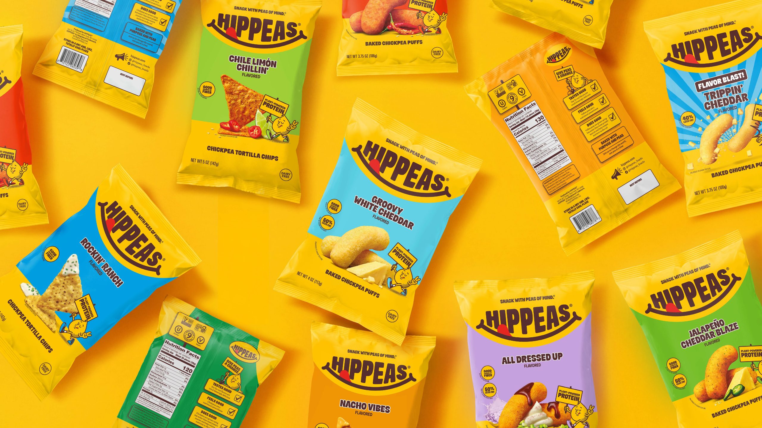
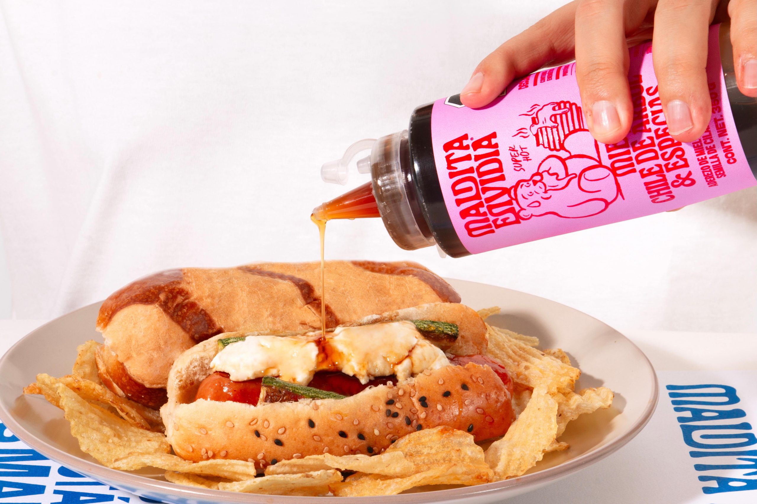
The most fun and challenging part of creating a custom typeface is figuring out how to convey the brand’s personality through letterforms. As abstract as it sounds, it’s essentially discovering how to best express the playful, serious, or friendly nature of the brand through type.

Serif typefaces, because of their structure, appear more grounded and are often used to communicate more serious, elegant, and thoughtful personalities. Sans serif typefaces, however, are usually used to express more happy, young, bold personalities, because their simple geometric shapes tap into that friendliness and playfulness. By altering the weights and styles, there are lots of other ways to achieve different qualities through the letterforms.

custom-elliptic.jpg

How about the functionality of the typeface? What does it do and where does it live? Based on its primary usage, different restrictions and permissions can apply. For example, if it’s mainly used in headlines, it can be more expressive and bold. It gets more freedom on the letterforms since it will be used at larger sizes, where legibility is less of a priority, but still important. If the intended use is for small-sized body copy, it should retain the general structures of letterforms, that way people can instantly identify each character as they read. Serif typefaces are also known to be easier to read in smaller sizes than sans-serif because our eyes register the differences between each character faster with serifs than without.

Finding the Right (Un)Balance

Not all typefaces need to have the perfect balance of personality and functionality. While some brands lean more toward personality, others do the exact opposite, and it depends on what purpose the brand typeface serves.

For instance, Arby’s new typeface, Saucy_AF, designed by Arby’s social content agency Moxie, went all-in on personality. This handwritten (or squeezed) font is fun and unique, except that it loses legibility completely when it gets smaller. It doesn’t even have lowercase letters. But that doesn’t really matter – Arby’s didn’t create this to use across all brand materials. It’s more of an open source (pun intended) promotional font for people to play and have fun with.

On the contrary, Netflix Sans, developed by the in-house design team with Dalton Maag, leans towards to functionality side. This low contrast typeface with subtle “cinemascopic curve” inspired by the logo is clean, neutral, and efficient. For a major global brand that houses thousands of different shows, it’s a safe, smart move not to overpower the show’s own identities by having too expressive of a typeface.

There were also hotly debated financial considerations. For a time, Netflix claimed that, with so many touch points, licensing an existing typeface was reportedly costing the brand millions of dollars per year as foundries moved toward impressions-based licensing.

Others question this number as compared to the cost of custom typefaces, which can also be a huge financial outlay, costing brands upwards of $100,000 every year on licensing or even bigger one-time, upfront payments for no contractual limits.

Plenty of major brands, from Apple to YouTube, have released their own custom brand typefaces over the past few years, creating huge hype not only within the graphic design community but also among an increasingly design-savvy public.

When carefully crafted with the solid understanding of the brand, custom typefaces can successfully help brands build more engaging relationships with consumers.


Nayoung Kim

Nayoung Kim is a designer at next-generation brand agency, Superunion. She has a big heart for type design.


This placeholder is removed when the ad slot is configured.

This placeholder is removed when the ad slot is configured.

This placeholder is removed when the ad slot is configured.

This placeholder is removed when the ad slot is configured.

This placeholder is removed when the ad slot is configured.

This placeholder is removed when the ad slot is configured.