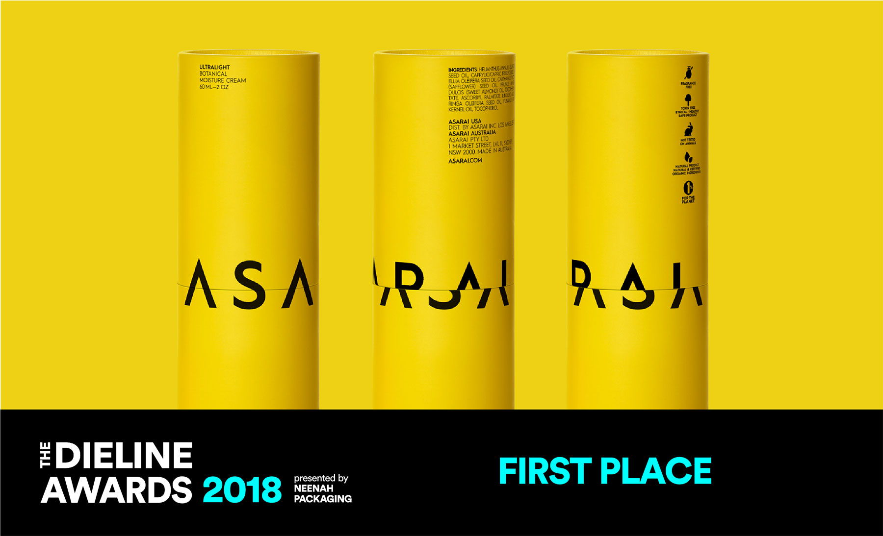


We branded the line based on two basic design elements which cooperate towards one, distinct and strong brand identity: a bright and unusual yellow color, a bold typeface and its dynamic visual use on the packaging. The name of the brand, ASARAI, dominates the all-yellow surface of each product container in straight, imposing linearity but is introduced on the outer tubular box of each product as a quirky play of and on the design lexicon: every time the tube’s upper part closes on the lower one it fits differently. The brand name letters are thus fragmented, rearranged, visually cut and conceptually completed by chance. Such a flowing use of the design reflects a dynamic and confident perception of the brand name and its values.


Agency: Mousegraphics
Client: ASARAI INC
Location: Greece