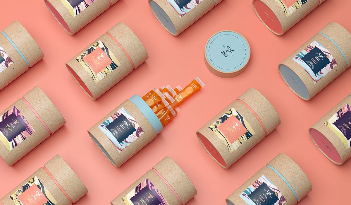
Tough Slate Design created this mesmerizing packaging for Jola, a new honey brand aimed at attracting a younger audience.
“To make the honey more desirable for a younger target audience, the client came up with an idea of roducing honey mixtures — they are as healthy as traditional honey, but have a spark of taste due to the added natural ingredients: juices, spices, nuts, etc.
Our agency has developed a simple and memorable brand name ‘JOLA’ which is a derivative from the Ukrainian word [bdzhola] meaning ‘bee’ in English. These days, natural food products often refer to crafting design, ignoring a wide gamut of visual communication techniques. For example, for modern youth such a language has become self-evident, ordinary, and therefore disappearing in the perpetual flow of motley diversity of design. In this project, we chose to explore a different approach which involves a refined graphic reflection of our time.”