One Love Organics is a natural and environmentally conscious skincare company whose product packaging just got a lovely makeover from Kayla Griffin and the in-house design team. The refreshed art direction is soft, feminine and classic – no fussy extras.
“Who doesn’t love a good makeover? Our new look is a refinement of our existing packaging that expresses our commitment to the quality, integrity and pureness of each product that we produce.”
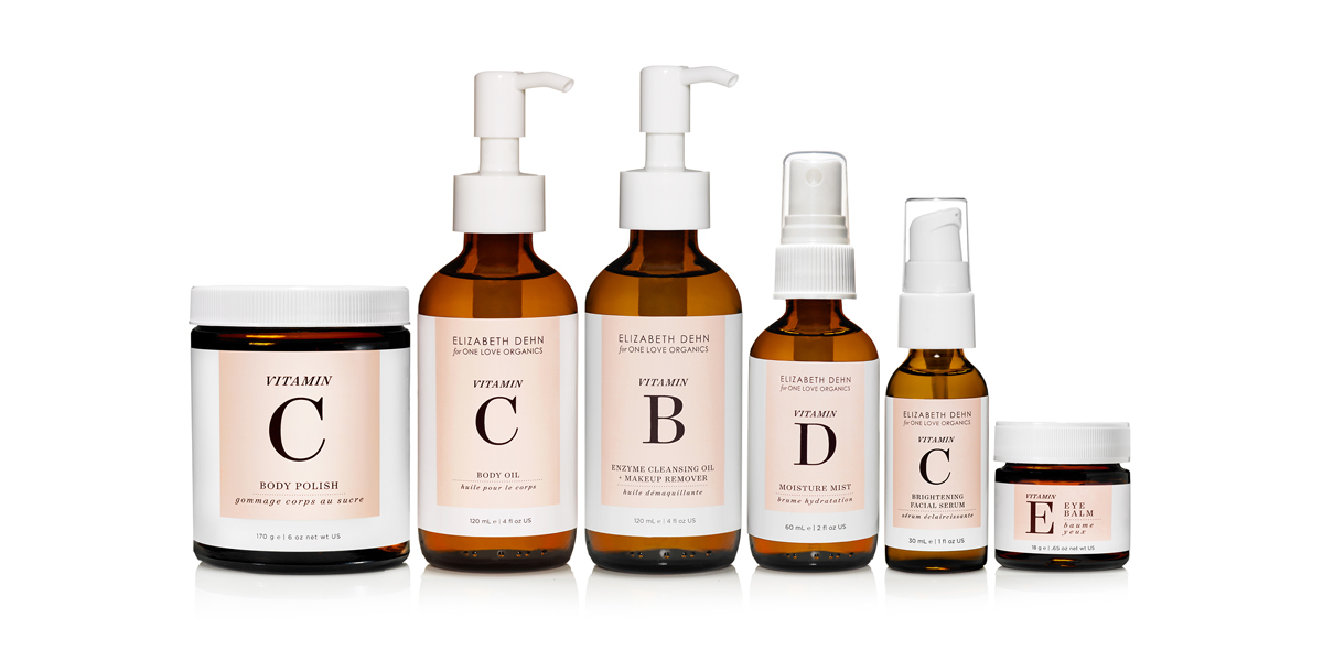
I’ve always been a fan of their cute little logo – black serif font with a single heart in the center. So of course I’m going to be happy with their new look. The One Love Organics packaging has an overall blush pink & white color palette, with black incorporated for the modest typography. What I find to be a really pretty touch is the choice of using brown glass cosmetic bottles to house some of the products. It adds in a rich additional color, a very tasteful choice.
“Taking customer feedback to heart, we endeavored to remove the guesswork of choosing products, making product names easier to read, and creating an easy-to-use icon system.”
The top focus for this packaging makeover was to create consistency across the product lines. Each line now has unique elements, but together they sit as a recognizable family of One Love Organics products. Light patterning, oversized font treatment, brown glass bottles – subtle elements, but still unique. And, just to add more to love about this product, all items are Certified Organic by ECOCERT.
A brand that’s just as pretty on the inside as the outside.


