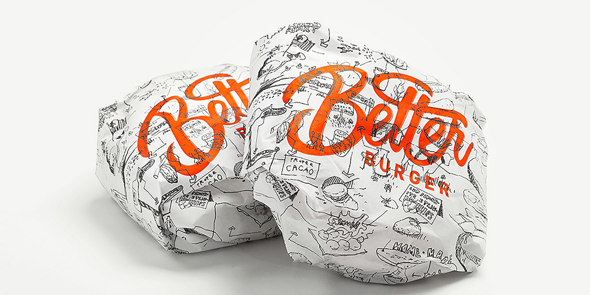
California has In-N-Out, Finland has Hesburger, and now New Zealand has Better Burger. While chains like McDonald’s and Burger King certainly dominate a lot of the fast food market, regional chains that use fresh, local ingredients appeal to a large audience as well. Those prime ingredients certainly make a better tasting burger, so 485 Design created the design for Better Burger, a name that not only makes the promise, but also delivers it.
The challenge with this particular brand is clearly communicating the superior ingredients used while still having a clear fast food presentation. The black and white hand-drawn images on the paper and cups look like graffiti, giving the brand a raw, edgy attitude. At the same time, the illustrations communicate valuable information about the burgers to the consumers. The ketchup-colored Better Burger logo stands out against the black and white design. It’s fast food created for those who care more about what goes into the food they eat.