Best Behavior Leaves Behind the Nostalgic Sugar Rush For Refreshed Cereal Packaging
By
Published
Filed under
By
Published
Filed under
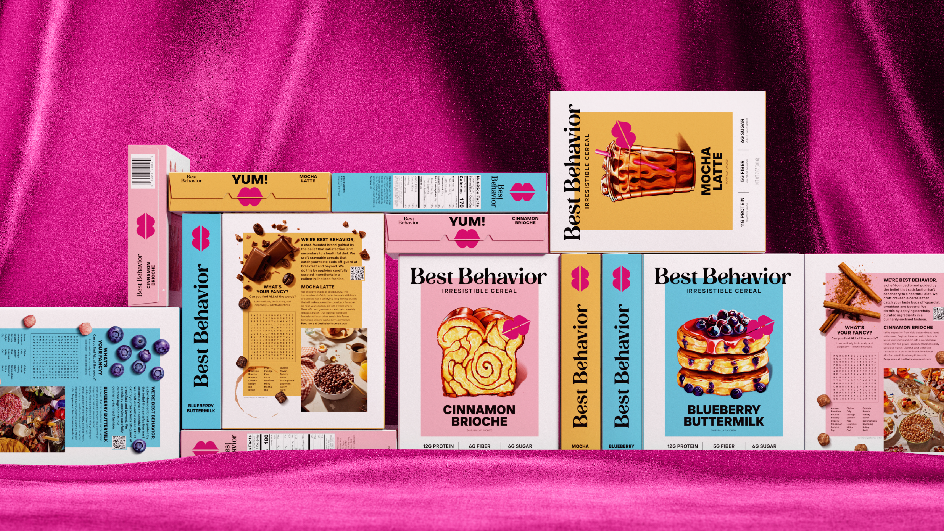
The cereal aisle is overwhelmed with brand mascots, cartoon-inspired designs, and loud, bold aesthetics. Appropriately, it looks like a sugar rush—one of children’s dreams and parents’ nightmares. Even cereal for adults like OffLimits and Magic Spoon (two brand designs we adore, mind you) evokes an aesthetic steeped in millennial childhood nostalgia.

Boulder-based agency Interact has recently revealed its design for Best Behavior cereal. The brand’s packaging resembles a magazine cover more than what’s standard for your run-of-the-mill cereal box. With its clean white canvas, the packaging immediately draws the eye to the vibrant rectangle that frames the artistic drawing of each cereal flavor within.
Get unlimited access to latest industry news, 27,000+ articles and case studies.
Have an account? Sign in


1 response to “Best Behavior Leaves Behind the Nostalgic Sugar Rush For Refreshed Cereal Packaging”
This is simply beautiful work.