It looks like the juice craze and a lifestyle of healthy eating is going strong up in Canada too. Belamonte Raw is a Canadian based delivery service that specializes in raw, organic juices and foods. Founded by the company’s namesake Carol Belamonte, the company grew fast and quickly outgrew its original brand identity.
“Over six years ago Carol Belmonte launched Belmonte Raw by bringing salads via bicycle to hungry office workers. At the time of their inception, there were no organic places offering what Belmonte Raw was creating.”
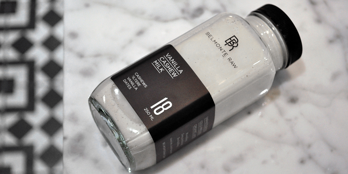
Designer David Taylor was the man for this project. He saw the need to create an identity that differentiated the premium quality of Belamonte Raw’s products from the rest of the playful juice branding in the marketplace. Taylor designed a monogram of the company initials with the name typset below in an all caps, san serif font. This combined with a black and white color palette created a clean, classic brand foundation.
“A paired down palette allowed the color of the food to shine and communications were lead by brand statements that brought the product to life.”


