Lowkey Design’s Playful And Nature-Inspired Packaging For Amble Sheep Coffee
By
Published
Filed under
By
Published
Filed under
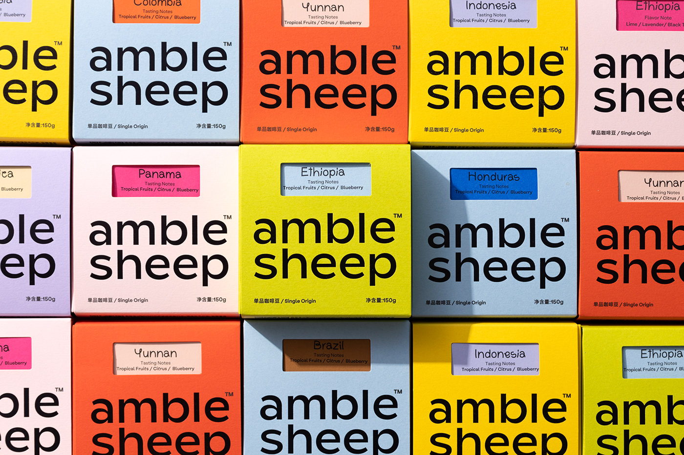
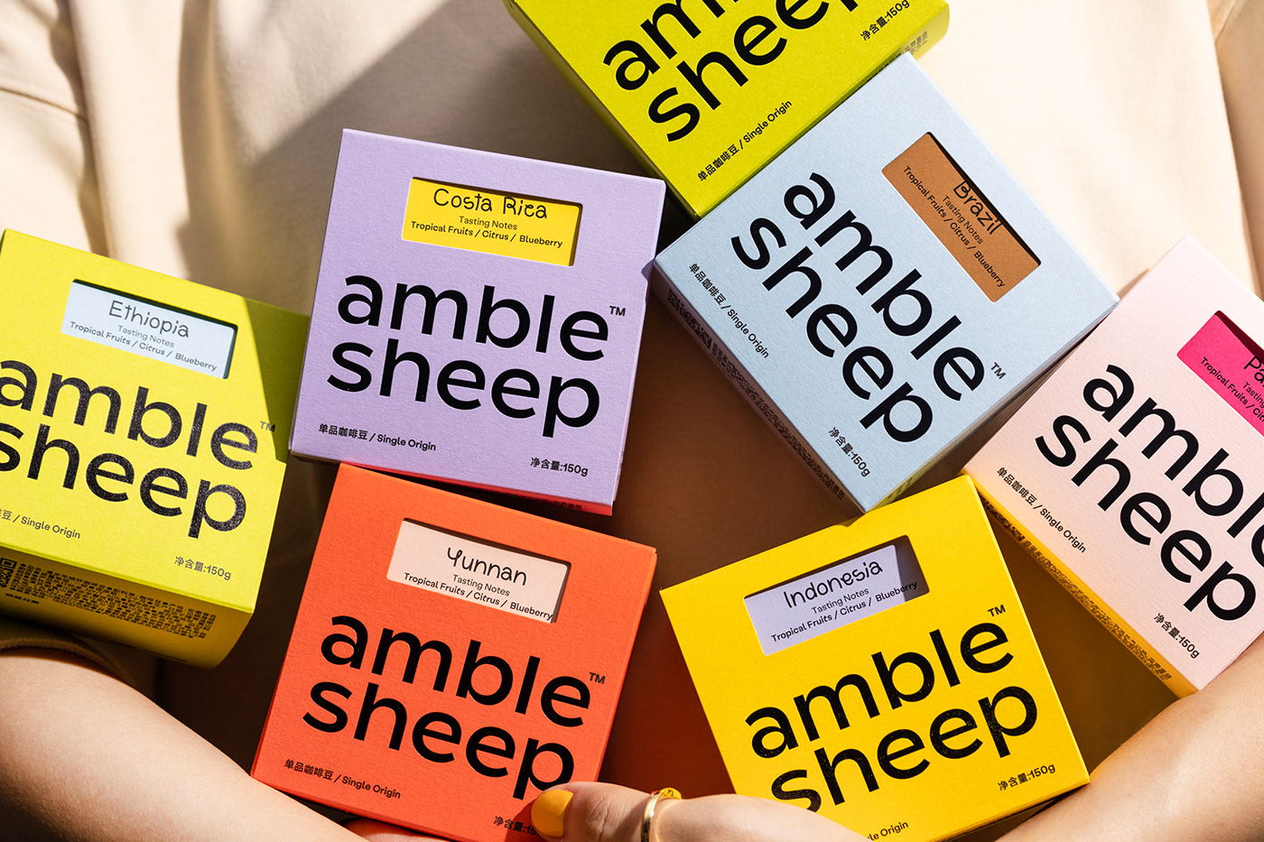
Lowkey Design’s packaging for Amble Sheep wonderfully captures the brand’s friendly and nature-inspired essence, stemming from the Huizhou region’s artisan culture. Amble Sheep’s mission to provide quality coffee in a relaxing environment is echoed by the lowercase logo, offering a warm and casual visual identity.
The secondary logo cleverly combines the sheep’s outline with the letter “A,” drawing inspiration from the serenity of grazing sheep on a grassy landscape. The packaging design’s bright, vivid colors and relaxed typography exude a playful charm that harmonizes beautifully with the coffee brand, setting Amble Sheep apart by introducing a refreshing and rarely seen playful design aesthetic in the coffee industry.
Get unlimited access to latest industry news, 27,000+ articles and case studies.
Have an account? Sign in