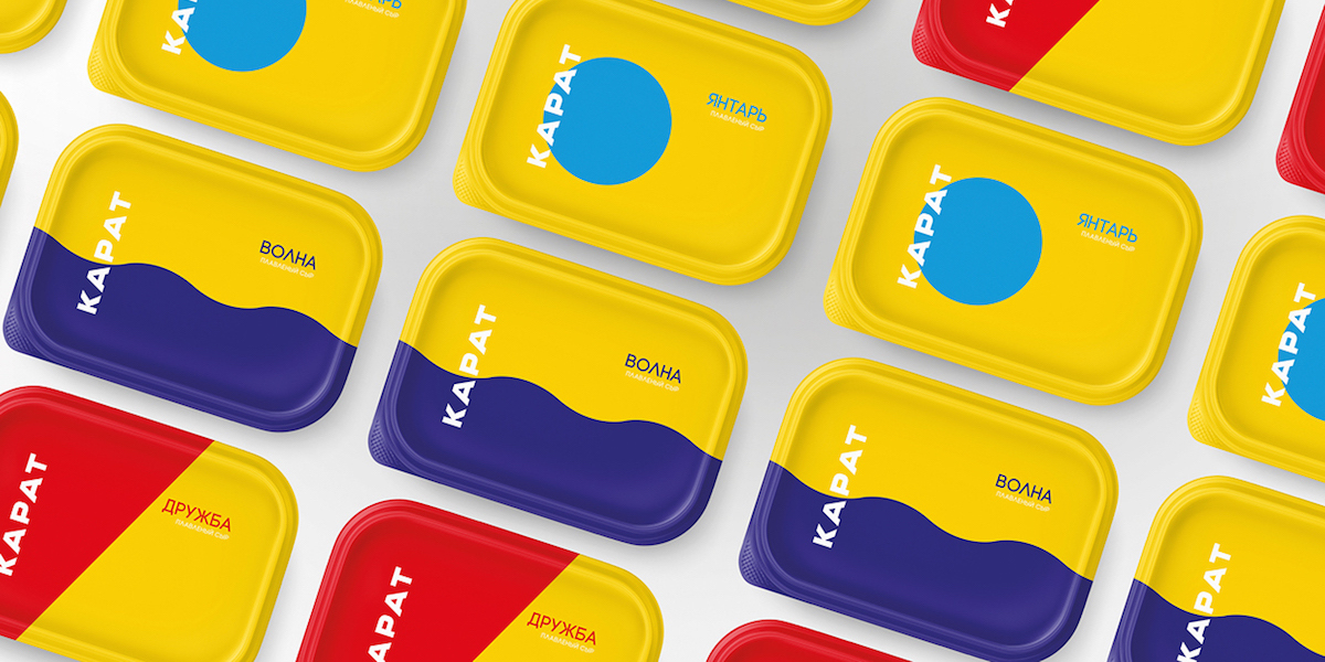
Simple and striking, this new cheese packaging does away with images of cow pastures and barns with a totally different approach. Using distinct lines and blocks of color, Karat cheese mixes retro inspiration with a modern and clean approach.
“Moscow factory processed cheese ‘Karat’ and for the first time in its 81-year history, the company held a large-scale rebranding and redesign of its products, which is familiar to every Russian. For updated corporate brand and packaging throughout the product line, Karat hired agency Depot WPF. The new version of ‘Karat’ abandoned Soviet-style soft cheeses – the usual globe, sweeping the letters ‘Friendship,’ retaining only the recognizable color code – red-yellow for ‘Friendship,’ blue and yellow for ‘Waves,’ turquoise and yellow for ‘Amber.’”
Saturated yellows and reds are reminiscent of packaging from the 70s and 80s. Yet the overall design is minimal, giving it a breath of fresh air for today’s consumer.
