Ten Degree Tour’s Packaging Blends Form and Landscape For Quiet Rituals
By
Published
Filed under
By
Published
Filed under
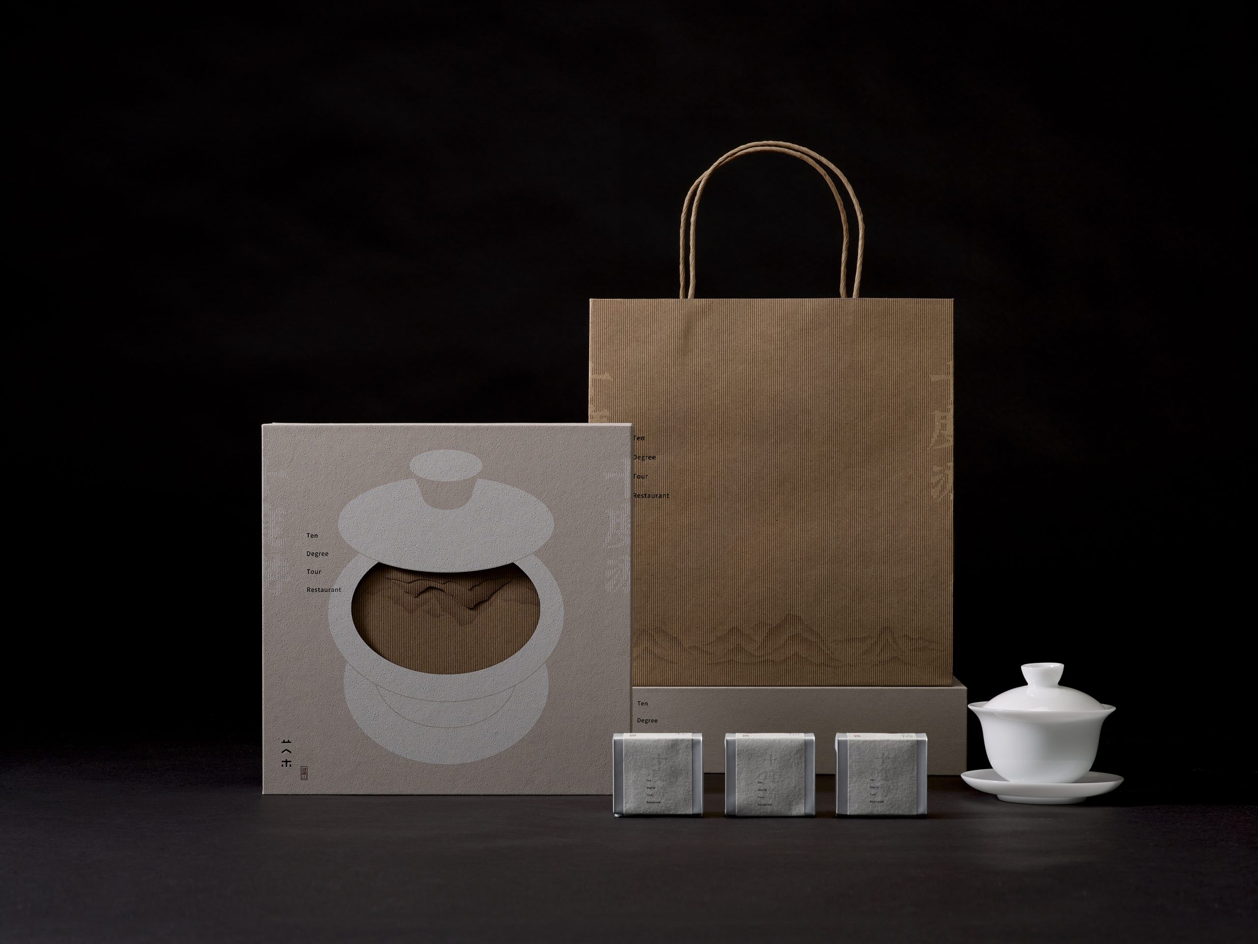
Linshaobin Design Shenzhen‘s packaging for Ten Degree Tour layers soft textures, minimal colors, and subtle dimensionality.
A die-cut teacup illustration reveals an embossed paper with mountain and bird motifs, referencing tea’s connection to nature. The typography is delicate, evenly spaced, and positioned off-center to balance the circular graphic. Meanwhile, the palette stays neutral with warm greys, soft whites, and natural kraft, keeping the focus on the form and shadow play. It feels considered, quiet, and tied to ritual.
Get unlimited access to latest industry news, 27,000+ articles and case studies.
Have an account? Sign in