NAM Coffee’s Asymmetrical Yet Balanced Coffee Bags Blends Two Cultures Through Design
By
Published
Filed under

By
Published
Filed under
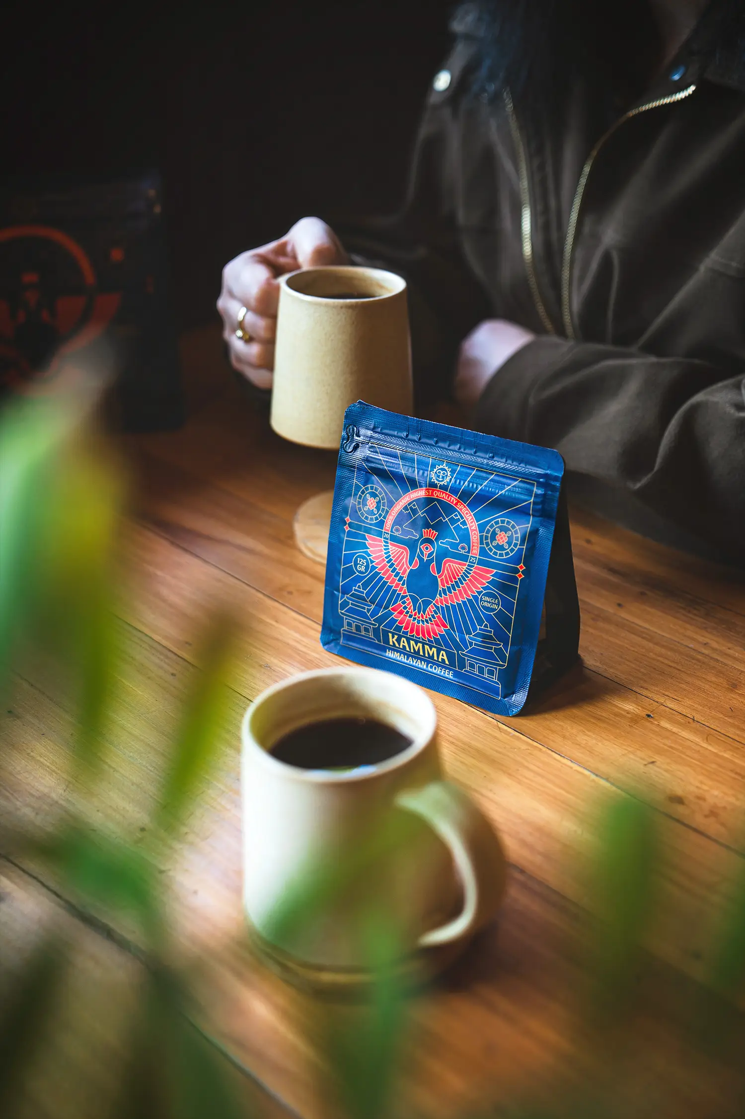
Chochoi Creative designed the packaging for NAM, a coffee brand inspired by a journey from Vietnam to California. The packaging implements design elements from both cultures, converging to create a bespoke, innovative system. The structural typography paired with custom, asymmetrical labels visually consumes the viewer, while the white space and white bag add a sense of balance to the overall design.
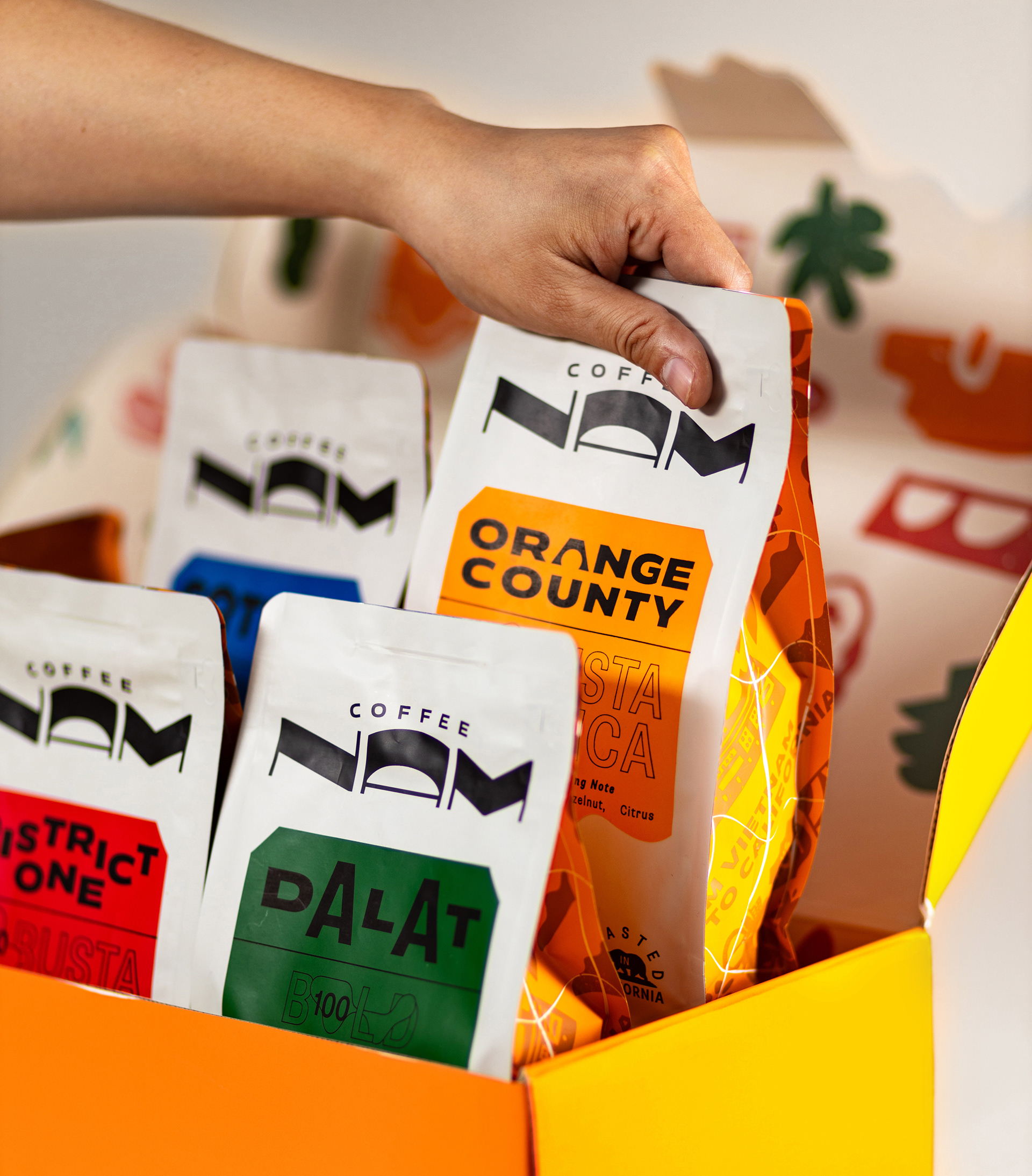
To whoever was born and raised in the bustling yet beloved city named Saigon, this city is such a box full of amaze where the culture and motivation meets ,however, wrapped up inside was the beautiful fusion of lifestyle, landscape and nature. Beyond the some iconic images of Caphe Sua Da, Non La or Xe Om, etc. any “self-proclaimed” local people won’t mind proudly telling you about those the culturally-mixed infrastructure of Saigon, or those heavy rain seasons inevitably making you fall or our daily bustling lifestyle in which we are the very most down-to-earth examples of Saigonese spirit. NAM COFFEE, together with its very best essence of coffee, is really mean to write the new chapter of Saigon with more contemporary yet culture-appreciating way towards the rest of the world.
Get unlimited access to latest industry news, 27,000+ articles and case studies.
Have an account? Sign in