Sunday Gravy’s Got a New Look: Pomi Announces Unified Global Brand Identity
By
Published
Filed under
By
Published
Filed under
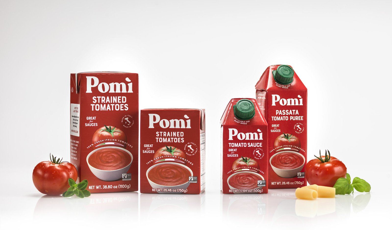
Founded in 1982, Pomì has provided consumers with 100% Italian sauced, chopped, strained, juiced, and pureed tomatoes.
Recently, the tomato pedlar underwent a comprehensive brand refresh, enlisting the creative agency Saatchi & Saatchi (Publicis Groupe) based in Italy to rework the global pack redesign. The new look is bolder, retaining its signature tomato red and white color palette while contemporizing the visual identity and packaging to attract the latest generation of consumers needing ingredients for some decent gravy. Additionally, the packaging refresh has been adapted with details crafted to the countries where the products get distributed. The US packaging adaptation comes from New York City-based creative studio QNY.
The new wordmark is flattened, the drop shadows are removed, and the accent over “ì” is changed from green to white. A new, wider serif is deployed and given a uniform width to make it stronger and bolder.
Get unlimited access to latest industry news, 27,000+ articles and case studies.
Have an account? Sign in