Guayusa’s Tea Packaging Takes A Cue From The Ingredients’ Rich History
By
Published
Filed under

By
Published
Filed under
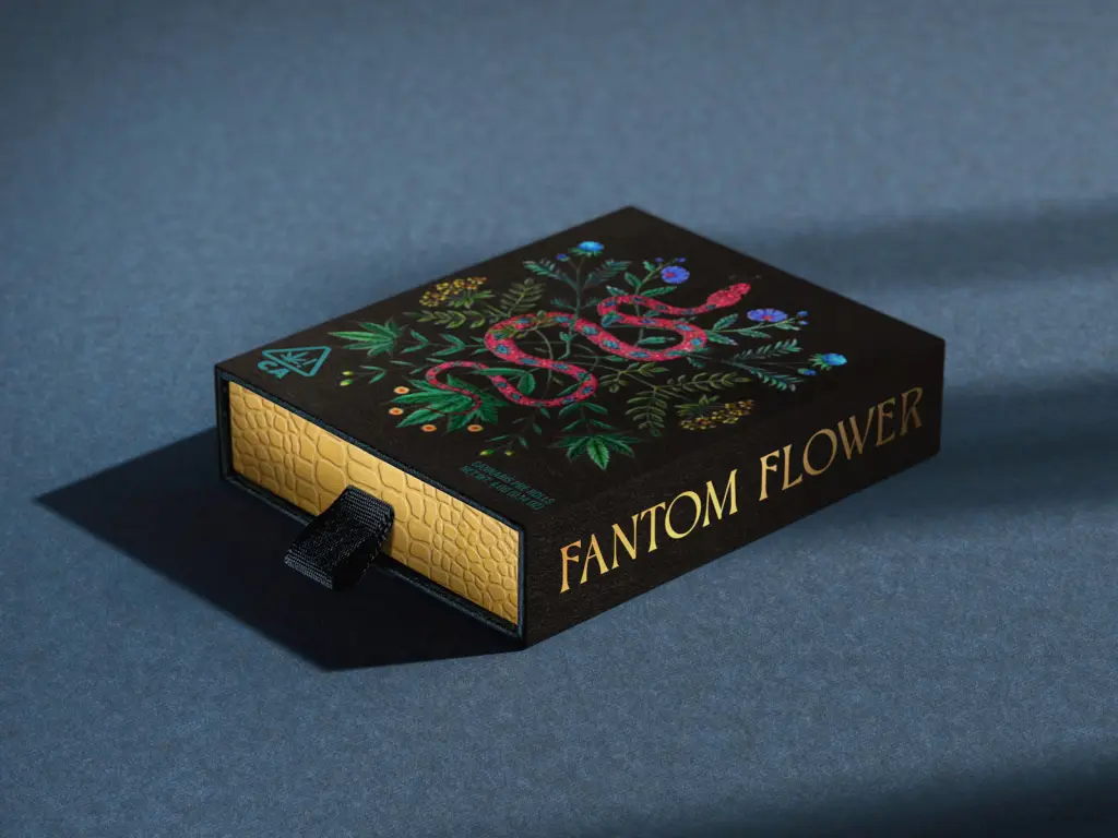
Design Move is the agency behind tea brand Guayusa’s overly vivid packaging design. The organic curves and shapes play into the brand’s rich historical references, but the bright colors help modernize the visual system. Moreover, the typography creates a statement through the psychedelic-inspired details.

New packaging for a tea line with agroforestry ingredients inspired by the Amazon, by @vivaregenera. Guayusa, a leaf native to the Amazon rainforest, is high in caffeine and is a natural source of energy. During the research to create the graphic project, we discovered that tea from the Guayusa’s leaf was used by indigenous peoples at dawn, during dream interpretation rituals. The curves and sharp entrances of the Ouroboros type have been distorted to assume the shape of the Guayusa treetops. The hallucinogenic look of the Basteleur font (both from @velvetyne foundry), combined with bright saturated colors and organic shapes, creates a playful vibes for the packaging, as in a vivid dream.
Get unlimited access to latest industry news, 27,000+ articles and case studies.
Have an account? Sign in