THIS IS IT! DIELINE Awards 2026 Late Entry Deadline Ends Feb 28
Entre Pierre et Terre Spirits Packaging Is As Cute As They Come
By
Published
Filed under

By
Published
Filed under
With a consistent red and cream color palette and cheeky typography, the apple-based spirits from Entre Pierre et Terre Spirits are instantly recognizable. Designed by Wedge Studio, there’s no denying that this line of spirits is filled with personality. And, if we’re honest, the typography on the label describes the liquid inside more flawlessly than any description ever could.
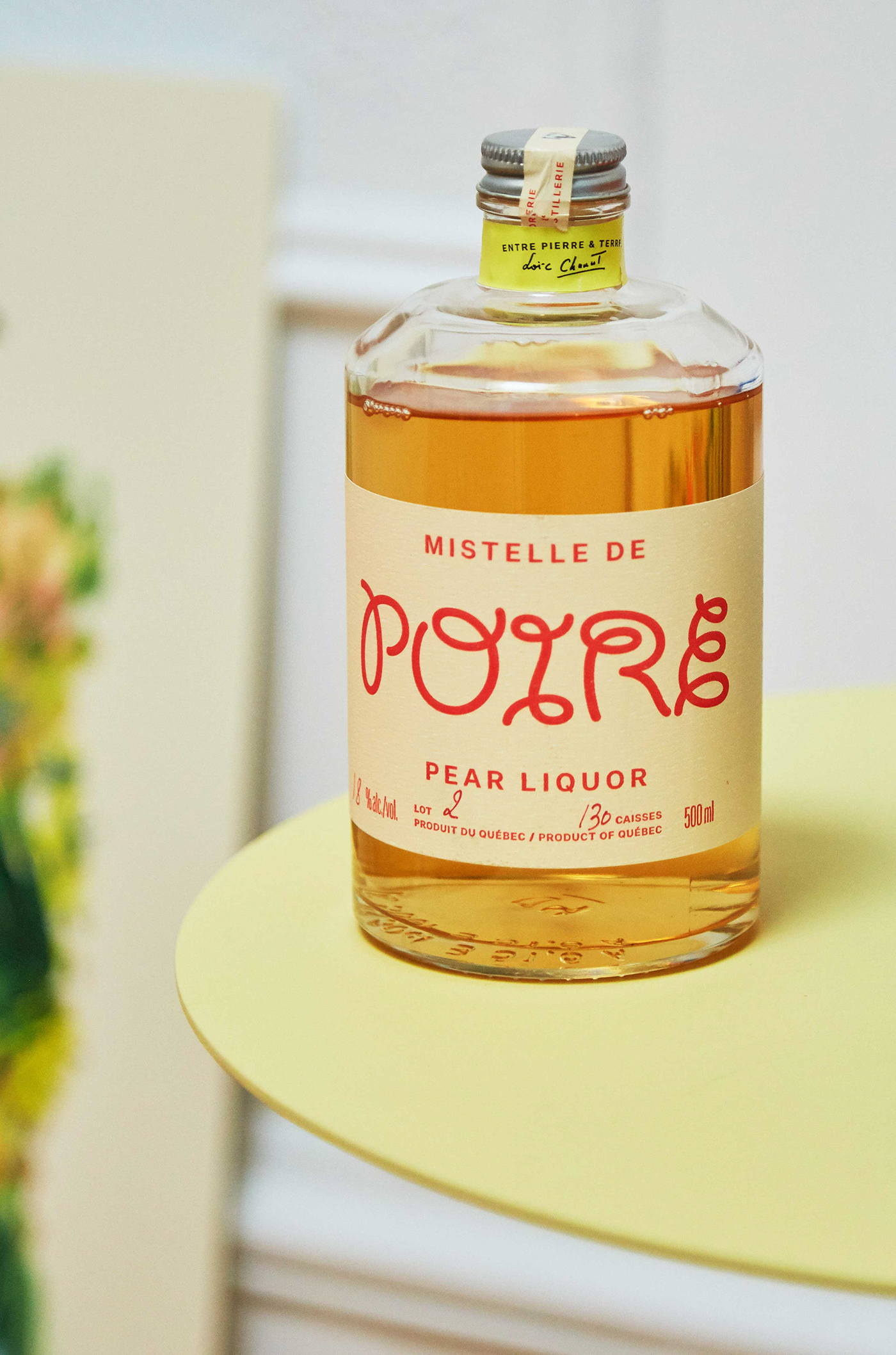
Line of apple-based spirits of exceptional quality and accessible nature, crafted by a master French distiller. The series lands its signature through a consistent red-and-cream palette inspired by the apple and informational system. Each spirit is given a unique typeface to express each drinks’ unique personality. The various typographic choices are inspired by Parisian brasserie design language. The bottle selection is cute and chubby, finished with a cigar tag detail.
Get unlimited access to latest industry news, 27,000+ articles and case studies.
Have an account? Sign in