Nagi: Underwear You Can Feel Confident In, Every Day Of The Month
By
Published
Filed under
By
Published
Filed under
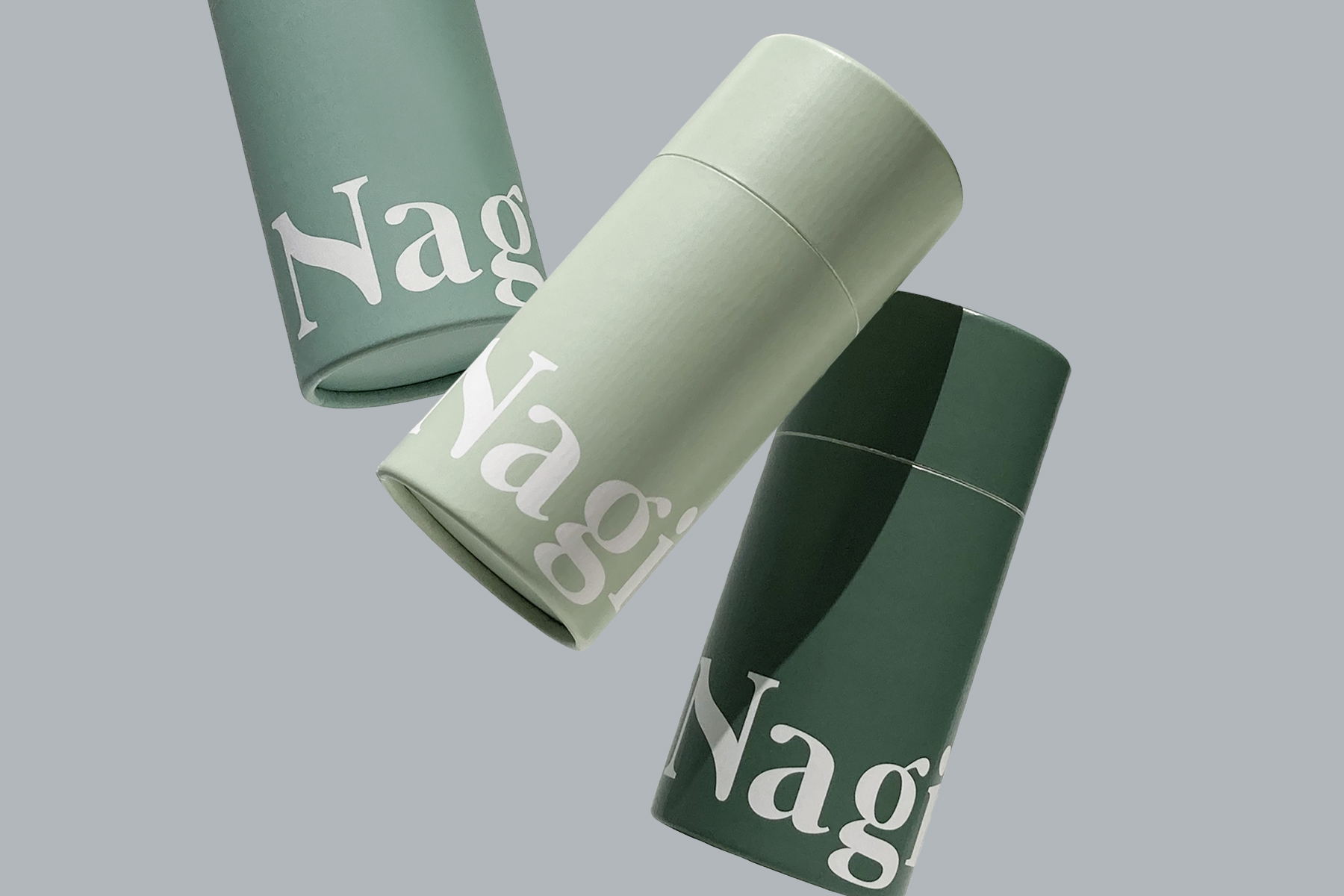
This underwear brand is on a mission to empower women to feel confident wearing their favorite underwear: period or not. The design itself is minimalist, and incorporates calming greens and blues for a brand experience that is the equivalent of some good ASMR. The speckled design is a subtle design move that shows that while a brand’s identity might be mostly type-focused, that doesn’t mean there isn’t room for a few tricks.
Nagi is a Tokyo based period-proof underwear brand, and I worked closely with Rina Ishii, the founder, to develop the brand identity, and deliver an entire branding suit from tag to packaging to illustration to website. The brand aims to empower women by producing underwear that allows anyone with period to stay calm and positive even while on period.
The graphic solution seeks to communicate the calm feeling, and the bold brand’s messagings mixed with a touch of sophistication, while reminding us of the curviness of the human body. To achieve this feeling, the logo was created using a bold, distinctive serif typeface accompanied by a curved line in the N, inspired by the human body, and sits at the bottom of packaging confidently in big scale.
Get unlimited access to latest industry news, 27,000+ articles and case studies.
Have an account? Sign in


