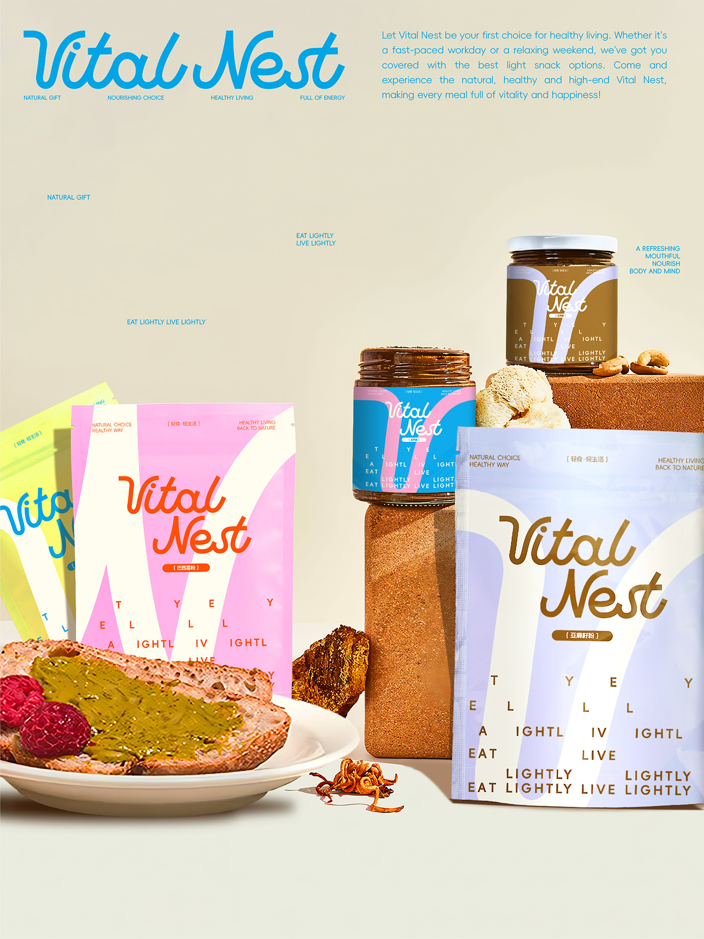
Vital Nest’s packaging, designed by Resauce Studio, leans into a playful minimalism that feels visually and conceptually light. The oversized “V” shape on each pouch and jar acts as a central design anchor, breaking up the negative space without overwhelming it.
The typography is kept clean and curvy, with “Vital Nest” in a stylized script that contrasts nicely against the geometric sans-serif type scattered across the background. Each SKU is differentiated by soft color blocking, there’s lemon yellow, sky blue, and cotton candy pink, working together to create a lineup that feels fresh, orderly, and slightly retro in its palette logic.