UNTO’s Packaging Flair Makes This Olive Oil Stand Out In An Overcrowded Market
By
Published
Filed under

By
Published
Filed under
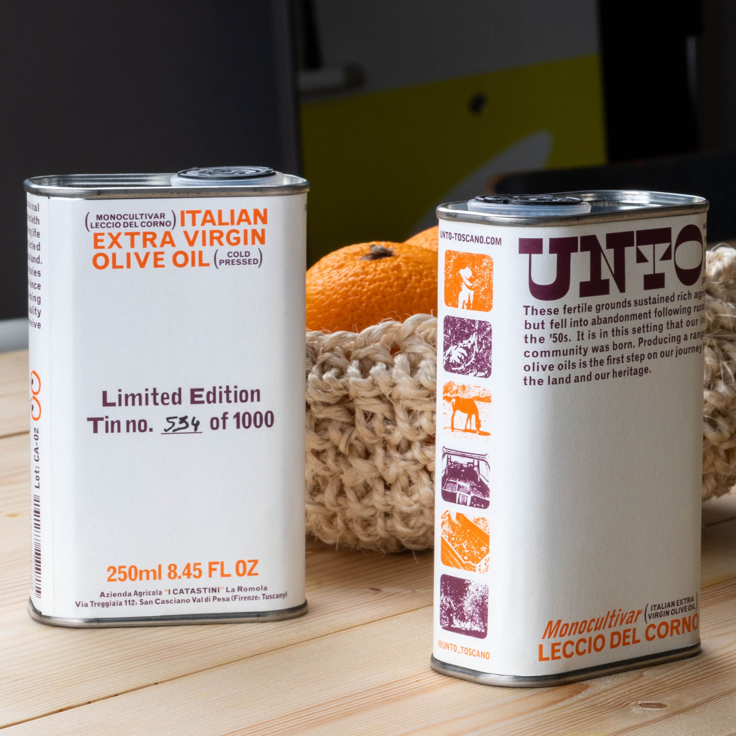
Retro typography and unexpected color combinations melt together to create an explosion of delicious packaging design for Unto’s olive oil packaging. Designed by Studio Bergini, the highly distinctive packaging design leans into white space with surprising pops of color to bring the tin to life. And beyond the unexpected, the editorial flair differentiates this brand from the crowded olive oil space in a way that makes olive oil feel more like a fashionable accessory than a necessary ingredient.

Get unlimited access to latest industry news, 27,000+ articles and case studies.
Have an account? Sign in