Studio Earthling’s Redesign for Jubel Beer Achieves a Timeless Feel Without Playing It Safe
By
Published
Filed under
By
Published
Filed under
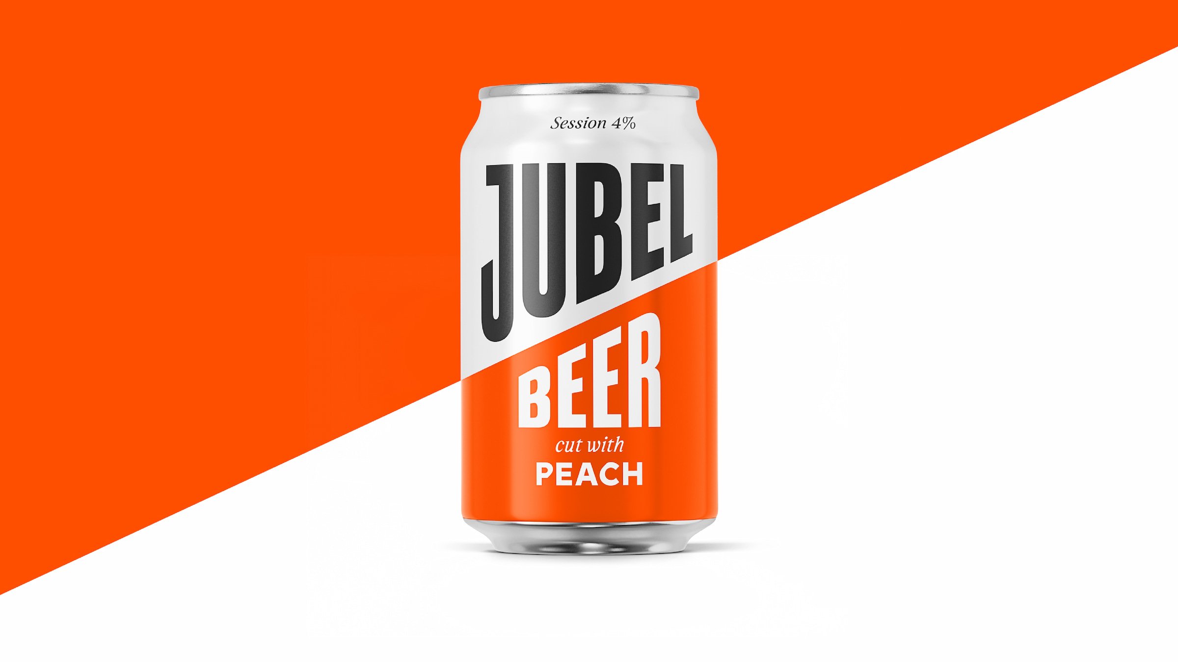
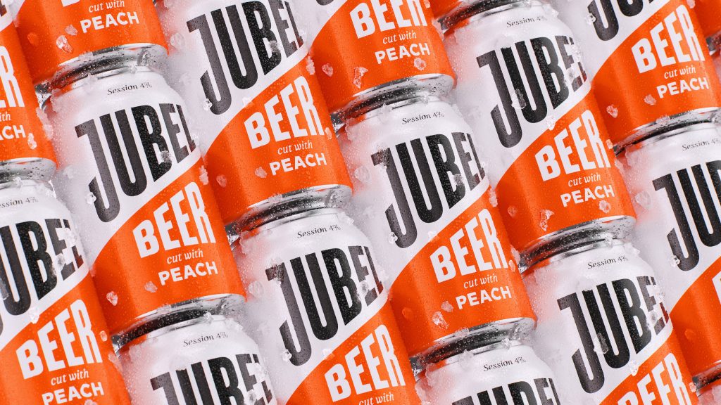
Some aesthetics never get old, and Studio Earthling’s redesign for the appetizingly peachy Jubel Beer fits in that category. The central diagonal stripe motif makes it look like it could be from just about any time post-1950, while its punchy use of color and smart serif mixing gives it a modern feel.
It doesn’t necessarily feel like “safe” work, especially with its direct nod to caution signs, but it’s hard to imagine this can ever looking out of date.
Get unlimited access to latest industry news, 27,000+ articles and case studies.
Have an account? Sign in