THIS IS IT! DIELINE Awards 2026 Late Entry Deadline Ends Feb 28
Student Week: Strawberry Ice Cream Packaging With Fun, Groovy Notes
By
Published
Filed under

By
Published
Filed under
Inspired by 70s psychedelic artwork, student designer Julia Górka created the packaging design for strawberry ice cream that’s as sweet as can be. The rich strawberry colors and the playfully groovy typeface work together to create an enthusiastic packaging system that visualizes all the best dessert qualities. Additionally, the patterned lid makes a simple, lovely detail yet extends the brand’s playful side to the top of the pint. The design is uncomplicated yet highly effective and beautifully lively.
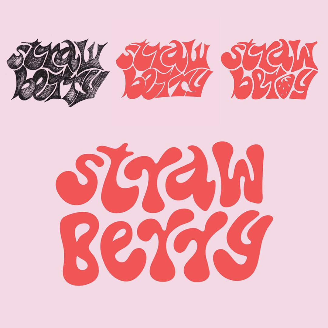
Ice cream inspired by 70’s psychedelic art? Yes, please! For this project, I was trying to combine psychedelic art with something more modern and playful. The whole concept is based on custom lettering, that I made, including the digitization process.
Get unlimited access to latest industry news, 27,000+ articles and case studies.
Have an account? Sign in