THIS IS IT! DIELINE Awards 2026 Late Entry Deadline Ends Feb 28
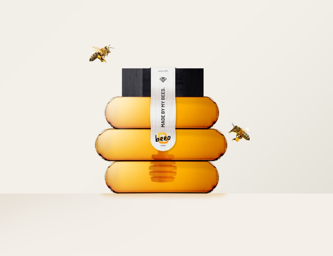
The honey industry’s packaging needed a little bit of a refresh from the plain glass mason jars and squeezable plastic bears. Mattéo Tabutieaux, a student at Lycée Technique et Professionnel Privé Saint Vincent de Paul, Algrange, France, realized what the market was missing and created the conceptual honey brand and packaging appropriately named Beeo Honey. The packaging is reminiscent of a bee’s hive, and the lid ingeniously comes with a honey dipper attached. While simple, this honey’s packaging makes a bold statement.

Beeo is a concept for a new brand of honey that strictly adheres to the criteria of organic farming and above all the good remuneration of the affiliated beekeepers. Modern in its way of producing honey, it is also modern in its graphic identity. Beeo is the contraction of the words “bee” and “organic”. The name is a powerful evokes the world of honey and organic products. I created the “B” pictogram of the logotype from the symbol of a natural hive. I associated this pictogram with a freehand typography for the authentic aspect and an orange panel reflecting the diversity of honeys.
Get unlimited access to latest industry news, 27,000+ articles and case studies.
Have an account? Sign in


