THIS IS IT! DIELINE Awards 2026 Late Entry Deadline Ends Feb 28


Every single week this past year, I’ve spent my time analyzing trends for my weekly Shelf Life newsletter. From what’s trending in flavor innovation and the stories people are dissecting deep in the TikTok comments to things I overhear at my local bars and grocery stores, I’ve had a blast digging into the why behind the what. I’m endlessly fascinated by what’s shaping our culture, especially when it comes to marketing, branding, design, and packaging.
The CPG landscape alone has changed dramatically since I started working with The Dieline (five years ago!). This year has made it clear that the most successful brands find the most value in appearing culturally aware.
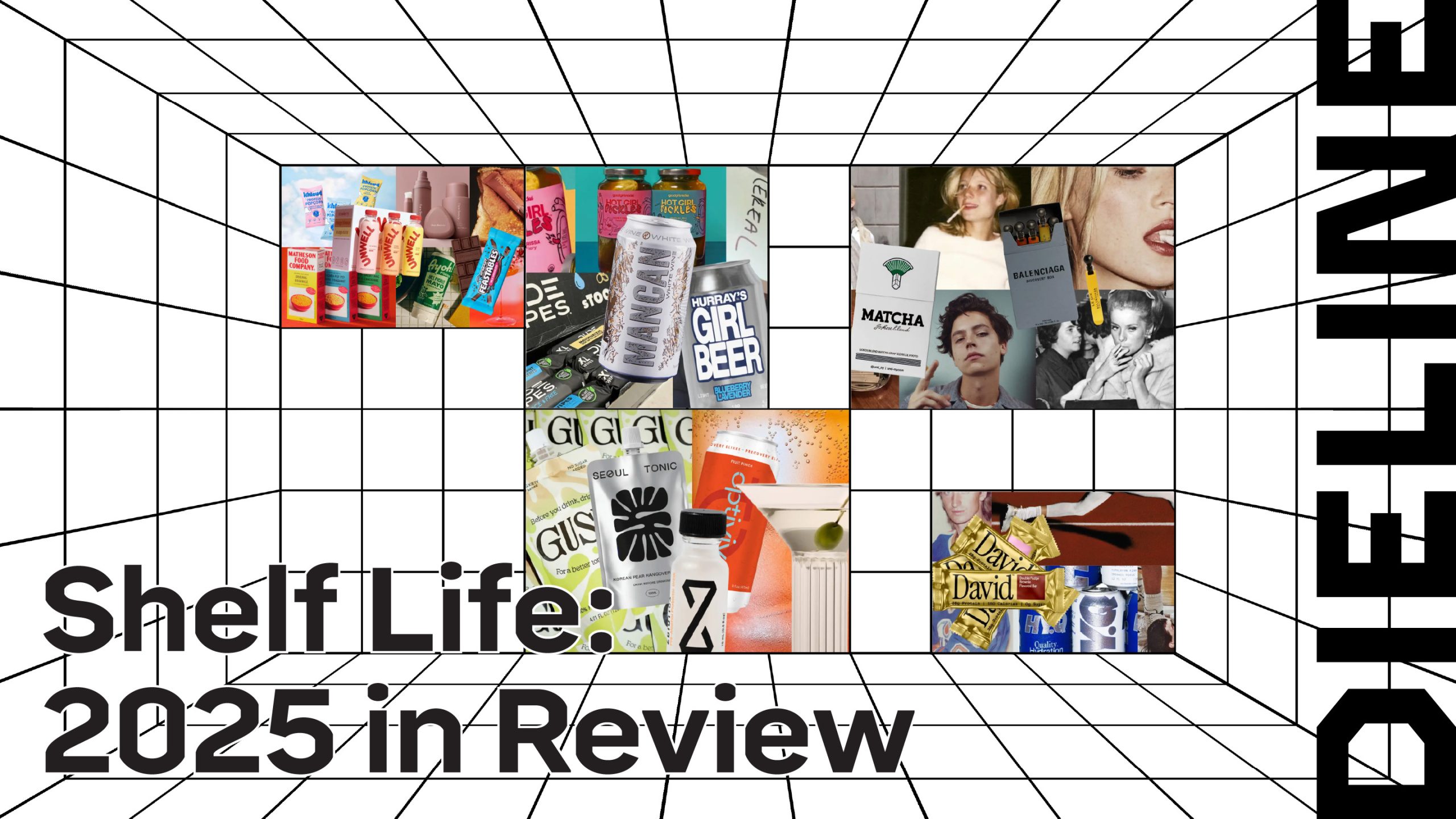
Across Shelf Life, over the past year, I kept returning to the same tension week after week. What the design stands for beyond the aesthetic. Whether it was cigarette-inspired packaging, vibe-based flavors, or the rise of intentionally “ugly” design, brands leaned into signals that felt culturally literate rather than pretty for pretty’s sake.
Get unlimited access to latest industry news, 27,000+ articles and case studies.
Have an account? Sign in